

WBUR
WBUR
Tune in to a new radio experience
Tune in to a new radio experience
ABOUT
iOS and Android App, Winter 2016
ROLE
User Interface, User Experience
TEAM
Design - Kathy Chau, Guilherme Schmitt, Aaron Tenbuuren, Lauren Armstong, Jim Forrest, Xan Klotz
Development - Matt Bridges, Glen Daniels, Rob Boyle, Vincent Toms, Mark Daigneault, David Zou, Ayal Spitz, Kerry McElhaney, Colin Tan, Lu Quan Tan, Xiaochen Huang, Peter Farlow, Bryan Weber, Tetyana IIlyash
Project Management - Jackie Di Ianni, Cara Quigley
THE PROBLEM
Signal Among The Noise
Signal Among The Noise
As emerging Internet services get new users at exponential rates, public radio stations keep a stable audience of dedicated listeners that have included their reliable transmissions into their daily lives.
To keep their relevance in the digital age, WBUR reached out to us to redesign their mobile app for both Android and iOS.
As emerging Internet services get new users at exponential rates, public radio stations keep a stable audience of dedicated listeners that have included their reliable transmissions into their daily lives.
To keep their relevance in the digital age, WBUR reached out to us to redesign their mobile app for both Android and iOS, with the following subjects in mind:
FOR THE RADIO STATION
Facilitating Contributions
Public radio relies on its passionate audience to get funds that guarantee their quality throughout the years. WBUR wanted to revitalize their mobile presence, with an on-demand experience that still allowed the audience to connect and contribute to their favorite shows.
Public radio relies on its passionate audience to get funds that guarantees their quality being consistent throughout the years. WBUR wanted to revitalize their mobile presence, with an on-demand experience while still allowing the audience to connect and contribute to their favorite shows.
FOR RADIO LISTENERS
Engagement Through Convenience
Engagement Through Convinience
In the current engagement-seeking environment, multiple apps fight for users attention. WBUR listeners have to proactively search and download the app, so we had the challenge of providing a clear value proposition for users to make that jump - focusing primarily on convenience.
In the current engagement-seeking environment, multiple apps fight for users attention. Since Radio is not a navite feature for smartphones, users have to proactively search and download a dedicated app, which is a big hurdle - research shows that users are downloading less apps every month. WBUR had the challenge of providing a clear value proposal for users to make that jump - user conveninence was key.
How might we...
How might we...
build a radio experience that allows listeners to discover new shows in tune with their preferences?
build an on-demand radio experience that connects listeners to their favorite shows?
Process
Process
Iterating for Discovery
Iterating for Discovery
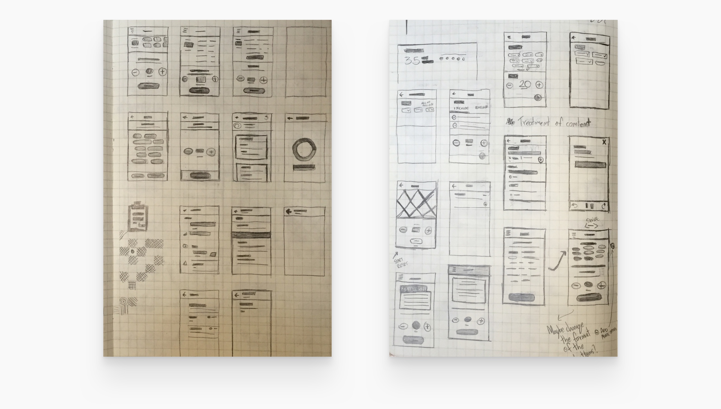
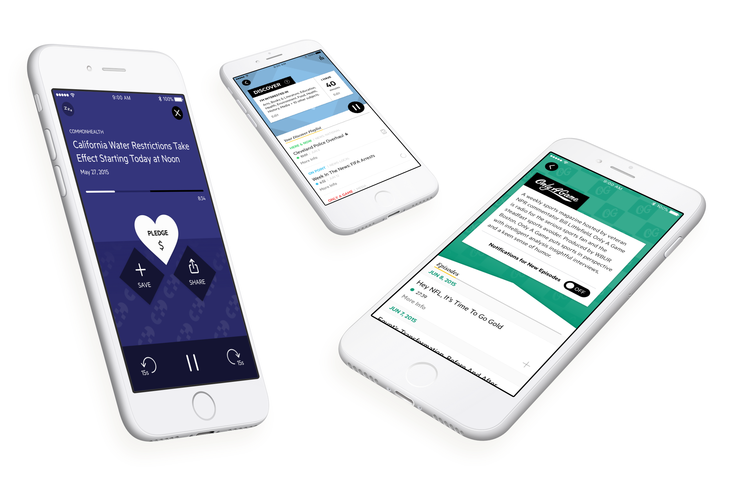
WBUR features a vast catalog of content from varied sources, but data showed that listeners were only tuning in to the same set of favorites - they had a hard time discovering new shows. To fix that, I worked on the design of the Discover feature, focused on promoting episodes and shows catered to the preferences of each listener.
I researched into other services that tackled personalization at scale (Beats Music, TED Talks) and identified that not only the subject needed to have relevance but the content delivered must fit into how much time each user had available.
WBUR station features a vast catalog of content from varied sources; but data showed that WBUR listeners were only tuning in to the same set of favorites - they had a hard time discovering new shows. To fix that, I worked on the design of the Discover feature, focused on promoting episodes and shows catered to the preferences of each listener. I researched into other services that tackled personalization at scale (Beats Music, TED Talks) and took note that not only the subject matter had to be relevant, but the content delivered must fit into a flow of discovery based on how much time each user had available to dive deep into a new show.
Donations, Sans Frustrations
Donations, Sans Frustrations
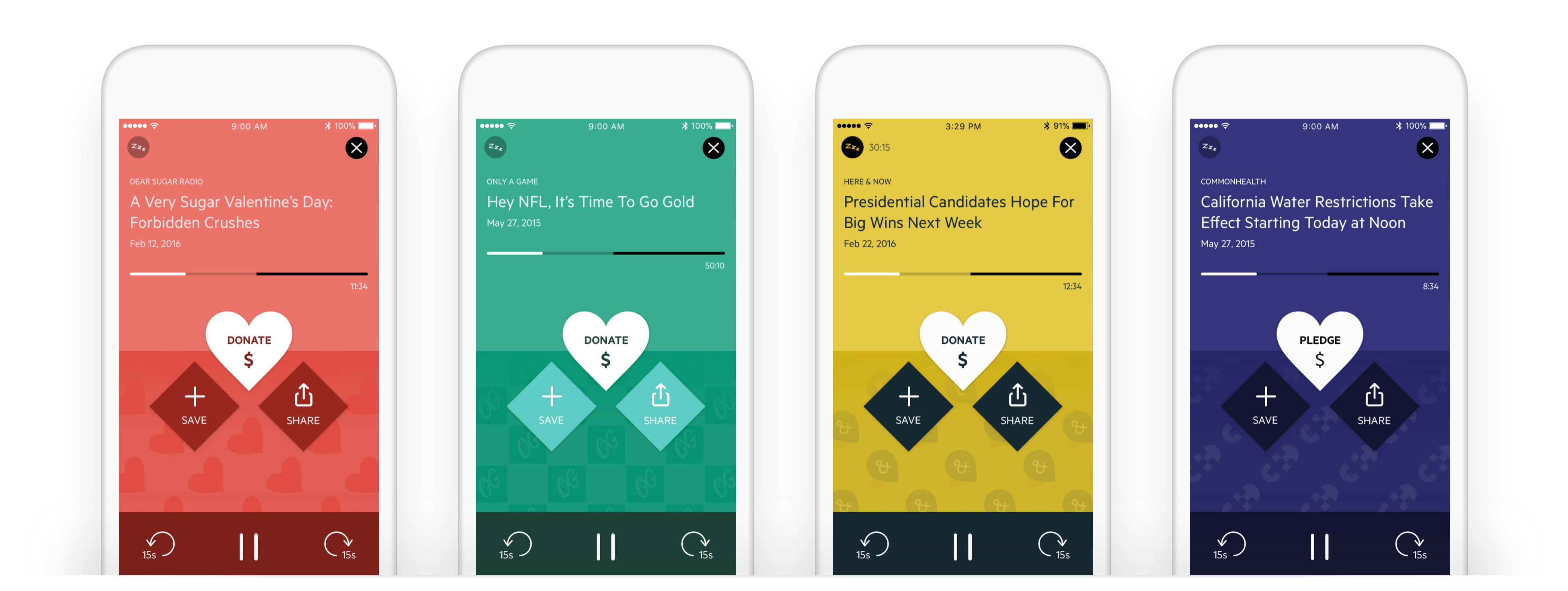
WBUR listeners had a genuine interest to show support for their favorite shows, but the donation process was cumbersome and easy to forget, especially when dealing with memorizing SMS numbers during a live broadcast.
We integrated donations on the player screen, making the process effortless - listeners are a button away from showing their support for their favorite shows.
WBUR listeners had geninune interest to show support for their favorite shows, but the donation procedures were cumbersome and easily to forget, specially when dealing with SMS numbers that had to be memorized during a live broadcast.
WBUR app makes SMS donations effortless - listners are a button away from showing their support.
Solution
Solution
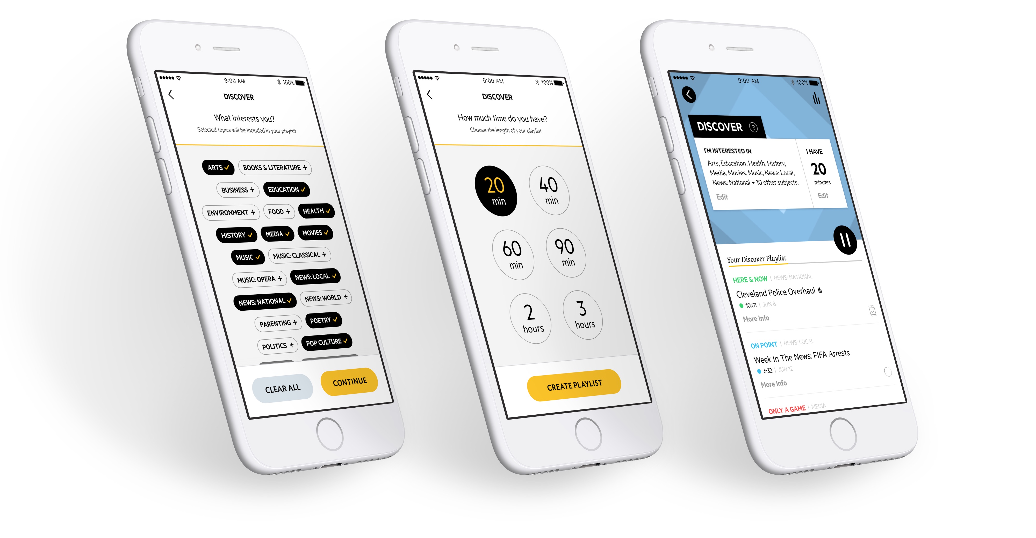
Convenient Discovery
Convenient Discovery
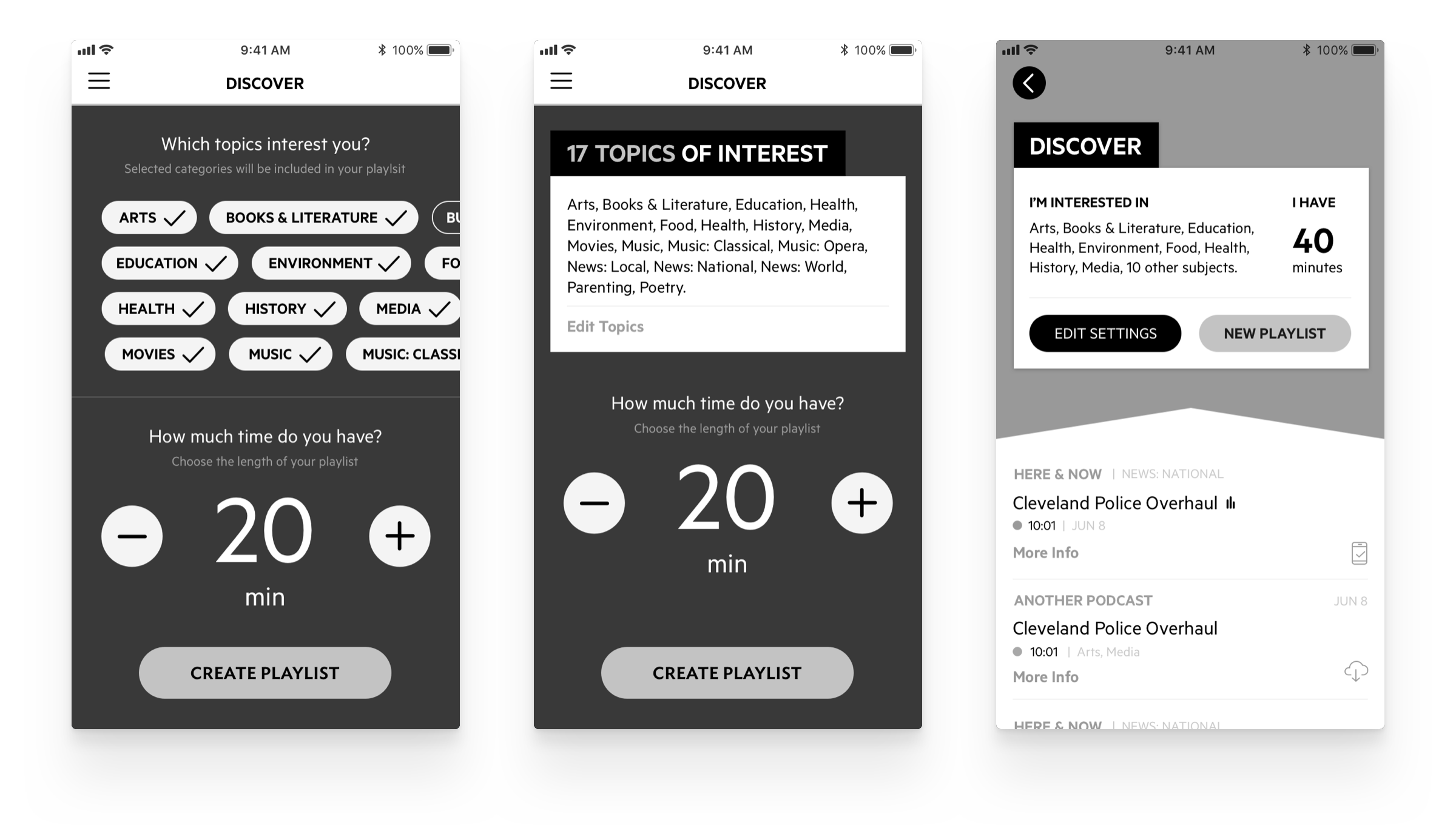
Through the Discover feature, users can get custom playlists with fresh episodes catered to their interests and available time. Discover playlists download in the background when the device connects to Wi-Fi, saving data and giving listeners an opportunity to explore new shows even without data connection.
Starting a Qup as a host is as easy as choosing the name of your event. To help users get things started quickly, a party name randomizer is available to surprise and delight guests and hosts alike.
Motion and Delight
Motion and Delight
We extended the uniqueness of WBUR's visual identity to use motion to craft an experience as dynamic as the shows they showcase.
We extended the uniqueness of WBUR's visual identity to use motion to craft an experience as dynamic as the shows that they showcase.
A Show Apart
A Show Apart
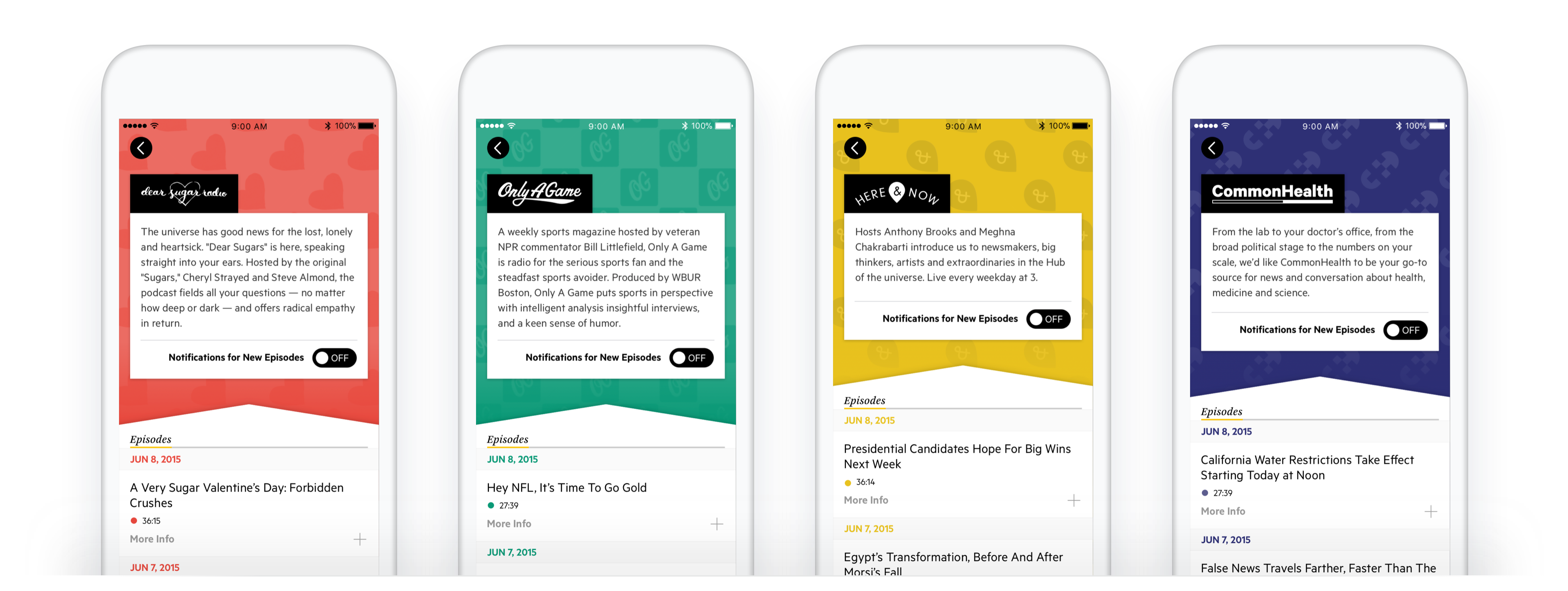
We worked closely with the brand agency responsible for redoing all visual identities for WBUR shows. We customized the look and feel of each show page and audio player, giving the app a distinctive visual appeal. The different styles also help users discern shows during live programming.
We worked closely with the brand agency responsible for redoing all visual identities for WBUR shows. We customized the look and feel for each show page and audio player, giving the app a distinctive visual appeal. The different styles also helps users discern shows during live programming.
EXTRA
EXTRA
Onboarding Explorations
Onboarding Iteration
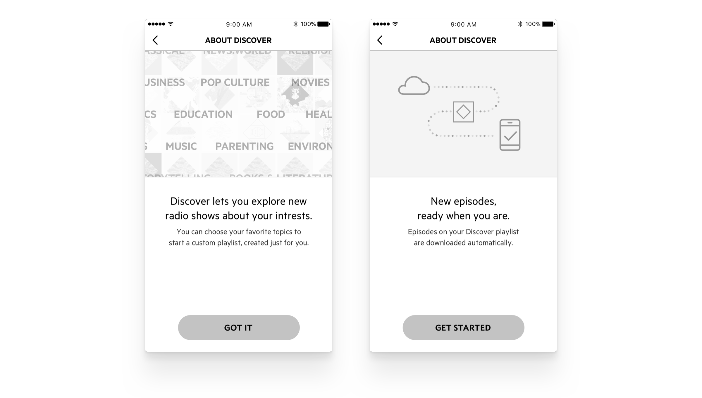
I explored a motion-centric onboarding flow that guides users through the download and the donation features. The goal was to drive excitement and set expectations of a polished, immersive experience.
On this unused onboarding flow, users are introduced to the download feature and the donations system. The shipped version includes a video narration over the app's UI.
links & hobbies
links & hobbies
links & hobbies
links & hobbies
links & hobbies
Photography ∙ Playlists ∙ Films
hey, thanks for visiting
hey, thanks for visiting
hey, thanks for visiting
hey, thanks for visiting
hey, thanks for visiting
have a nice day
have a nice day
have a nice day
have a nice day
have a nice day
PIXELS POLISHED WITH ♥, BY GUI ∙ UPDATED SOMETIME AMIDST THE BLUR OF 2020-21
PIXELS POLISHED WITH ♥, BY GUI ∙ UPDATED UPDATED SOMETIME AMIDST THE BLUR OF 2020
PIXELS POLISHED WITH ♥, BY GUI ∙ UPDATED UPDATED SOMETIME AMIDST THE BLUR OF 2020
PIXELS POLISHED WITH ♥, BY GUI ∙ UPDATED SOMETIME AMIDST THE BLUR OF 2020
PIXELS POLISHED WITH ♥, BY GUI
UPDATED SOMETIME AMIDST
THE BLUR OF 2020
