

Thread Group
Thread Group
Thread Group
Thread Group
Refined debugging
Refined debugging
Refined debugging support
OVERVIEW
Thread Group is a not-for-profit organization responsible for market education around the Thread networking protocol. I worked on the design of their commissioning app - used for adding devices to a network for testing purposes as the technology developed. The focus was on streamlining technical debugging and support.
OVERVIEW
Thread Group is a not-for-profit organization responsible for market education around the Thread networking protocol. I worked on the design of their comissioning app - used for adding devices to a network for testing purposes as the technology was being developed. The focus was on streamlining technicical debugging and support.
ABOUT
Android App, Summer 2015
ROLE
User Interface, User Experience
TEAM
Design - Guilherme Schmitt
Project Management - Chad Hammer
Development - Nick Servidio, Ayal Spitz, Anton Spaans
THE PROBLEM
Technical, Not Obtuse
Technical, Not Obtuse
Technical, Not Obtuse
As an emerging platform, Thread had a very utilitarian app used by developers for tech debugging. To build a stronger and more consistent brand presence, their app experience should align with the underlying value that their technology enables for the wireless world - simple, smart and effortless utilities.
As an emerging platform, Thread had a very utilitarian app used by developers for tech debugging. Thread recognized that all brand touchpoints should be considered to build a strong brand presence. They wanted a redesigned app experience that is aligned with the underlying value that their technology enables for the wireless world - simple, transparent and effortless.
IN STRUCTURE
Control and Status Visibility
Control and Status Visibility
As a piece of technical debugging software, several different states needed to be communicated to the user. Error states should be noticeable to be acted upon as the technology developed simultaneously.
As technical debugging software, there were several different states that needed to be clearly communicated to the user. Error states should be noticeable to be acted upon as the technology was simultaneously developed.
As technical debugging software, there were a lot of different states that needed to be clearly communicated for the user. Error states should be noticeable to be acted upon as the technology was simultaneously developed.
IN BRANDING
Visual Overhaul
Visual Overhaul
The consumer-facing side of the Thread group brand had a different style and design. The commissioning app should be visually consistent with other marketing materials so that users are not left wondering if the right app downloaded or not.
The consumer-facing side of Thread group had a clearly different style and design. The commissioning app should be visually consistent with other marketing materials so that users are not left wondering if the right app was downloaded.
The consumer-facing side of Thread group had a clearly different style and design. The commissioning app should be visually consistent with other marketing materials so that users are not left wondering if the right app was downloaded.
The consumer facing side of Thread group had a clearly different style and design. The comissioning app should be visually consistent with other marketing materials so that users are not left wondering if the right app was downloaded.
How might we...
How might we...
How might we...
How might we...
build a support tool that is transparent about complex processes while still enabling technically minded users to get the debug information they want?
build a support tool that is transparent about complex processes while still enabling technically minded users to get the debug information they want?
build a support tool that is transparent about complex processes while still enabling technically minded users to get the debug information they want?
build a support tool that is transparent about complex processes while still enabling technically minded users to get the debug information they want?
build a support tool that is transparent about complex processes while still enabling technically-minded users to get the debug information they want?
Process
Process
Technical Breakdown
Technical Breakdown
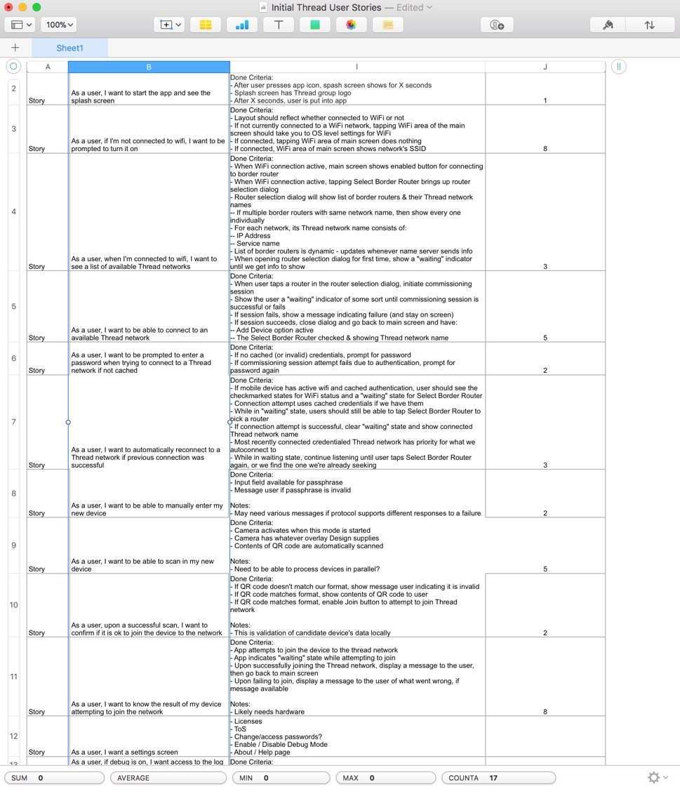
The first step was to understand how the underlying technology worked and the tasks that users could perform on the existing commissioning app. I worked closely with their tech leads to prioritize the feature set so that the experience aligned with the users natural debugging workflow.
The first step was to understand how the underlying technology worked and the tasks that users could perform on the existing comissioning app. I worked closely with their tech leads to prioritize the feature set so that the experience would be aligned with the users debugging workflow.
App Flow
App Flow
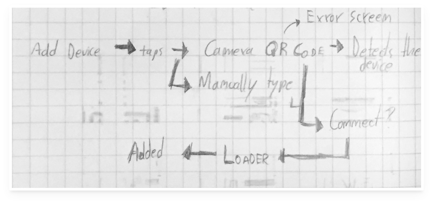
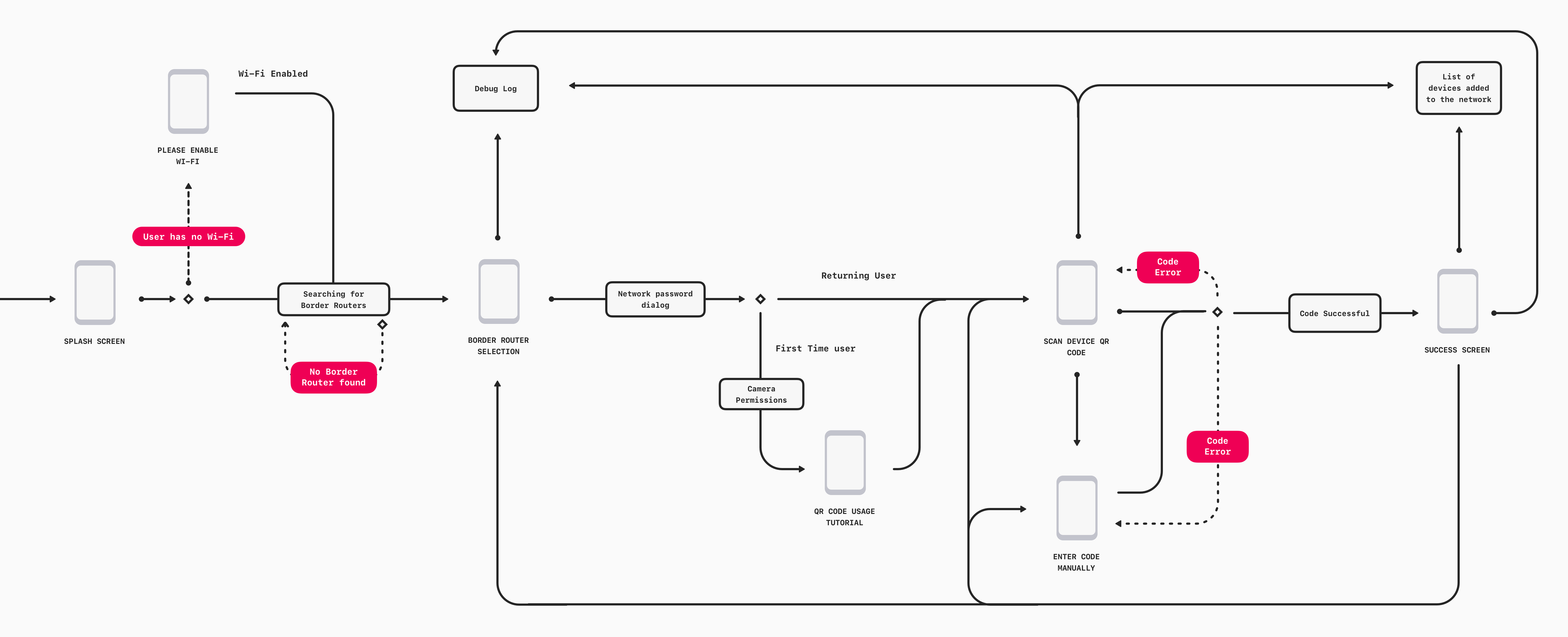
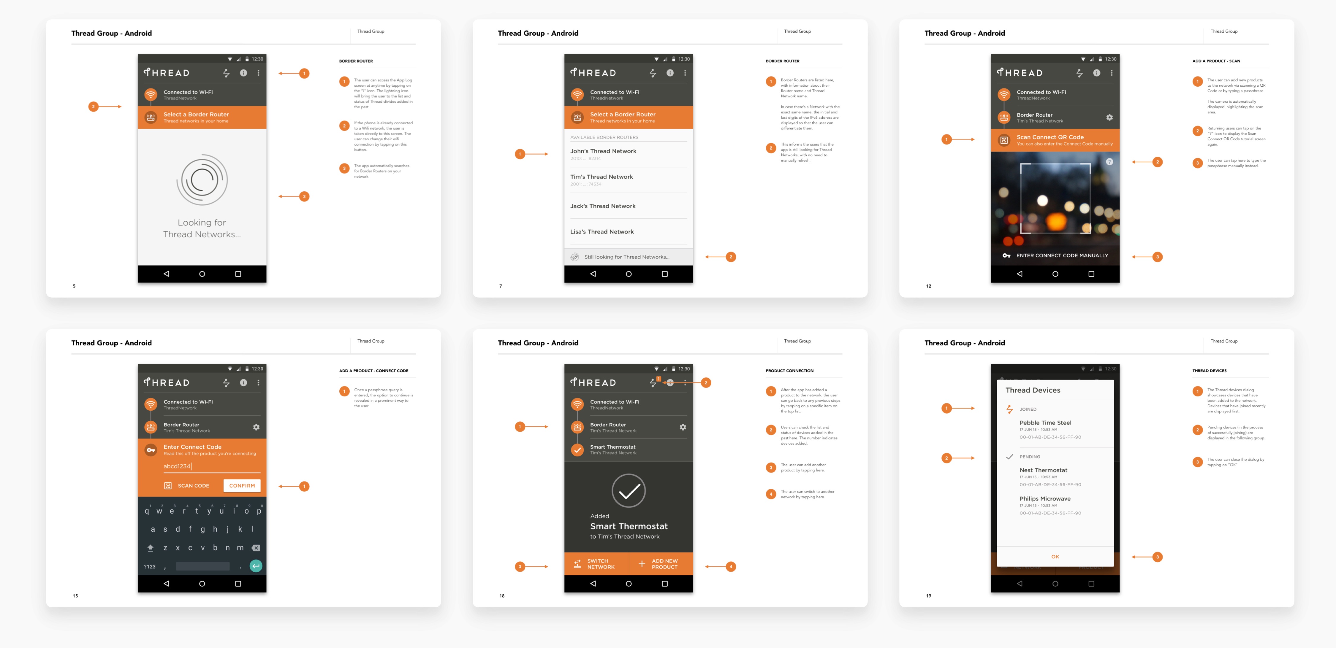
I designed the app flow to allow users to quickly jump between steps along the device addition process while having advanced debugging and configuration options a tap away.
The app flow was designed to allow users to quickly jump between steps along the device addition process, while having access to advanced debugging and configuration options a tap away.
Sketches
Sketches
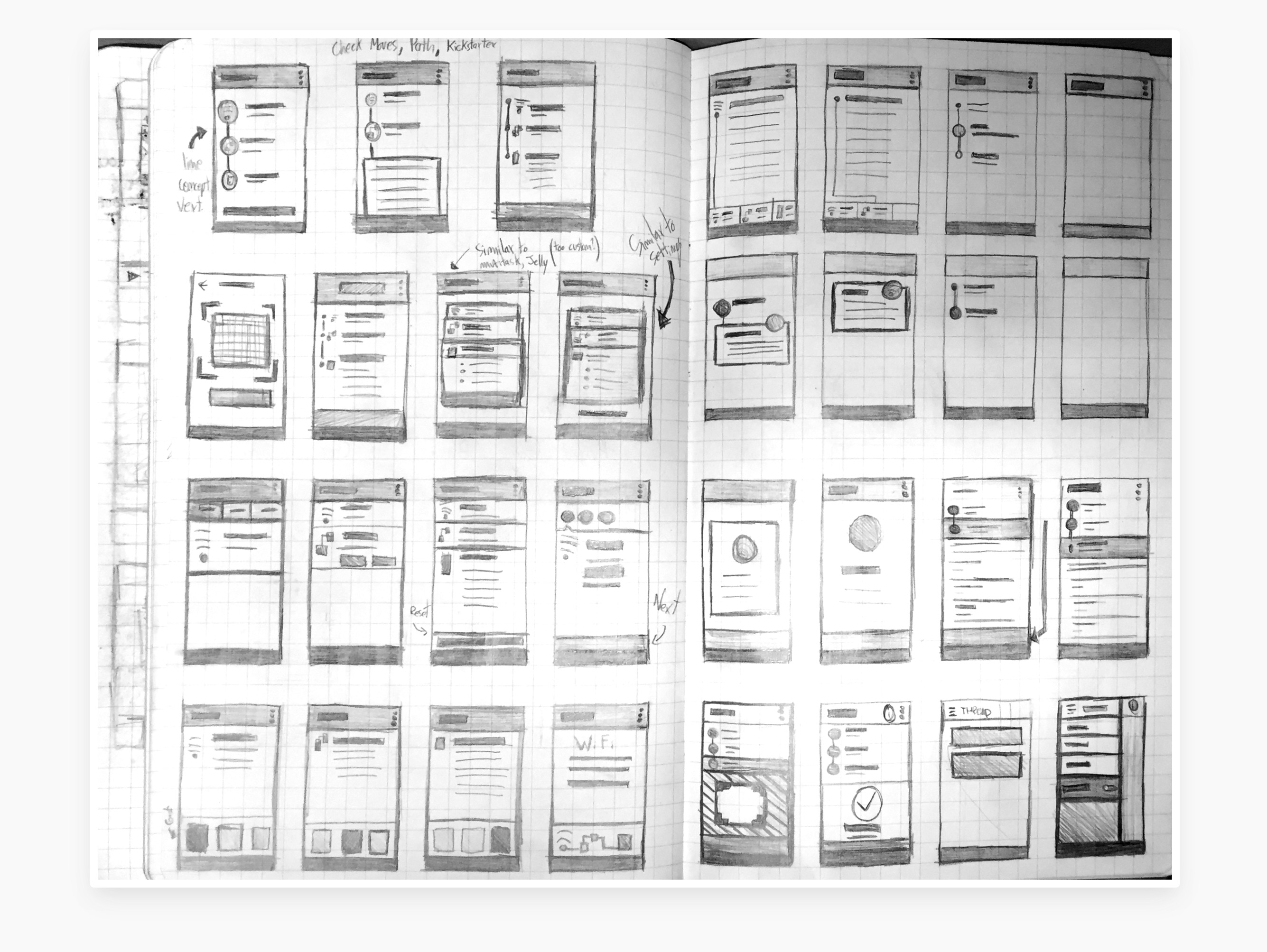
Through iteration, I focused on finding ways to clearly convey to the user where they were along the process and the action that is expected of them to proceed.
I played with the concept of taking the device hierarchy of Wi-Fi Network > Border Router > Device and applied that to the structure of the app, showcasing a nested structure of simple, 1, 2, 3 actions.
The iteration process was focused on finding ways to clealry communicate to the user where they are along the process and what is the action that is expected of them to proceed.
I played with the concept of taking the device hierarchy of Wifi Network > Border Router > Device and applied that to the structure of the app, showcasing a nested structure of actions.
Product Deck
Product Deck
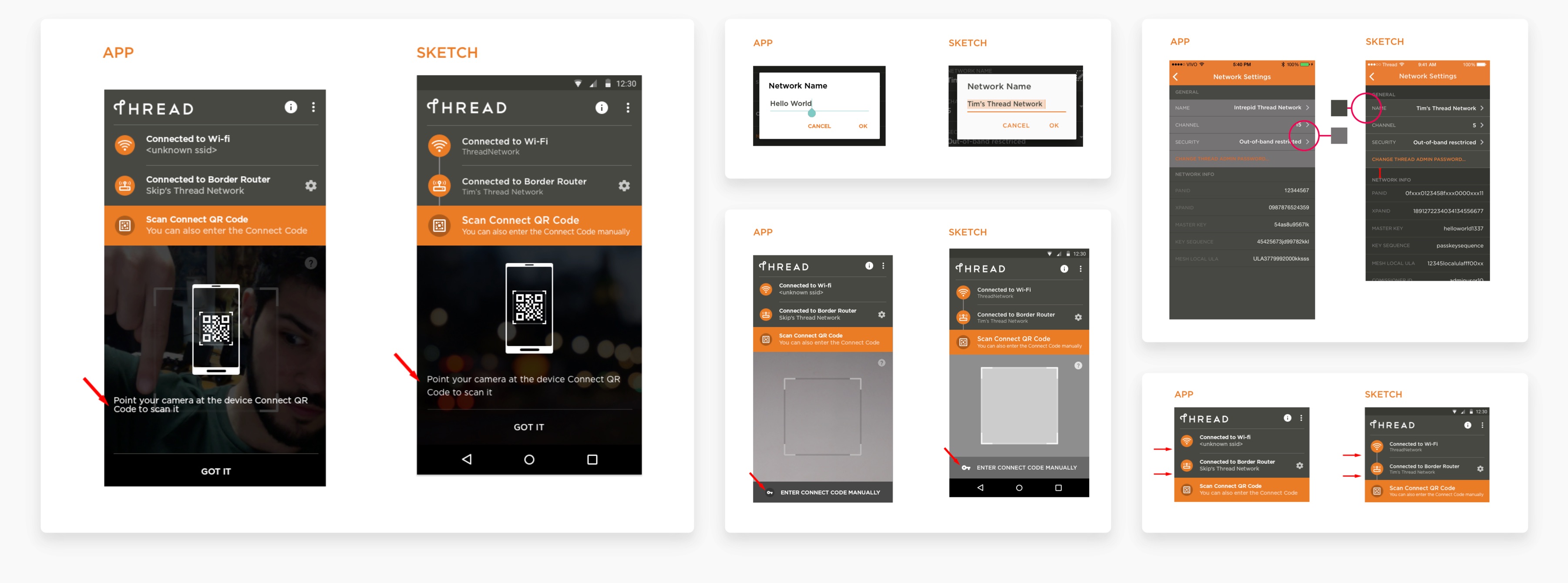
Through frequent touchpoints with the client across the iteration period, we delivered product decks documenting each interaction, validating our approach before development.
Through frequent touchpoints with the client across the iteration period, we delivered product decks documenting each interaction, validating our approach prior to development.
Through frequent touchpoints with the client across the iteration period, we delivered product decks documenting each interaction, validating our approach prior to development.
Quality Assurance
Quality Assurance
I also worked closely with the development team on a Quality Assurance role, making sure that the coded app matched the intended designs. Since the brand perception was involved, every detail counts.
I also worked closely with the development team on a Quality Assurance role, making sure that the coded app matched the intended designs. Since the brand perception was involved, every detail counts.
During the development process, I worked closely with the development team on a Quality Assurance role, making sure that the coded app matched the intended designs.
Solution
Solution
Simple Setup
Simple Setup
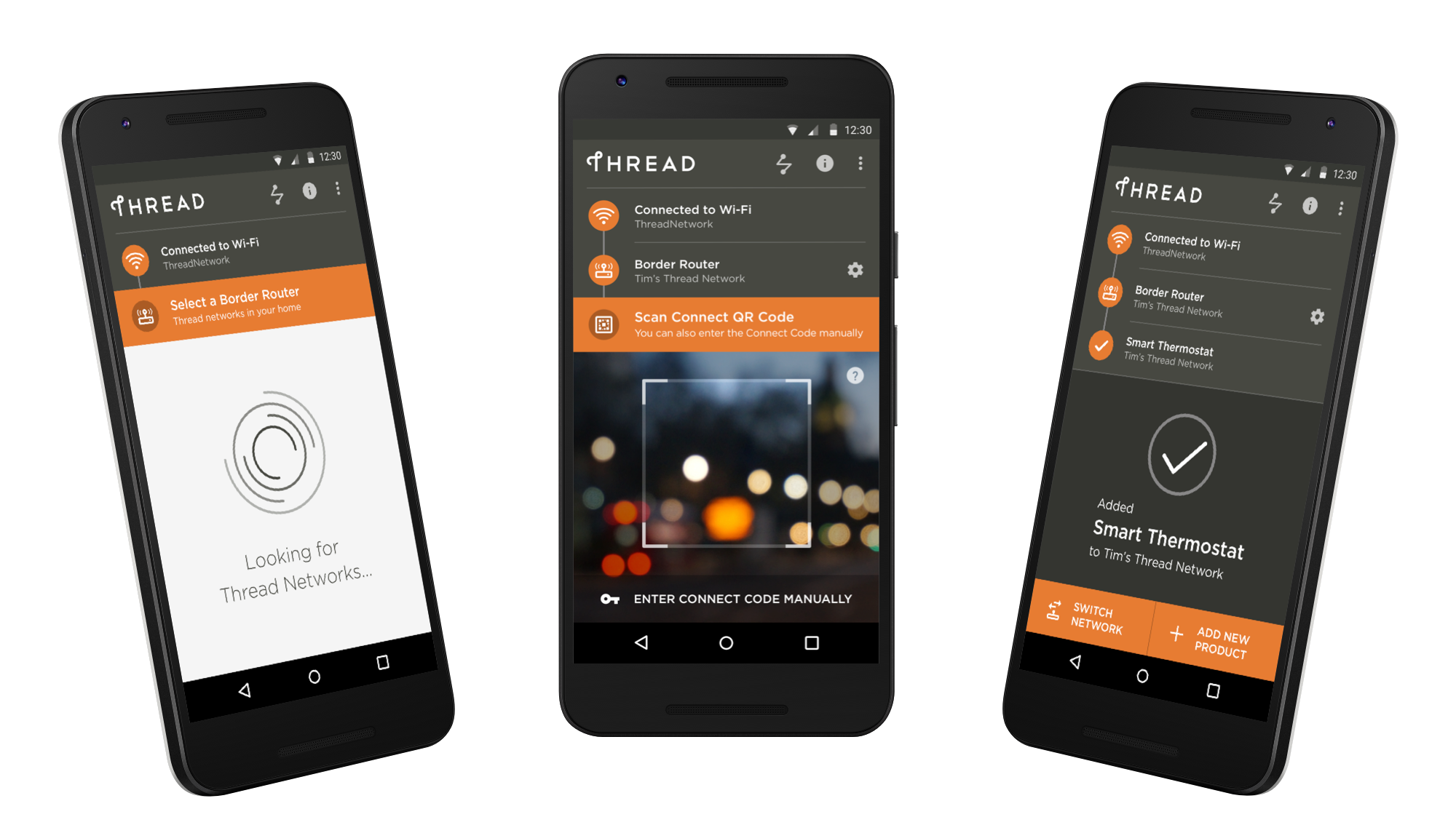
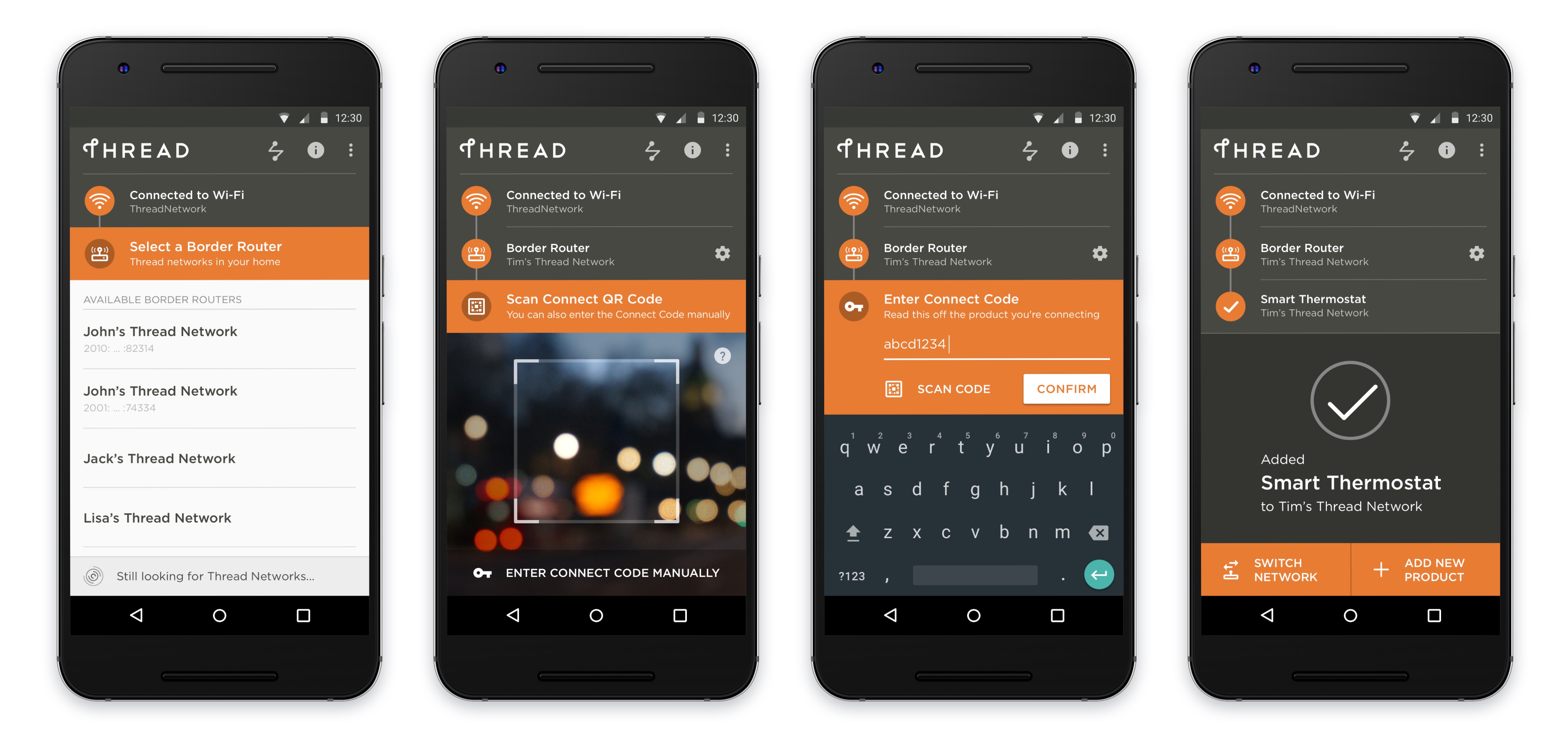
The process of adding devices is visually represented and broken down into 3 steps that users can jump back to at any time - network selection, border router connectivity, and device scanning. Users can add devices by either scanning a QR code or entering a Connection Code manually.
The process of adding devices is visually represented and broken down into 3 steps that users can jump back to at any time - network selection, border router connectivity and device scanning. Users can add devices by either scanning a QR code or entering a Connection Code manually.
The process of adding devices is visually represented and broken down into 3 steps that users can jump back to at any time - network selection, border router connectivity and device scanning. Users can add devices by either scanning a QR code or entering a Connection Code manually.
Visible Status
Visible Status
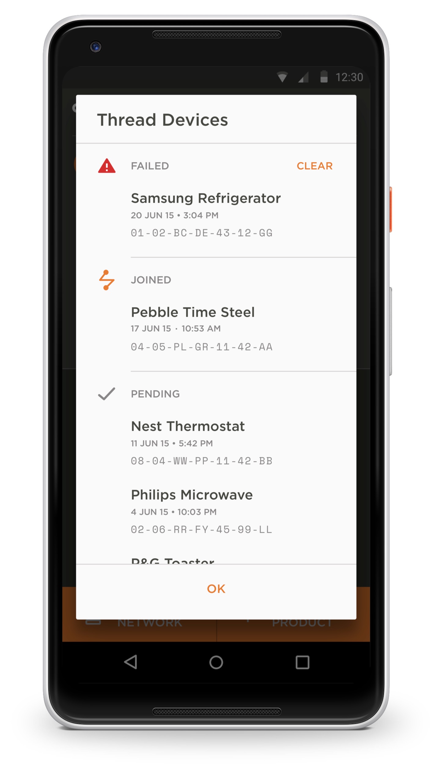
Users have quick access to the list of devices added in the past and their current status. Potential actionable errors are pushed to the top, informing users on what they should debug more closely.
Additionally, to facilitate the identification of each device, a mono-spaced font is used to label their ID.
Users have quick access to the list of devices added in the past and their current status. Potential actionable errors are brought to the top, so users can be informed on what to debug more closely.
Additionally, to facilitate the identification of each device, a mono-spaced font is used to label their ID.
Users have quick access to the list of devices added in the past and their curent status. Potential actinonable errors are brought to the top, so users can act to debug them.
Loading Delight
Loading Delight
Debugging and fixing network problems can be a frustrating task, so a custom loading animation was made, easing the waiting period and adding up to an elegant brand perception.
Debugging and fixing network problems can be a frustrating task, so a custom loading animation was made, easing the waiting period and adding to a refined brand perception.
Debugging and fixing network problems might be a frustrating task, so a custom loading animation was made, communicating its status in a refined way.
links & hobbies
links & hobbies
links & hobbies
links & hobbies
links & hobbies
Photography ∙ Playlists ∙ Films
hey, thanks for visiting
hey, thanks for visiting
hey, thanks for visiting
hey, thanks for visiting
hey, thanks for visiting
have a nice day
have a nice day
have a nice day
have a nice day
have a nice day
PIXELS POLISHED WITH ♥, BY GUI ∙ LAST UPDATED EARLY 2023
