
MUPA
Mobile UX Patterns App
OVERVIEW
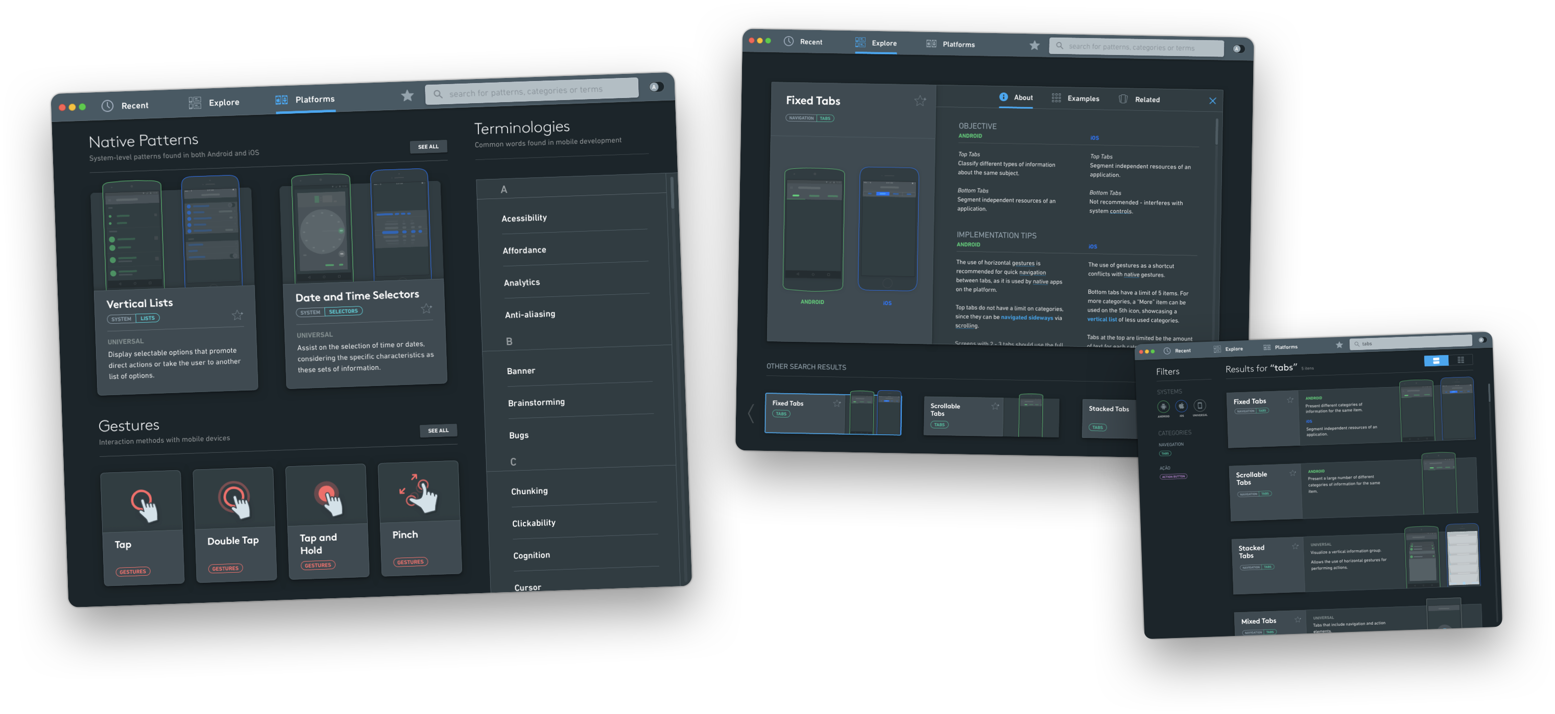
MUPA is an award-winning (2016 ApDesign Thesis Recognition Award) thesis project, a concept for a desktop application that would empower designers - both experienced and new - to learn about and build upon established mobile UX patterns in iOS and Android. Users can search, save and compare mobile UX patterns as well as access detailed information about their use cases and recommendations - considering the core concepts of interface design usability.
The origin of the project came from my own personal frustrations in getting into UX design, from a Graphic Design centric education.
OVERVIEW
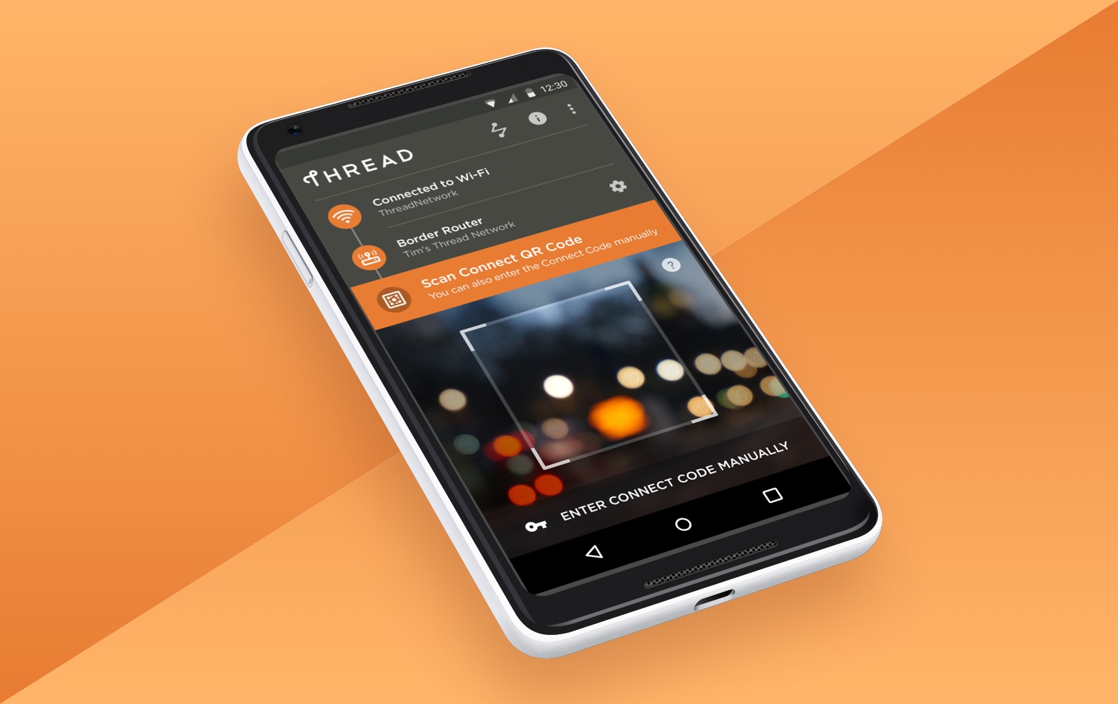
Thread Group is a not-for-profit organization responsible for market education around the Thread networking protocol. I worked on the design of their comissioning app - used for adding devices to a network for testing purposes as the technology was being developed. The focus was on streamlining technicical debugging and support.
ABOUT
macOS App, Winter 2016
ROLE
Strategy, Project Management, User Experience, User Interface
TEAM
Design - Guilherme Schmitt
Thesis Supervisor - Gabriela Perry
THE PROBLEM
Valueble Patterns of Hard Access
As the UX market gets more attention and job opportunities, new tools must emerge to assist aspiring designers in learning from the cumulative knowledge that the field has gathered over the years.
UX patterns benefit both designers and final users. Established interface paradigms can bridge the gap between the designer's intention and user's interaction with little friction. Sadly, existing tools related to this valuable asset are either too superficial (relying mostly on screenshots) or hard to digest in the middle of a workflow (I.E. in-depth design articles from Nielsen Norman Group).
FOR ASPIRING DESIGNERS
Empowering Context
Most easily accessible resources on mobile UX patterns provide a catalog approach, showcasing examples of patterns with little to no contextual information on their strengths, best uses, and weaknesses. The tool should provide users with enough relevant context to make informed design decisions, regardless of their expertise.
FOR EXPERIENCED DESIGNERS
Effective Productivity
Existing resources for UX pattern research don't provide the level of time efficiency that the current sprint development environment requires. There's an untapped need for a tool that delivers meaningful value while matching the accelerated iteration workflow that modern UX design demands.
How might we...
How might we...
bring together the vast knowledge available on user experience patterns with the conveniences of a digital tool, serving both beginners and experienced designers?
bring together the vast knowledge available on user experience patterns with the conveniences of a digital tool, serving both beginners and experienced designers?
bring together the vast knowledge available on user experience patterns with the conveniences of a digital tool, serving both beginners and experienced designers?
bring together the vast knowledge available on user experience patterns with the conveniences of a digital tool, serving both beginners and experienced designers?
bring together the vast knowledge available on user experience patterns with the conveniences of a digital tool, serving both beginners and experienced designers?
Process
Thesis Theoretical Background
The first volume of my thesis was focused on research on the scope and validating the needs and goals that the tool should address.
The first volume of my thesis was focused on research on the scope and validating the needs and goals that the tool should address.
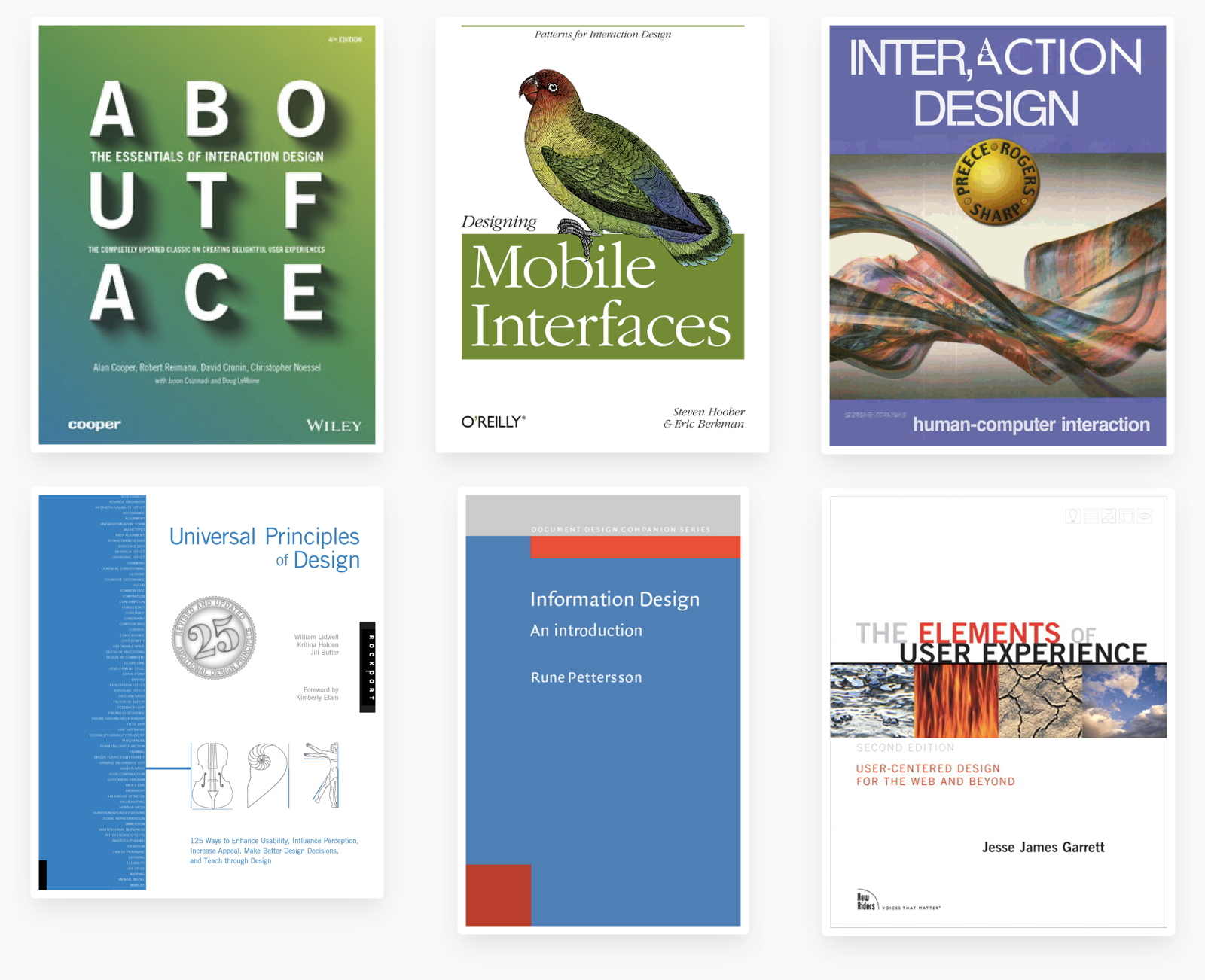
Books
About Face: The Essentials of Interaction Design
Visual interface design for digital cultural heritage: a guide to rich-prospect browsing
The Elements of User Experience: User-Centered Design for the Web and Beyond
Designing Mobile Interfaces
Conceptual models: begin by designing what to design
Universal Principles of Design
Information Design: an Introduction
In addition to the books listed above, Apple's Human Interface Guidelines and Google's Material Design guidelines were used whenever there was an official stance from either platform on how patterns should be utilized.
Pattern Selection
A subset of patterns was selected based on the most crucial structural elements that could assist aspiring UX designers, along with a subset of in-depth patterns that could assist experienced designers looking to design a cross-platform (iOS and Android) application while being mindful of unique characteristics of each system.
Structure
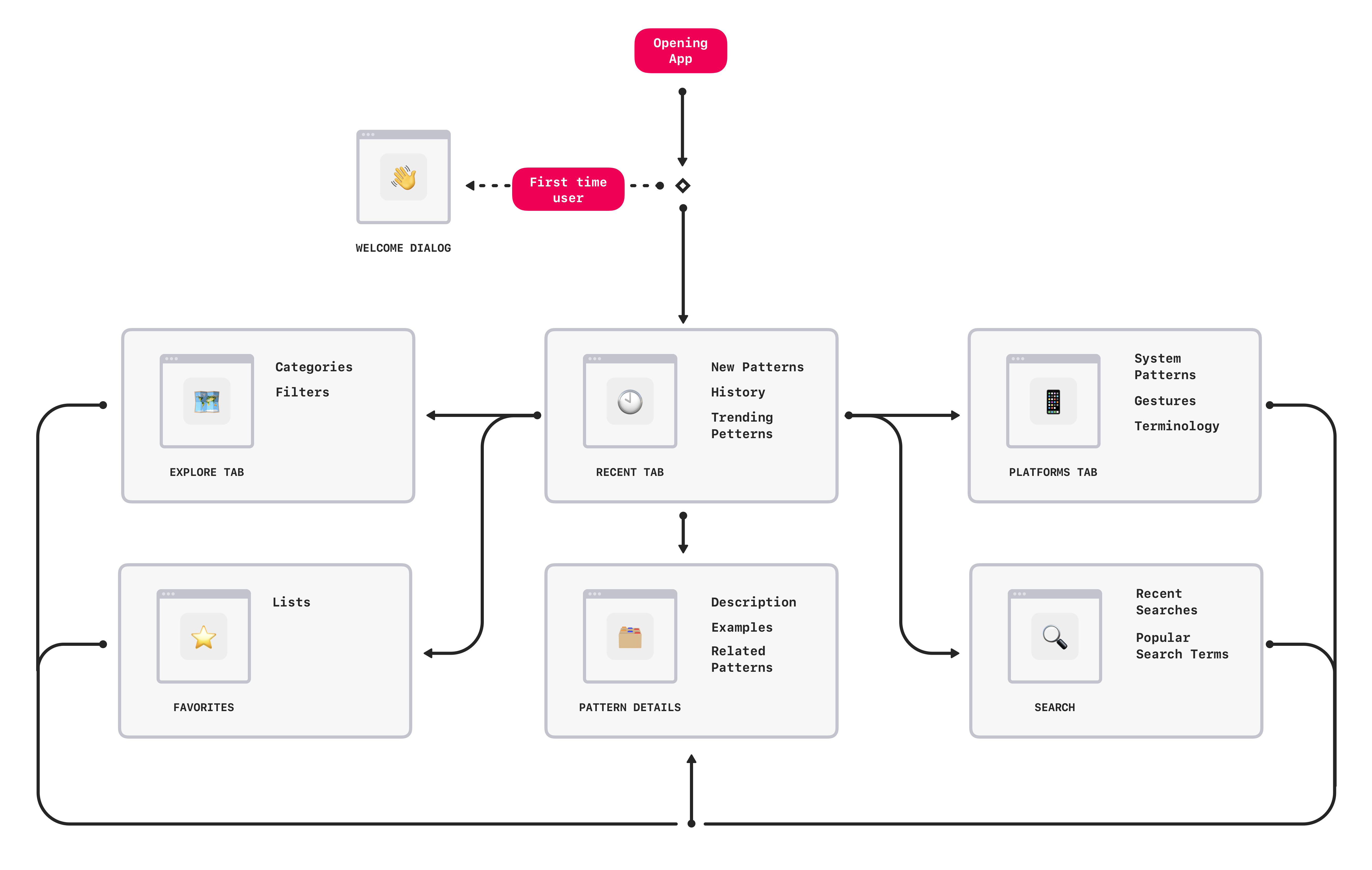
The user flow was optimized to enable users to quickly get to the content they want to access and to support users that are interested in diving deeper.
The Platforms and Explore sections create different entry points for beginners and advanced users alike.
One of my goals was to support a wide range of personas - gracefully scaling the complexity of features to assist advanced users. An example of this was the favorites features - users can easily add patterns to a collection for easy reference and comparison, useful for big projects in the initial stages of execution.
User Interviews and Initial Testing
UX designers from my college were interviewed to validate the tool's relevancy.
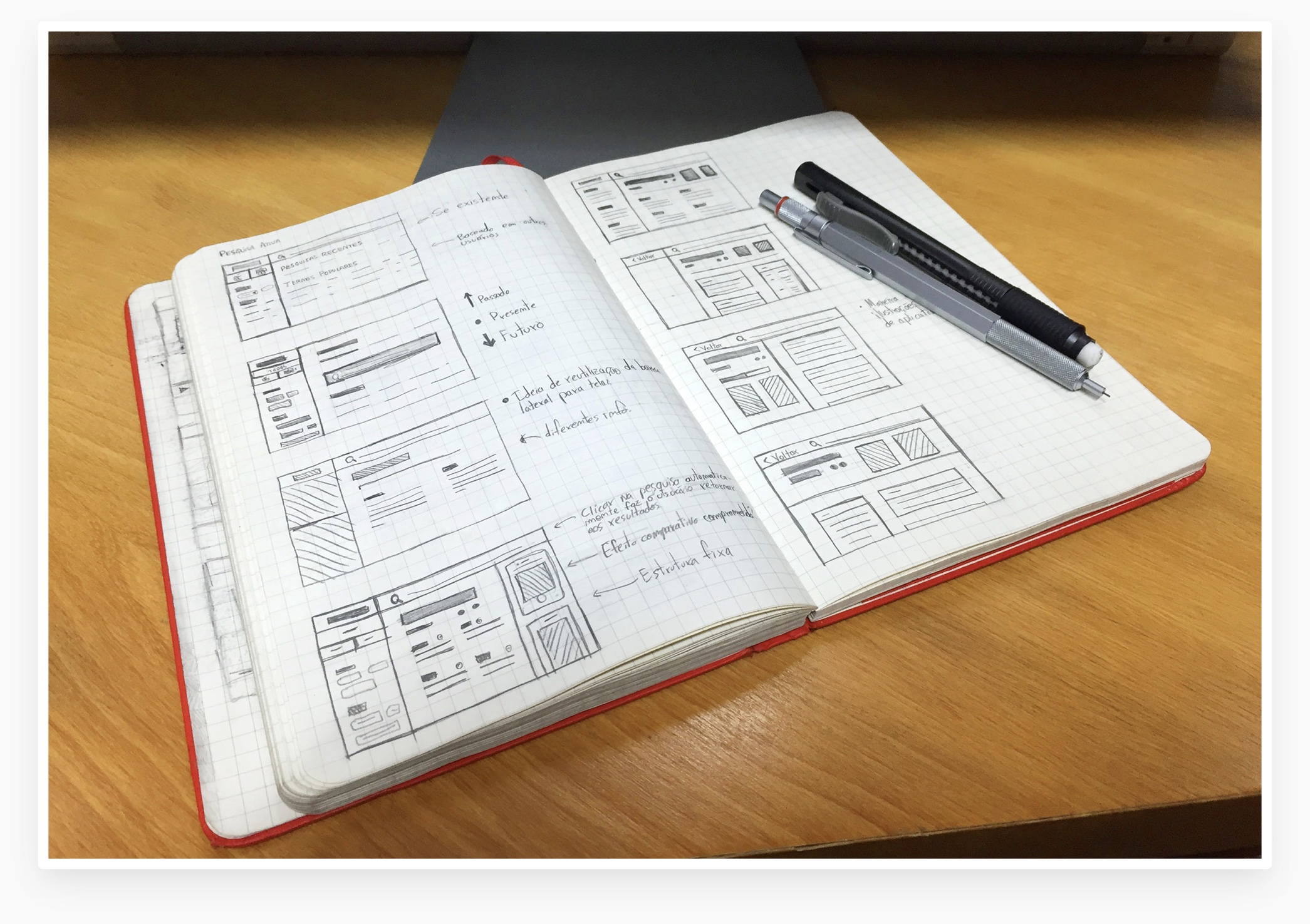
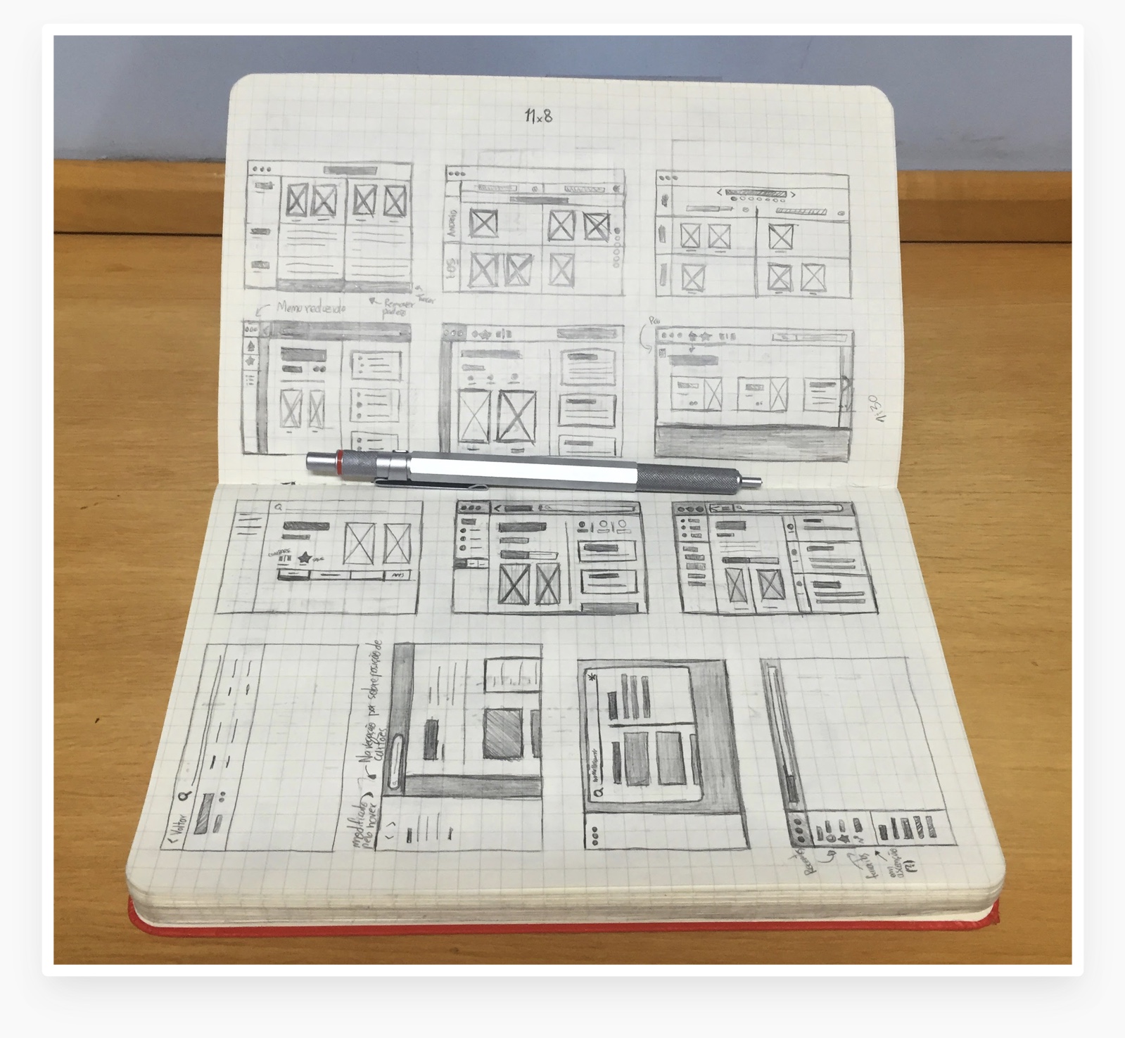
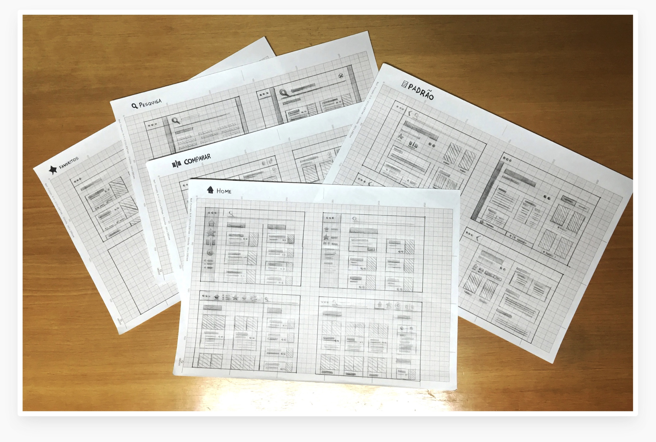
Concepts, both in sketches and structured digital wireframes form, were tested out, ensuring users understood the overall structure of the app and its value proposal.
Through frequent touchpoints with the client across the iteration period, we delivered product decks documenting each interaction, validating our approach prior to development.
Content
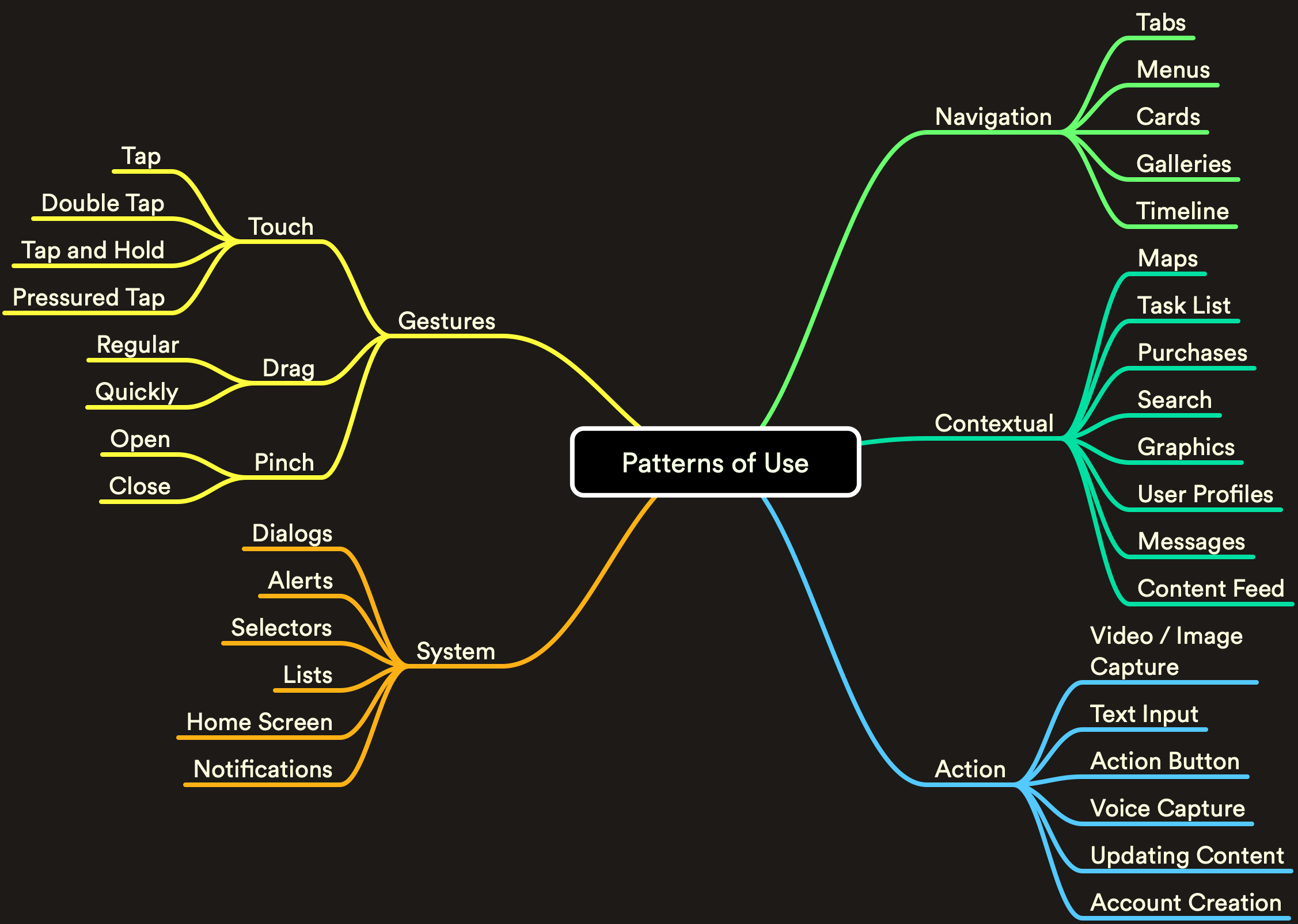
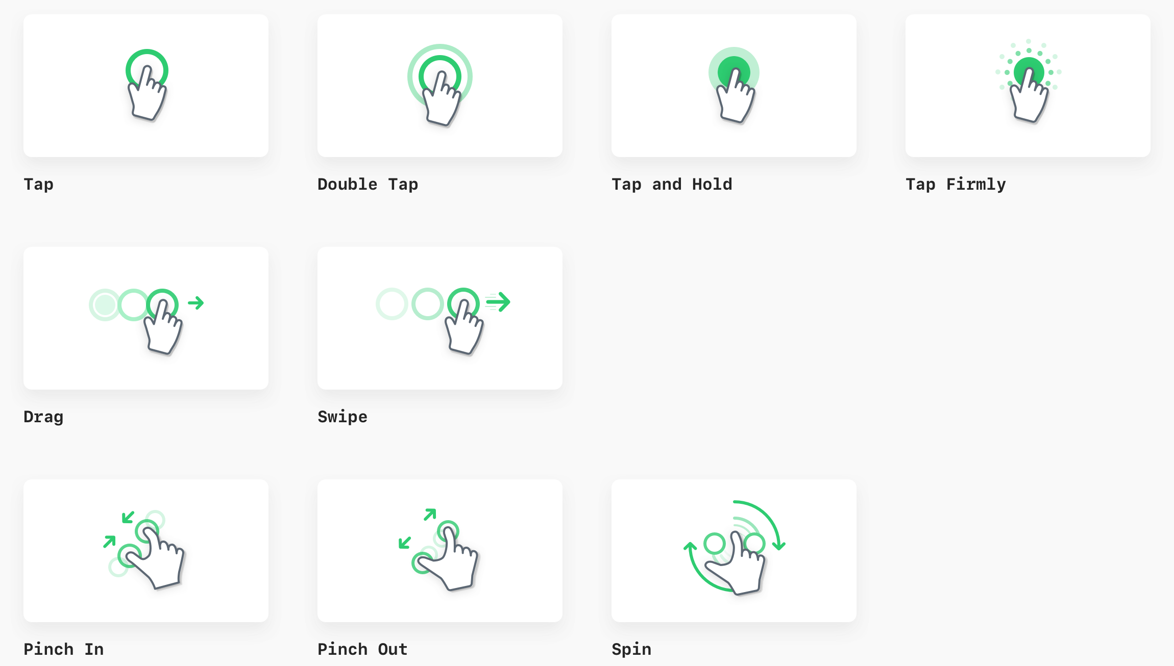
Gestures
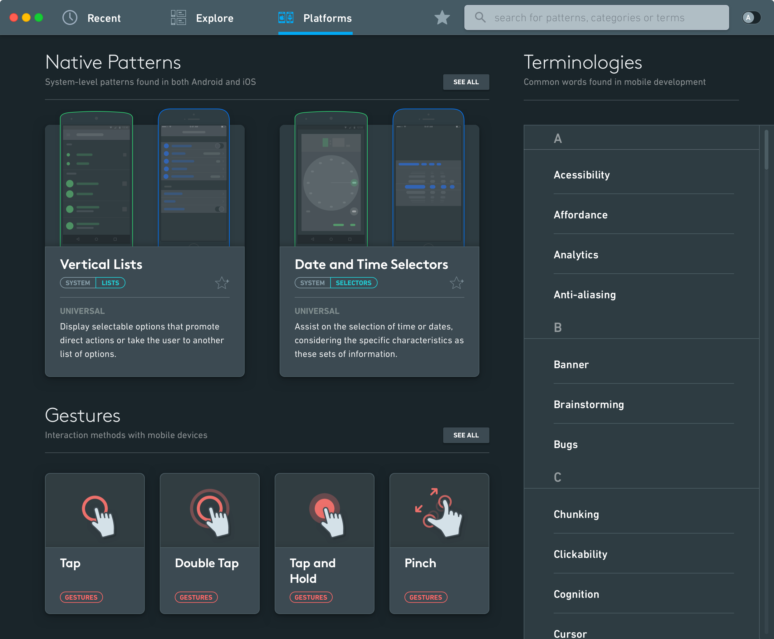
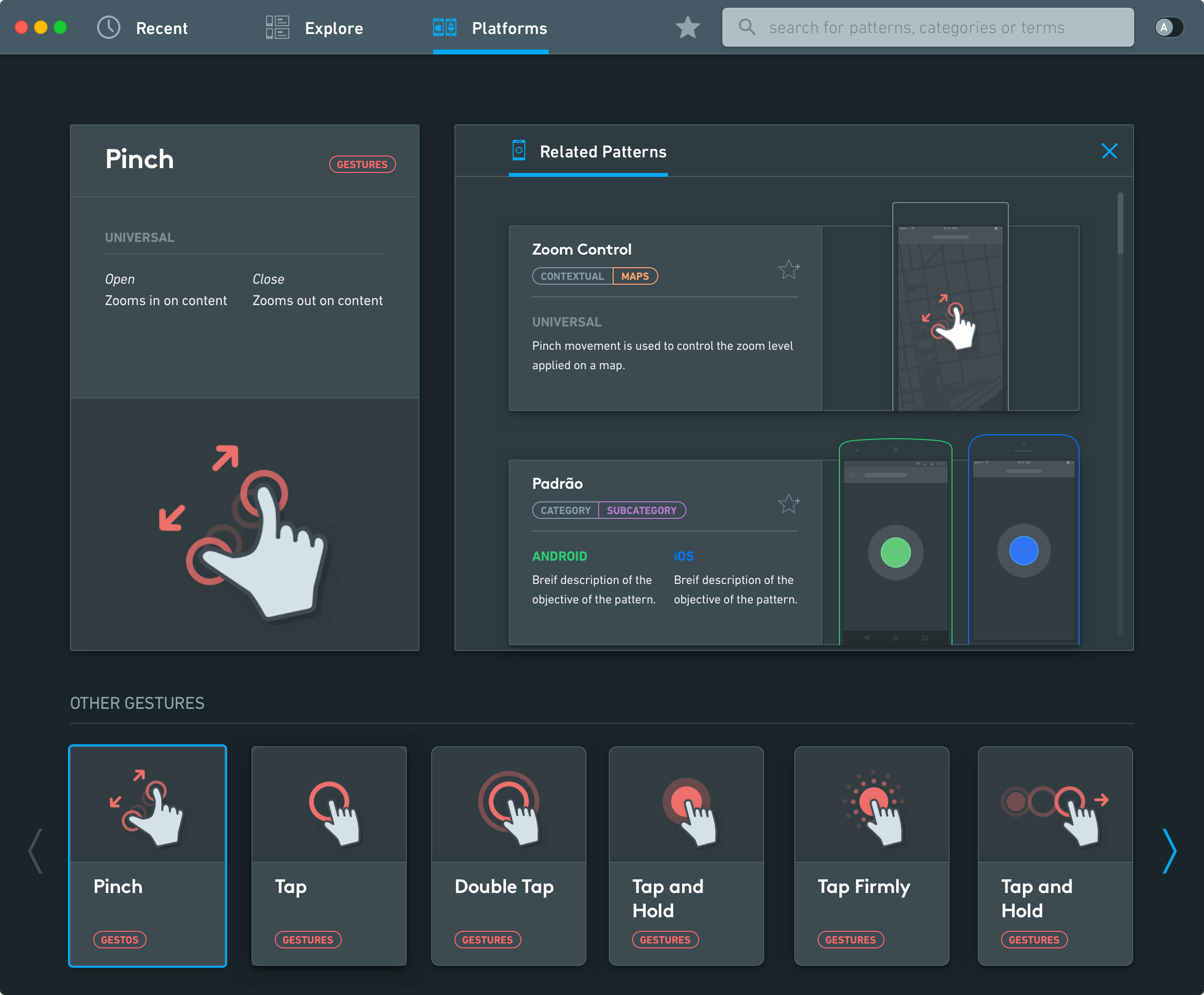
A series of abstract gestures were created to help inform users about common interaction patterns in mobile design.
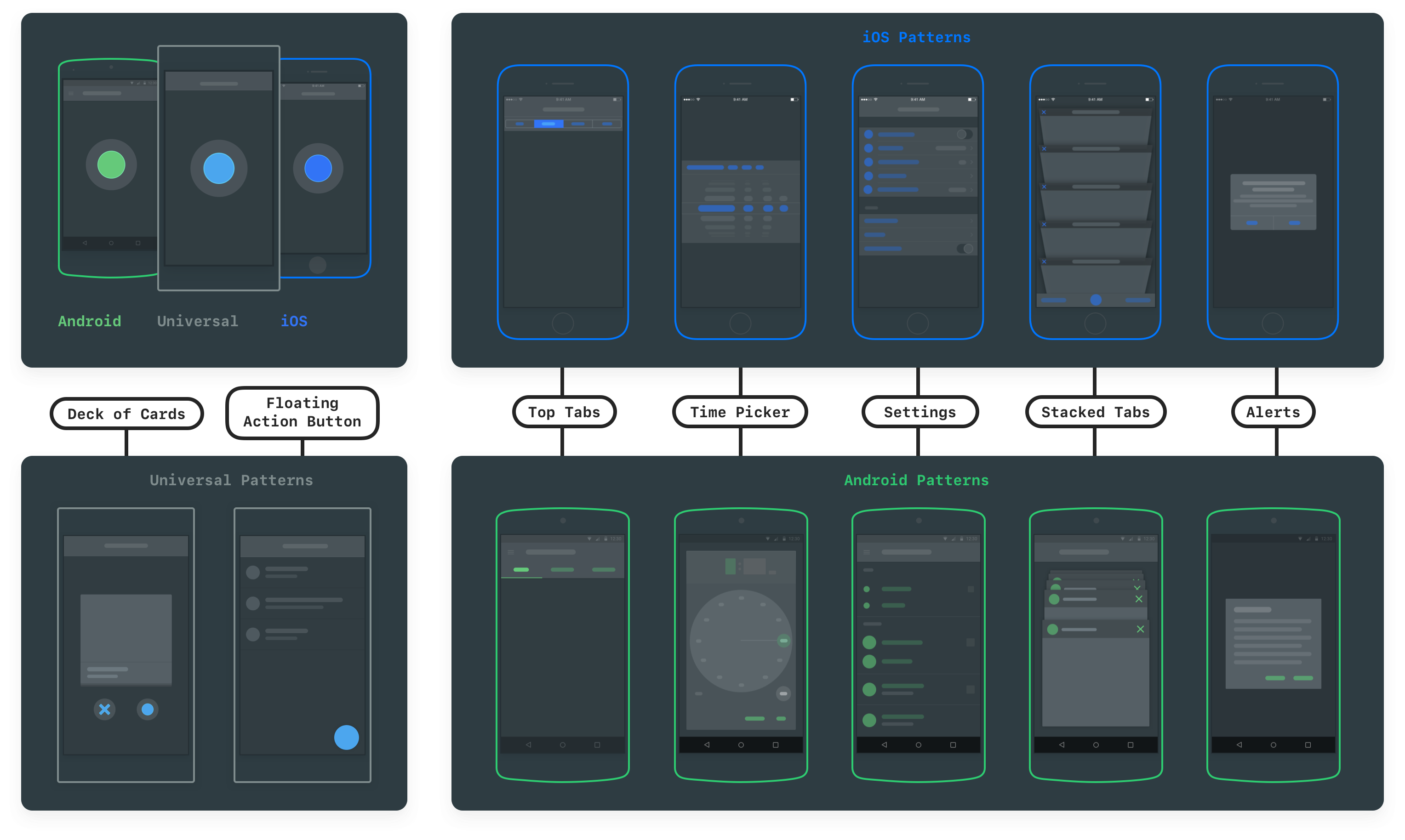
Patterns
Each mobile pattern is represented as abstract shapes.
This allows the app to bring visibility into its uses without distracting the reader on the details of the execution.
App Icon
The macOS app icon was designed to fit in with the system, using icon guidelines from Apple at the time.
ICON SKETCHES

APP ICON IN MACOS DOCK
Solution
Solution
User Guide
As part of the thesis submission, an extensive user guide was made, highlighting all the key interactions users can perform with the application. (PDF embedded below)
Onboarding
First-time users are greeted with a card carousel that explains core navigation and functionality.

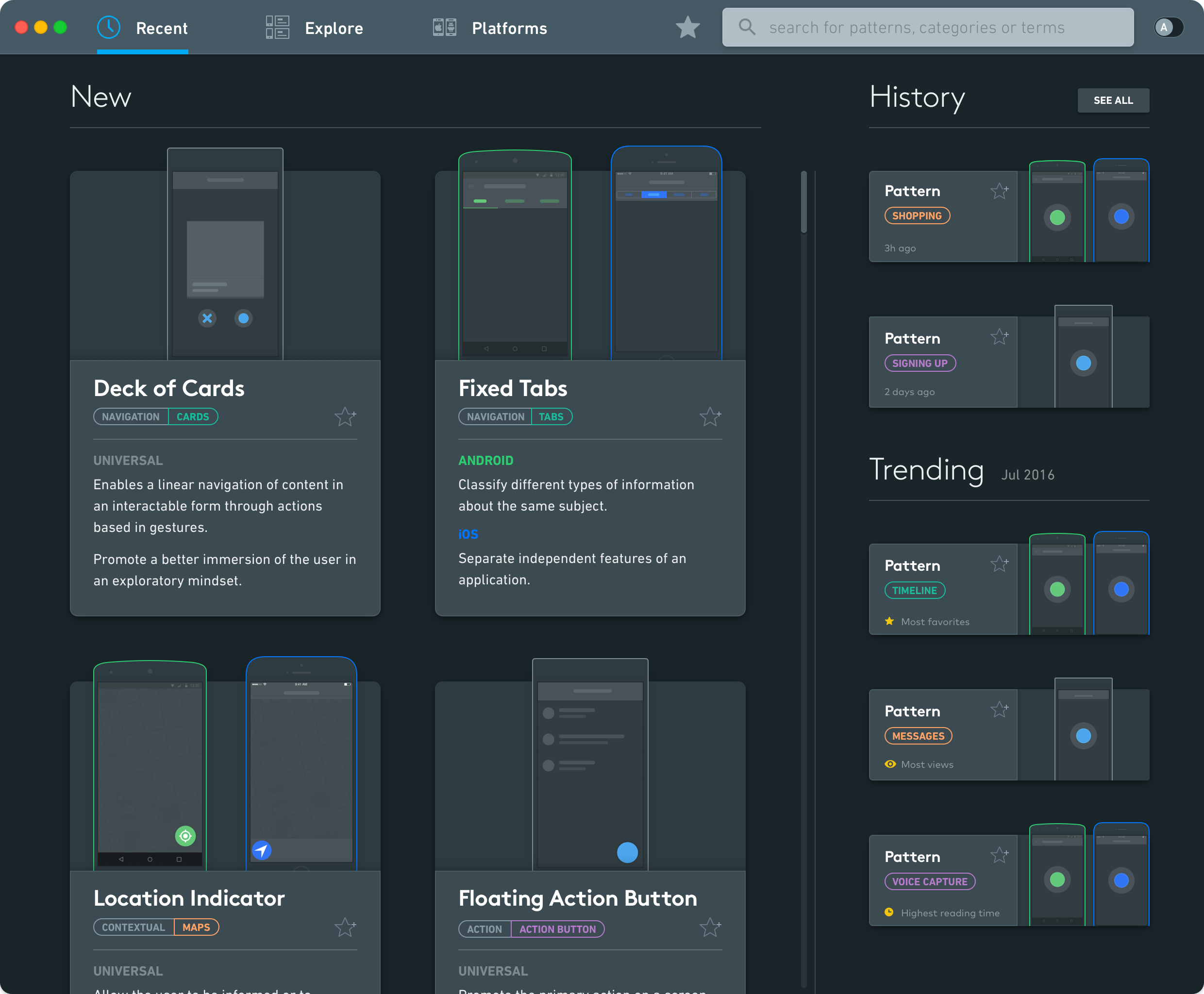
New and Trending
The "Recents" tab shows new content added to the platform. Each new pattern is presented with a summary of the pattern goal, as well as the categories they belong to.
Sidebar
The user's history is displayed, along with when it was last accessed.
Trending patterns are showcased below, according to different metrics (views, favorites, reading time).
Platforms
The Platforms section is dedicated to aspiring designers, or those just getting started to mobile design.
Here, they can learn about system-level patterns, common gestures used for interaction, and typical terms related to mobile design and user experience design.
Pattern View
Each pattern listed on the tool includes general information about its recommended usage across iOS and Android. Additionally, users can check tips on how to implement the pattern (using gestures, number of items, iconography, etc.) and other notes about what is supported on each system.
Users can check examples of apps that use the selected pattern and explore related patterns that can be used as an alternative for similar interaction goals.

Inline Learning
Throughout the app, users can hover over underlined terms to get familiar with common words used in mobile development.
Throughout the app, users can hover over underlined terms to get familiar with common words used in mobile development.
Explore and Search
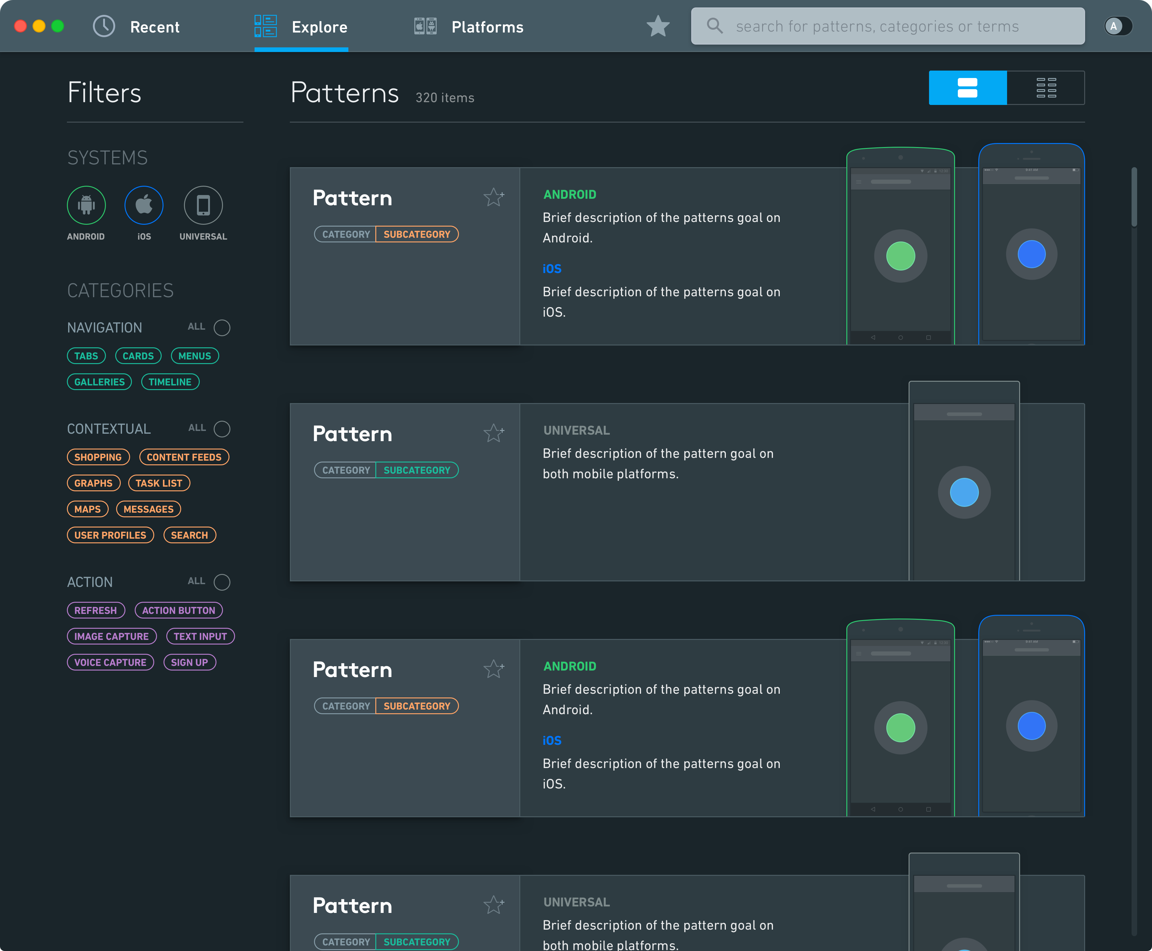
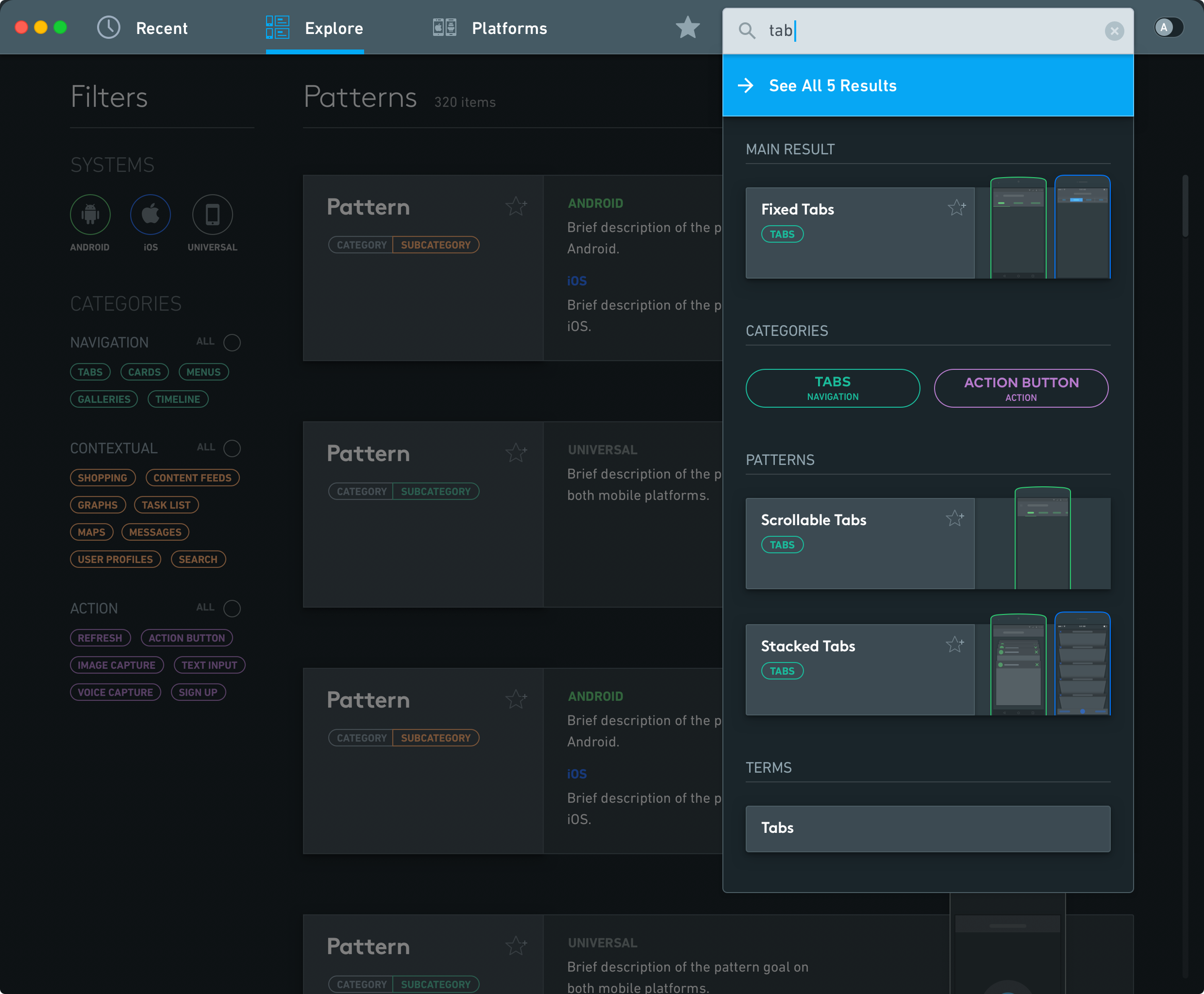
Users can use advanced filters to browse through all the content included in the app.
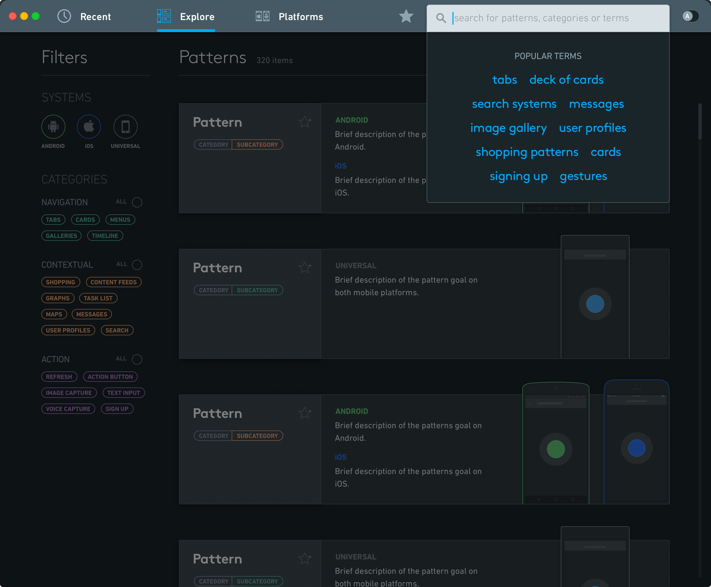
The search feature showcases popular search terms and presents results inline for less time finding, more time learning.
Feature Showcase Video
The final delivery of the thesis included a video that showcases the overall navigation and main features of the app.
(screens in Portuguese)
On a desktop, click on the content above and use keyboard arrow keys for easier navigation.
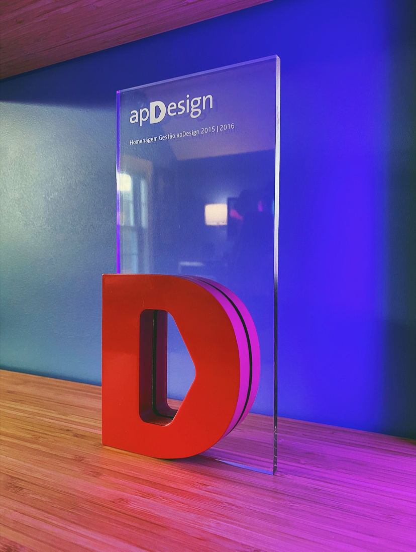
ApDesign Thesis Recognition Award
ApDesign Thesis Recognition Award
Each semester, the association of design professionals from Rio Grande do Sul honors a thesis project with a distinction award. MUPA received the 2015-16 award.
Each semester, the association of design professionals from Rio Grande do Sul honors a thesis project with a distinction award. MUPA received the 2015-16 award.
links & hobbies
links & hobbies
links & hobbies
links & hobbies
links & hobbies
Photography ∙ Playlists ∙ Films
hey, thanks for visiting
hey, thanks for visiting
hey, thanks for visiting
hey, thanks for visiting
hey, thanks for visiting
have a nice day
have a nice day
have a nice day
have a nice day
have a nice day
PIXELS POLISHED WITH ♥, BY GUI ∙ UPDATED SOMETIME AMIDST THE BLUR OF 2020-21
PIXELS POLISHED WITH ♥, BY GUI ∙ UPDATED UPDATED SOMETIME AMIDST THE BLUR OF 2020
PIXELS POLISHED WITH ♥, BY GUI ∙ UPDATED UPDATED SOMETIME AMIDST THE BLUR OF 2020
PIXELS POLISHED WITH ♥, BY GUI ∙ UPDATED SOMETIME AMIDST THE BLUR OF 2020
PIXELS POLISHED WITH ♥, BY GUI
UPDATED SOMETIME AMIDST
THE BLUR OF 2020
