ℹ️ This was originally written for Klaviyo's Medium

A matter of scale
When a company is small enough, certain aspects of your workflow are easy to get by without much thought — need a file? Just ask the other designer on the team that has been here since the beginning. Going to create a new project? Cool — just take a stab at it on a file in your computer and make sure you save it to the shared drive afterward.
But as you grow, processes need to be scale too — that original designer just can't be answering the same questions every single time. Introducing — documentation and workflows!
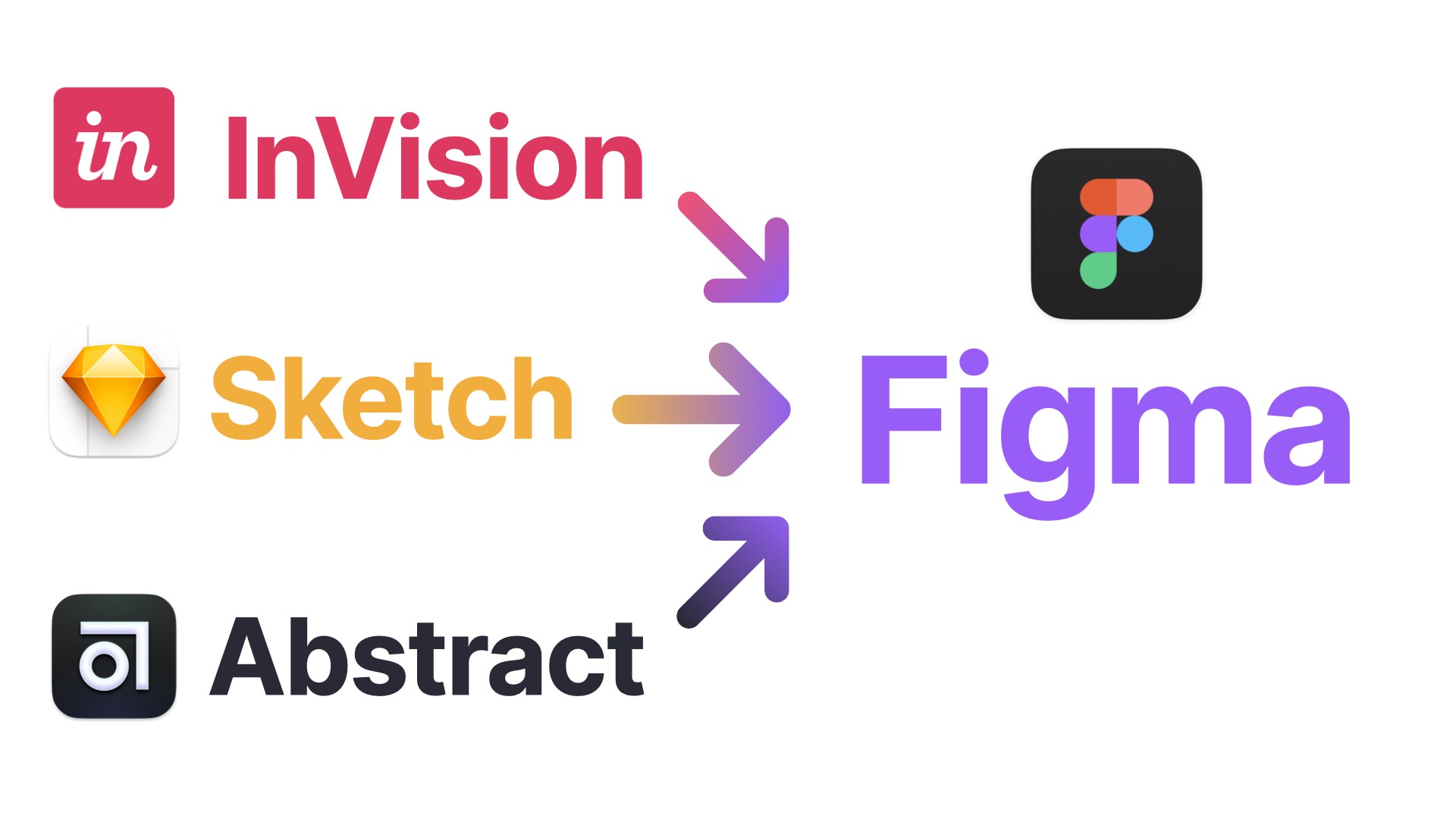
Two years ago, Klaviyo’s design team went through its first considerable workflow shift by incorporating Abstract into our process. Abstract allowed us to guarantee that designs were not only easy to find but also easy to manage versions —no longer did people have to ask "Is this the latest one?” for every file in the drive.
However, version control only goes so far in helping designers work with each other. For Sketch, other third-party tools like InVision helped bridge that gap. Want to get some feedback? Put together a quick InVision prototype or just upload some screens so people can take a look. It was a little bit of extra effort but worked fine for a while.
As the team grew, these little inefficiencies in communicating your ideas multiplied with each new member of the team. We needed to revisit our workflow once again.
There’s no decision more disruptive to your productivity than changing the tools you use to get things done. Figma was worth all the disruption.
Tool unification and the future of work
Moving to a web-based platform like Figma meant we could more easily integrate our designs with other web-based platforms. Documentation in places like Confluence and Notion could always have up-to-date designs embedded right on the page.
Doing so would unlock two key benefits: increased efficiency (no more updating things manually) and better clarity of communication (one click away from opening the full, editable file).
At the end of the day, designs represent ideas, not the real product. To have that representation be as flexible and devoid of maintenance is the best way to ensure we can be on the same page and make decisions faster.’’
See the workflow contrast of getting a prototype available for a quick feedback session and handing off files to engineers:
In Figma:
- Build a prototype directly in Figma.
- Embed a link to a prototype or Frame to a Confluence/Notion document.
- Organize your Figma file to guide developers during handoff.
- Receive comments in the context of the design itself.
- Address comments and resolve them directly on the design. Everything is up to date!
Compare it to InVision’s workflow:
- Make sure your artboard names have not changed when you iterated new ideas. (new artboard name = new content sent to the InVision)
- Select the artboards you’d like to update. (can only do the ones on your current page)
- After sync, check if InVision updated existing artboards or, for whatever reason, created brand new versions on the site.
- Build your prototypes using InVision’s prototyping tools.
- Create sections in InVision to help with developer handoff.
- Receive comments on InVision’s site, check what frames it relates to in Sketch.
- Address comments on Sketch and repeat all these steps.
Figma is better than Sketch + InVision + Abstract not because of the multiplayer editing feature (although that is pretty cool), but because it removes all layers of abstraction throughout the workflow.
A Figma screen is always the underlying real, editable design regardless of how the user is experiencing it.
Looking for references
Not a lot of companies share publicly how they organize their work, especially at mid/large sizes. Some exceptions to the rule:
- Spotify’s ways of working — a good example of a scalable model, with emphasis on discoverability and sustainability.
- Dropbox’s design tooling at scale — their Sticker Sheet approach makes iterations faster by peeling away complexity and making sure the most popular components are easy to find and use.
Figma teams
Each product area (a navigation item in Klaviyo) got assigned a “Team” on Figma, but with some grouping optimizations that we plan to introduce to our navigation sometime in the future:
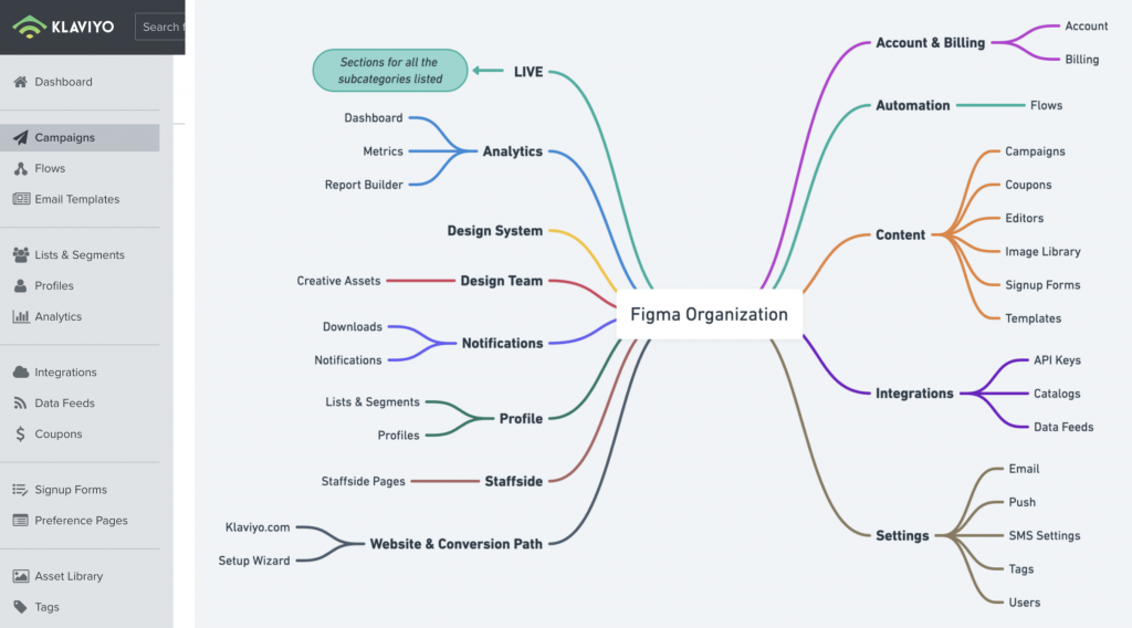
Some horizontal initiatives like Design Team assets and Design System components got their own teams as well.
Mapping out workflow strategies
The lack of dedicated versioning control forced us to rethink how to balance between making sure changes can be tracked and not bogging down the creative process with too much overhead.
We started with some key goals of what our workflow should enable:
- Finding work and iterations that help build it should be seamless;
- Designers should have a way to be aware of other designers working in similar areas, increasing serendipity;
- Ideation should be as frictionless as possible, with more deliberate organizing happening as more stakeholders get access to a file.
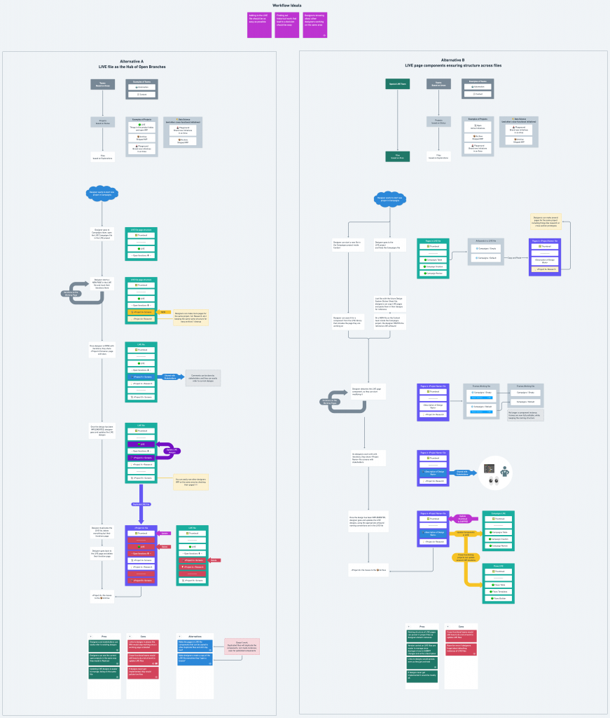
With those ideas in mind, we made a flowchart to list out some of the key steps a designer would take when trying to start work on a new feature in an existing area. Laying out steps visually helped us decide where the cost of friction was worth paying:
Option A — LIVE (Source of Truth) file replicating the concept of "open Abstract branches"
On this workflow, designers work directly on "Source of truth" files, but on different pages for each project/iteration.
After a project is complete, the designer can copy their changes over to the LIVE page, duplicate the file to archive iterations separately, and delete the iteration page on the LIVE file to keep things tidy. This basically also mirrors the work Abstract would previously do for us on Sketch, but not as automated.
Pros:
✅ Designers and stakeholders can easily refer to existing designs in the same file;
✅ Designers can see the currently open projects, in the same way, they were used to in Abstract;
✅ Being all on the same file, easier to update the reference work after something gets shipped.
Cons:
❌ Links to designs in places like Wiki would stop working since the original working page was deleted;
❌ Figma files have a size limit (based on the number of layers). This process could become unsustainable;
❌ If designs got into implementation limbo, they would be around LIVE files indefinitely;
❌ Deleting and duplicating pages of files can be prone to error and data loss (yes, Figma backs up everything on version history, but the retrieval of old versions is not straightforward).
❌ Teams that work on horizontal areas (Data Science) would need to work on different files if they are adding a feature that exists in more than one area.
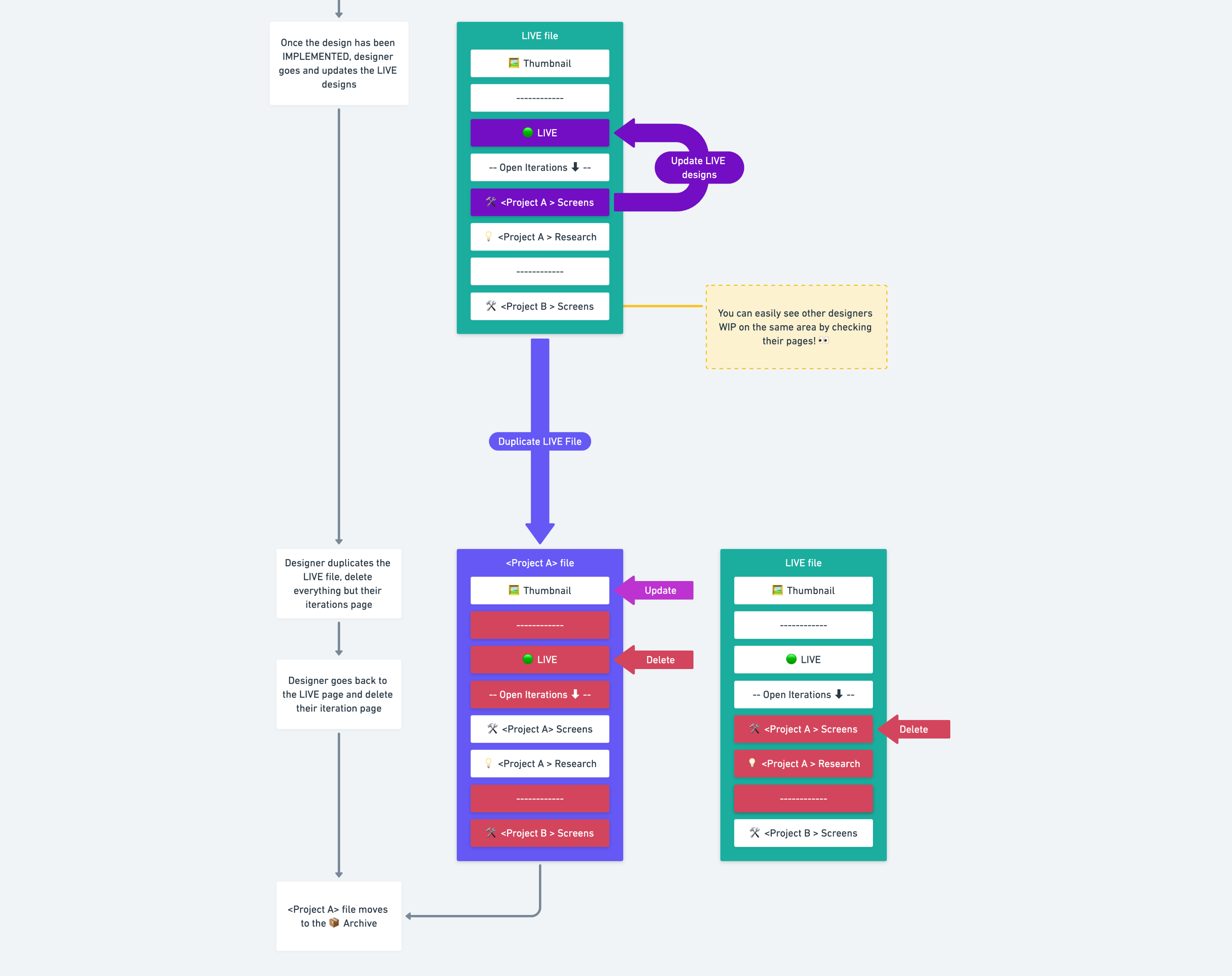
Option B — LIVE (Source of Truth) files assist the beginning and end of a project, with iterations happening independently elsewhere
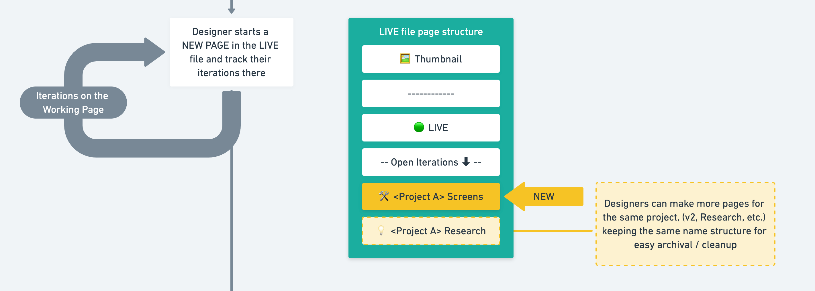
On this workflow, LIVE/source of truth screens are turned into components, enabling designers to reference work from separate working files, one for each project/iteration.
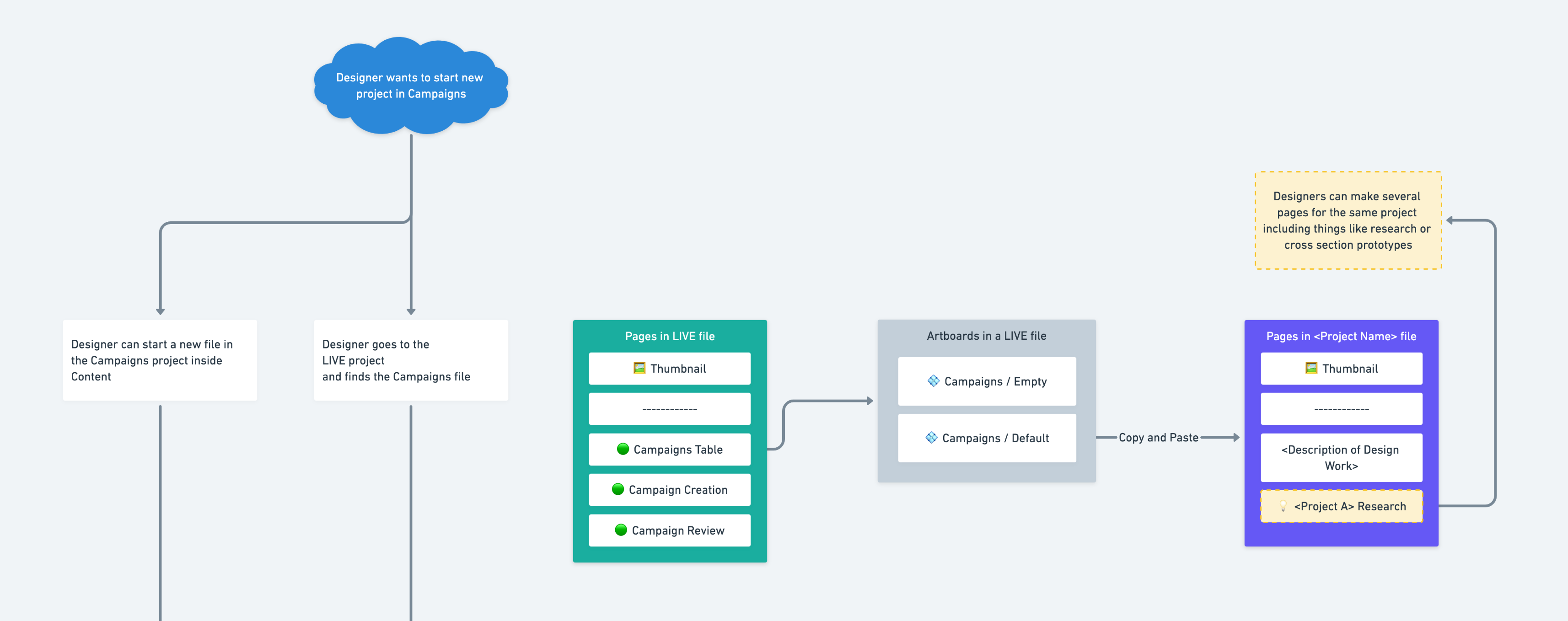
Detaching the source of truth components in the working files keeps the name structure (great to keep designers mindful of the naming conventions)

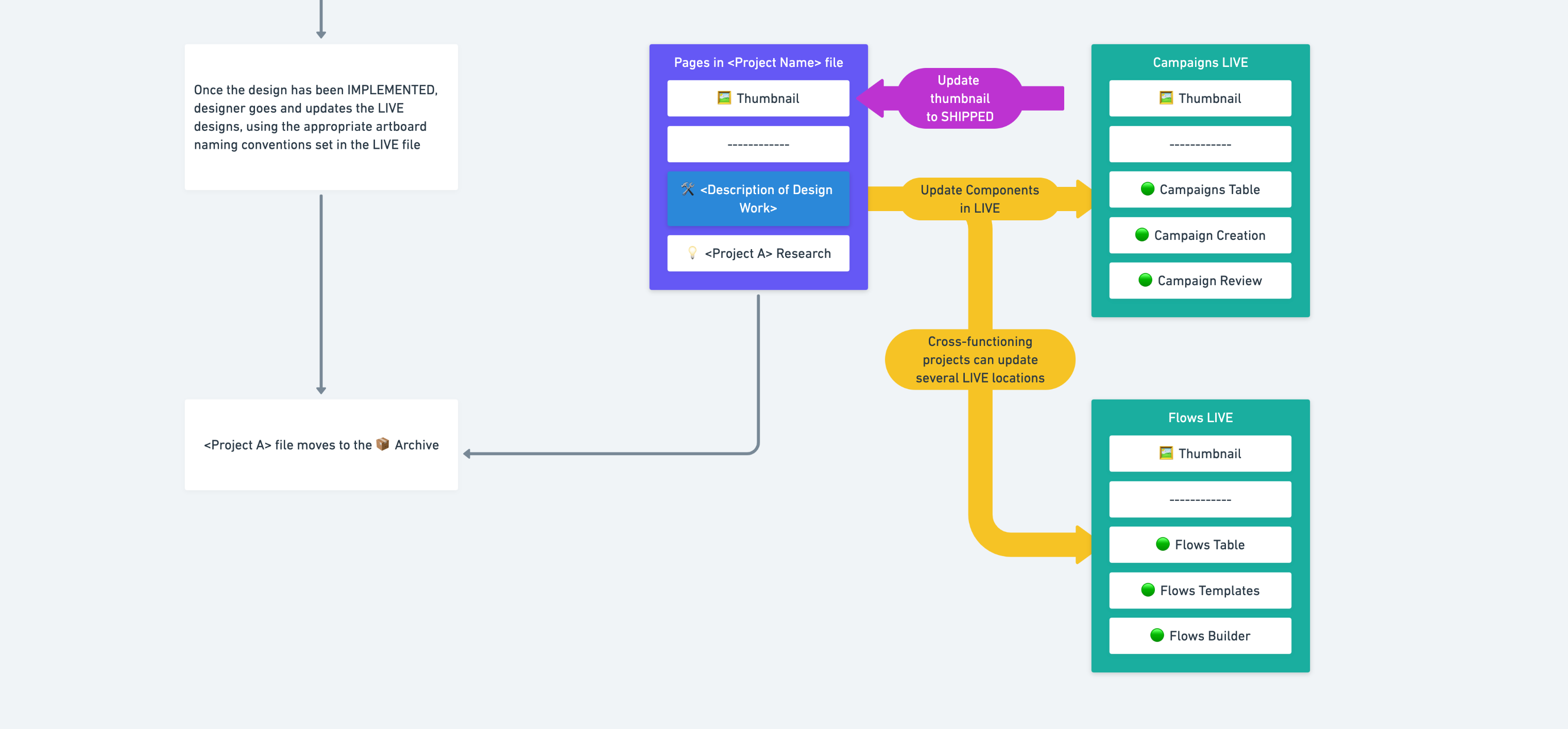
After work gets shipped, the designer goes back to the live / source of truth file and updates the components in there, making sure everyone else can have access to it to the cycle can repeat for new design work.
Pros:
✅ Easier to store iterations over the long run, with all changes on file history and external links preserved
✅ Working files with fewer pages, being faster overall
✅ Less moving parts at the end of the project (no duplication of files/cleanup), meaning fewer chances of data loss due to error.
Cons:
❌ Reduced visibility into what other designers are doing
❌ Adding designs to the library after they get shipped might leave reference designs outdated if the designer forgets about it.
After presenting these two workflow strategies, we got feedback from the team and decided to go with Option B.
Where friction makes sense
Option B won since the “friction budget” was streamlined as one main ask for all designers: whenever something gets added to the product, make sure the corresponding LIVE file is up to date with your design.
That way, designers are free to iterate on their working files without being bogged down by process, and somebody trying to quickly iterate on an idea can have a clear place to go to check the latest and greatest.
We opted to keep LIVE files as libraries for two reasons:
- Anyone can easily search directly from their file for a screen name and bring it to their design for quick iterations. This method also keeps the naming structure visible to designers while they work.
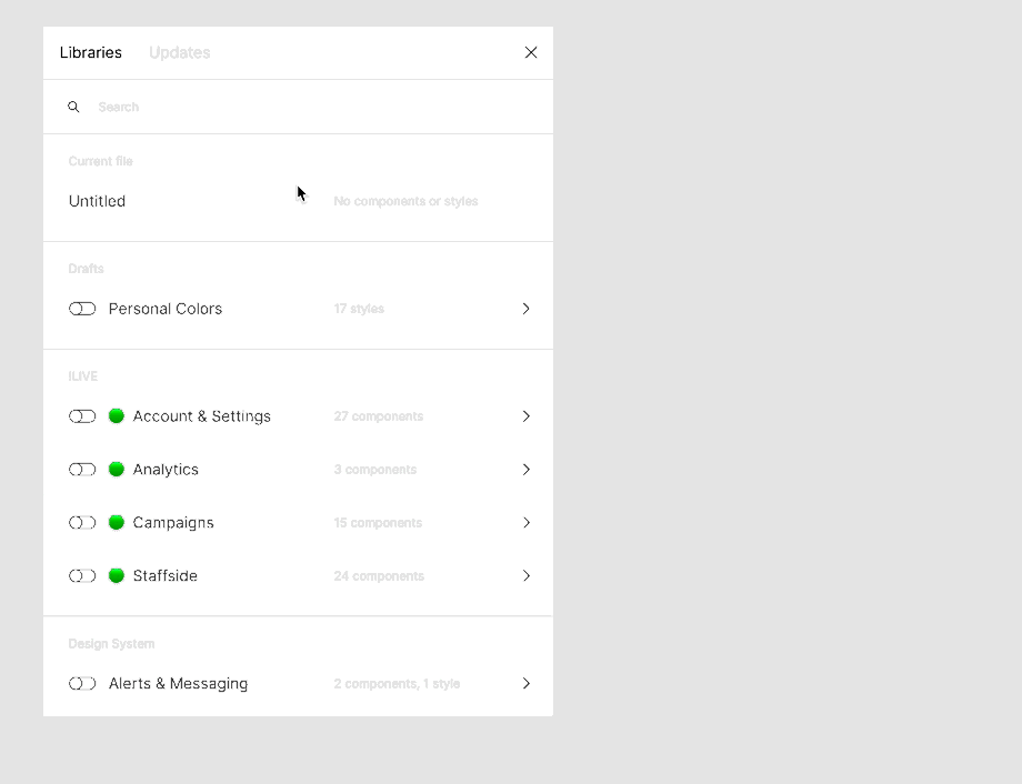
- Editing library files on Figma presents a similar workflow to Abstract — changes are not “real” until you decide to publish/commit a change. This helps with versioning — every Publish action includes a new named saved state on the file’s history, facilitating backtracking.
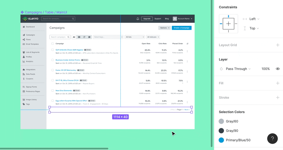
Figma's handling of library changes (with an alert at the bottom of the screen) reminds designers about being mindful of editing these special screens.
On the Design System planning side, a lot more companies have shared how they organize frames and layers, name their components, and create different files for different categories. Resources like the Design Systems for Figma were great to assess the state of the art of file organization. You can even get meta and check how the Figma uses Figma to design for Figma!
We adopted the Dropbox Sticker Sheet strategy and made our own, giving designers another avenue to quickly access components. This also allowed designers to be exposed to additions to the component library and have direct links to component guidelines and the equivalent version of the component implemented by Engineering.
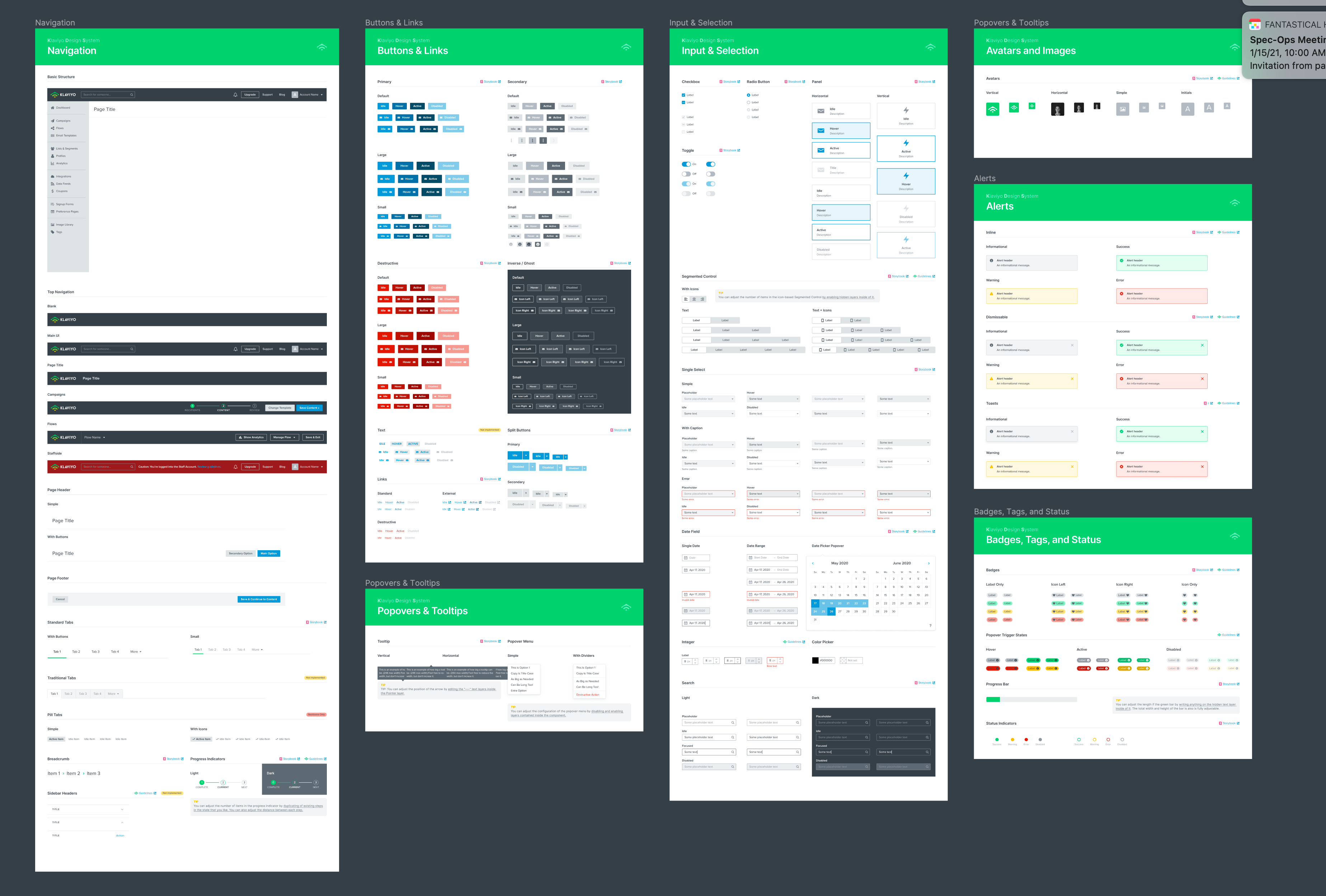
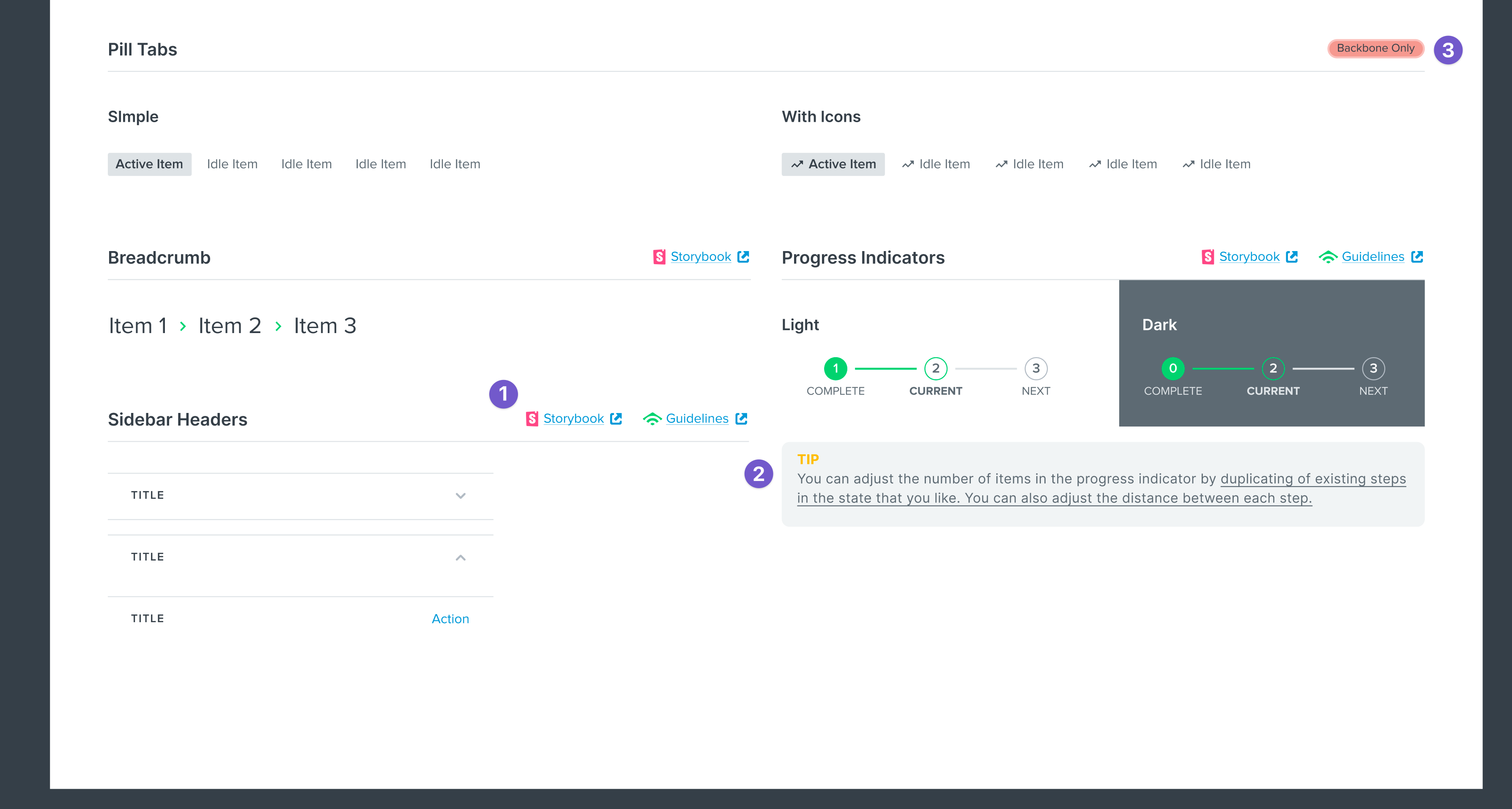
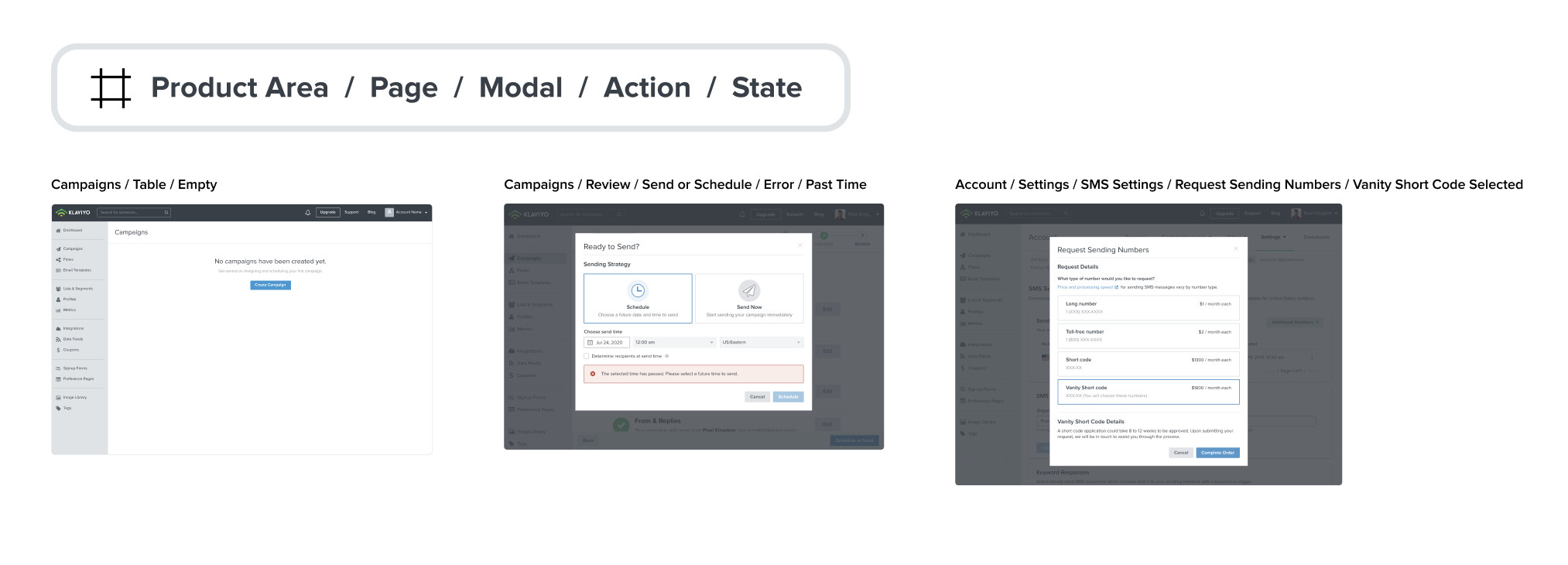
We optimized naming our screens for familiarity and findability by applying the principles of the atomic model. Our naming structure goes from the most general to the most specific.
Handing off with confidence
InVision and Abstract were also used as the official way designers provided design specifications to Engineering. Figma was able to cover that task really well with their Inspect feature.
However, Figma's flexibility also opened the door to a new problem: there's no inherent standardization for Engineering to find designs and for designers to provide additional documentation about them.
Just like how people make things tidy at their home before having visitors, designers needed to put some work into organizing their design files so that all stakeholders can be on the same page about how screens are connected, and all aspects of their behavior.
Again, we looked at what other people are doing in this area. We found a great video and reference file from Uber Eats designer Femke van Schoonhoven:
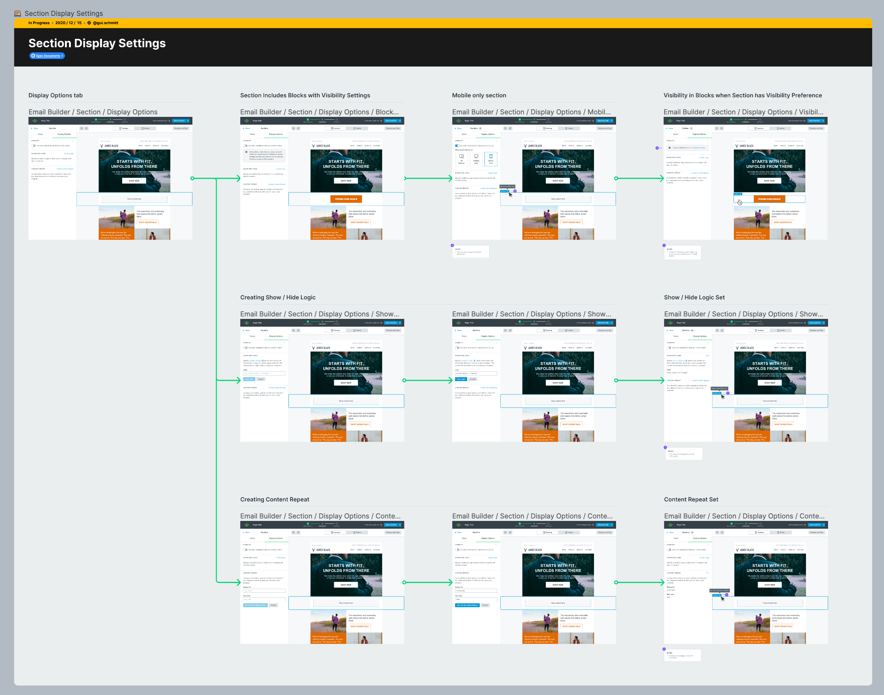
Inspired by some elements of the video above, we created a series of components that designers could use to go into additional detail about any aspect of a given design — a Handoff Kit!

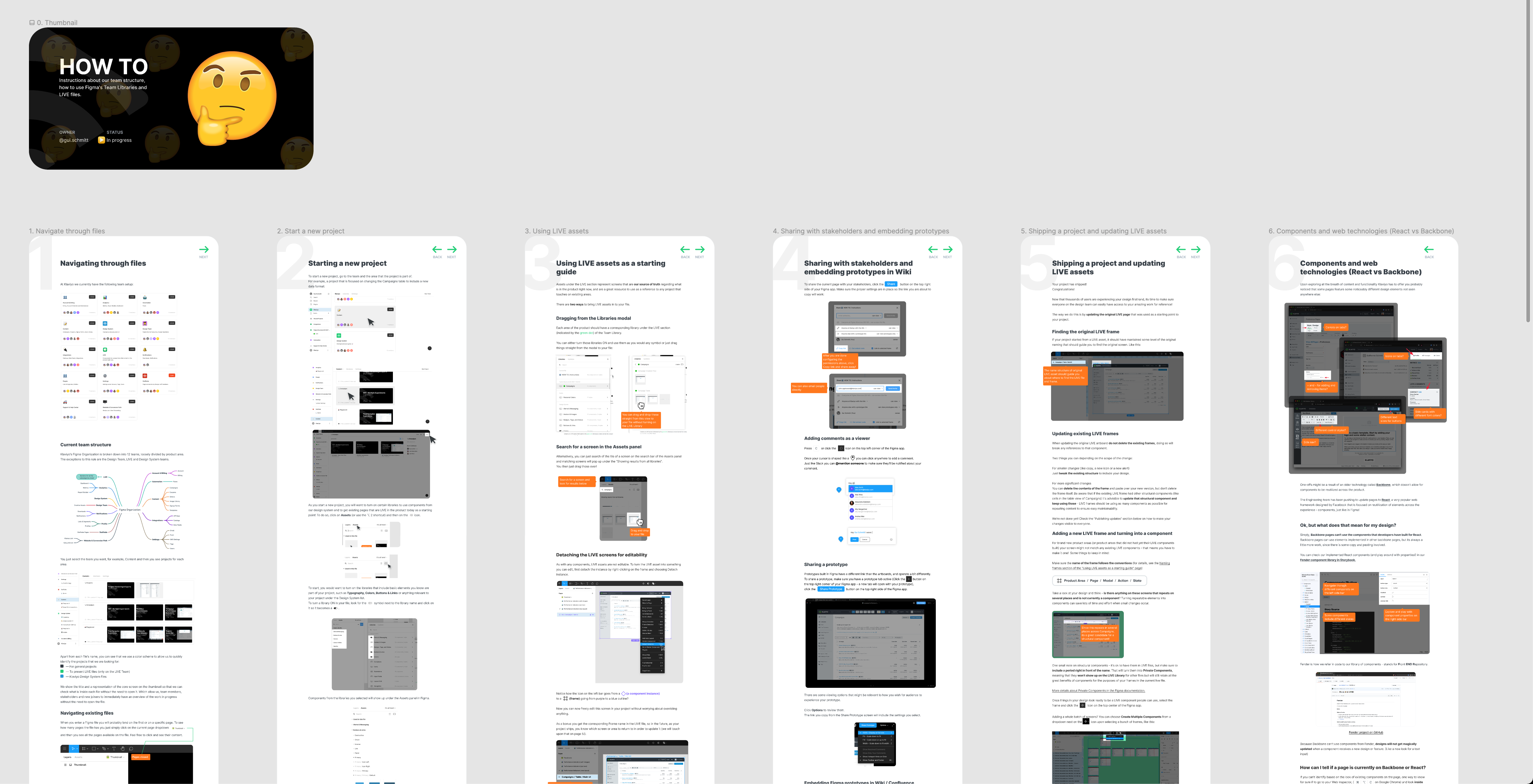
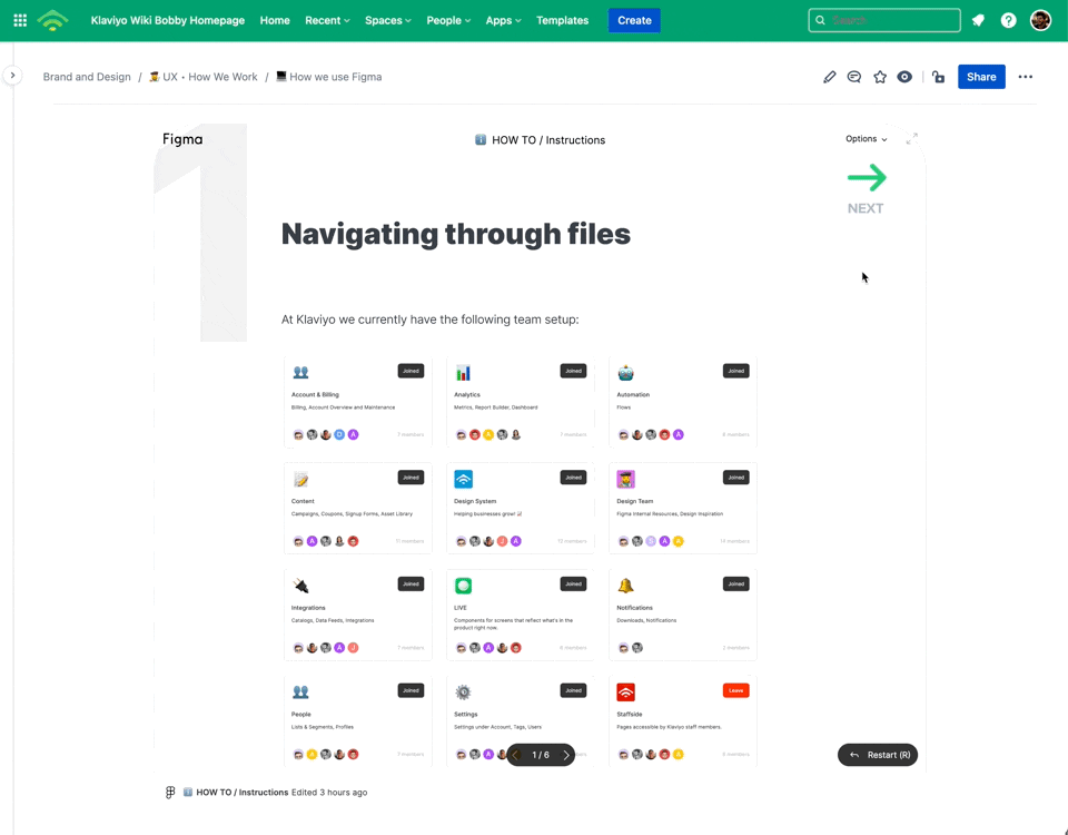
To communicate how our process works and to help onboard new hires to our workflow, we created a comprehensive How-To guide (made directly in Figma, but embedded in places like Confluence).
Rolling it out
For data migration, we allocated some time to migrate each of the 3 tools we were using before (InVision, Abstract, and Sketch) and shared details about how the transition would play out on a Wiki / Confluence page.
To avoid moving too many things at once, we put a buffer of 1 month between each tool’s data being archived and exported to a team Google Drive.
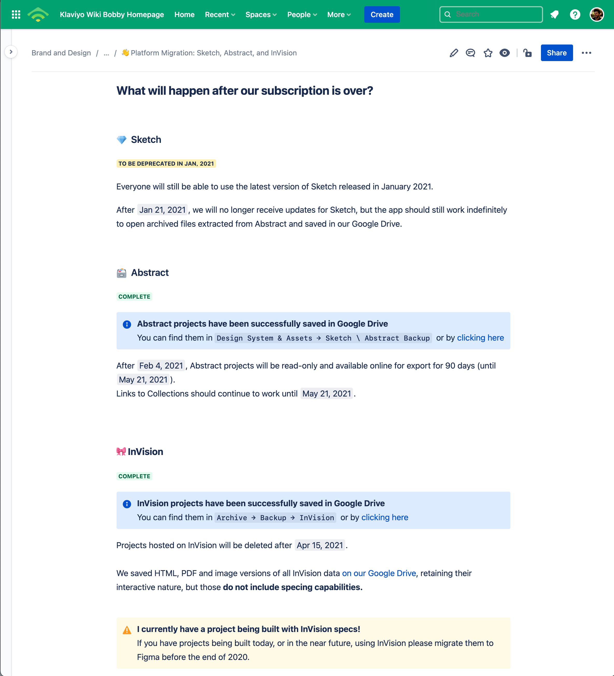
We put reminders on calendars and sent messages on Slack on the week when a tool was assigned to be deprecated.
A solid foundation
Our workflow has been live for a couple of months now, and so far, it seems to be well received by both members of our design team and stakeholders witnessing our improvements for handoff.
As with any other design endeavor, it's an ever-changing process — adapting and bending to better solve each problem, so we expect more changes in the future.
In a year with major disturbances in all matters of life, tackling our workflow was a disruption worth taking — we are now set to iterate faster while keeping ideas organized for future reference.
Finally, our design workflow can be as integrated and seamless as we aspire our product to be.
Special thanks to Zack Breakstone for helping with Figma documentation, organization, and moving many of our Sketch symbols to Figma components. 🙏
No Comments.