ℹ️ This was originally written for Klaviyo's Medium
The journey beyond email
From the start, Klaviyo set out on a mission to help businesses grow by building stronger connections with their customers. We also believe in making data science accessible to everyone, empowering businesses of all sizes to send the most relevant messages to their audience at the right time. And while it all started with email, back in 2012, we are now expanding to a new frontier of direct, personal communication for marketers and customers everywhere: SMS messages.
After a year of research, design, and development, SMS and MMS messaging features are now available to all Klaviyo customers. We’re excited to hear stories about businesses connecting with their audience in a more personal level using SMS messages and have some exciting features in our roadmap.
Building for a new communication channel was not the simplest of tasks, and in this article, I’m going to be sharing some of the challenges and learnings that we faced throughout this journey.
The Simplification and Sophistication Pendulum
All ideas start simple.
In design, pure, focused products can have an appeal of its own with multiple popular success stories. Naturally, as users’ needs become more sophisticated, ideas get complicated, and products start to satisfy increasingly specific needs that detract from that original appeal — the simplicity and ease of use that was once so inviting is now lost.
While your existing users are happy, new ones get harder to acquire — customer support gets overwhelmed with requests, and custom onboarding starts to play a role.

Sophistication was always a part of Klaviyo’s DNA — enabling users to configure automations, managing message customization at scale, providing data science recommendations on how certain times of day are better to send a message than others. While customer needs were always our north star in everything we built — naturally our complexity pendulum has swung to the right.
In that environment, how do you expand a product offering and still ensure everyone’s onboard? How can you make sure users won’t be turned away by the newly added complexity of managing a whole new way of communicating? How do you keep the pendulum from going further to the complexity side?
The answer, we found, was to leverage the accumulated knowledge users accrued by using our platform, and find opportunities to simplify existing workflows that could push other areas to revamp their powerful but complex status quo. It was time for the pendulum to swing back.
Understanding SMS
We set ourselves off by understanding the technology and what people are looking to do with SMS in an eCommerce scenario. SMS features more strictly enforced regulations around what, when, and how a business can send messages to an individual. Each country imposes its own rules, some more strict than others. In the United States, the TCPA (Telephone Consumer Protection Act) was created to regulate telemarketing but also applies those same rules to SMS messaging.
As we were absorbing all this information, it immediately became clear to us that education would be a critical factor in the experience. But what is the most efficient way to pass this information along? We have a collection of excellent, extensive support documentation — but research shows that people don’t read things on the web.
We opted to let users learn and understand how SMS can be different than email by doing.

One example of this behavior is how we communicate the implications of adding an emoji to a text message. Emojis are a huge part of the text messaging culture, and they are seamlessly integrated in our message builder. Emojis, however, can change the way a message is delivered. Including an emoji in an SMS message reduces the total of characters that you can send per message from 160 to 70.
This is naturally surprising to a lot of people — After all, nothing like that shows up in your phone when you are messaging your friends and family. In our SMS builder, as soon as an emoji is added, we set expectations on what they should expect. This progressive approach ensures users can write the message they set out to do while exposing a limited amount of relevant technical background.

Power in Defaults
Our goal, when designing for SMS unique communication challenges, was to make the right thing, the easy thing, applying defaults that utilize information already available on each account.
When texting with your friends, nobody needs to identify themselves every time they text, thanks to saved contacts on your phone. Even in that scenario, sometimes there is some confusion — “new phone, who dis?”, am I right?
SMS messages from a business can be even harder to identify, since they are not delivered from an easily identifiable source. You can check that shipment-tracking@amazon.com is real, but there’s no way of knowing that an SMS from 24193 is truly from Amazon. And while you could add a business to your contact lists, companies change their SMS numbers over time or share the same number with other companies when using similar services (like an SMS code to verify your login). Additionally, as a text-based medium, there’s no avenue for a brand to use visuals (custom fonts, images, logos) that bring that level of reassurance to recipients about who is speaking to them.
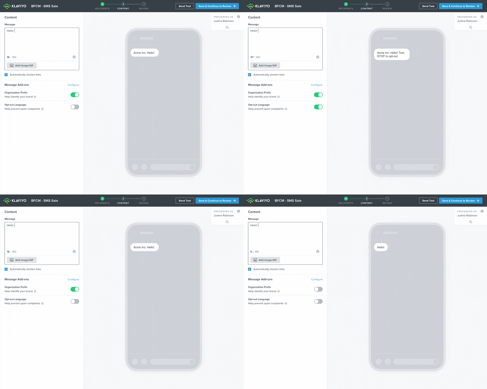
It is best practice for businesses to always include the name of their company somewhere in the text message itself. That’s how the “Organizational Prefix” feature came into play — by default, we take information about users’ businesses already set up in Klaviyo when they sign up and add that to the beginning of text messages. That way, users are introduced to the unique communication challenges of SMS messaging and can be assured that they can send an identifiable message with little effort.

Another example of defaults working in the user’s best interest is our handling of links. We automatically shorten Any links added to an SMS message, saving precious characters but also ensuring proper metrics can be tracked without requiring users to insert them manually via an action. Only when users try to remove the automatic link shortening we inform them about the complexities of what it means to not do so.

Building Confidence
Sending a campaign of any kind can be stressful. It’s one of the few elements on the internet that can’t be edited or fixed after the fact if a mistake is made (sadly, tweets are still one of those). For SMS, any mistake can bring extra financial pain — there’s is a cost charged per message sent.
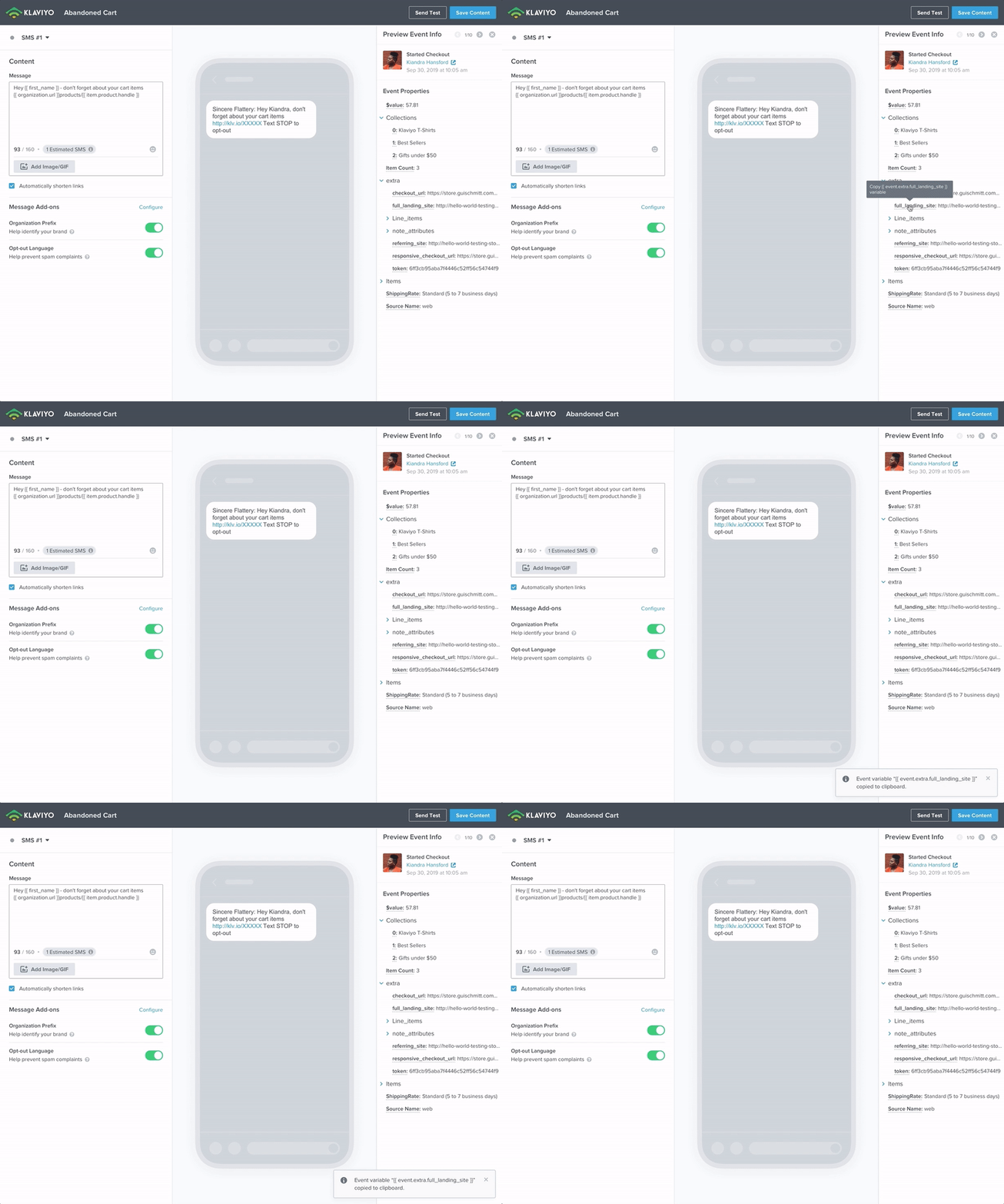
SMS in Klaviyo features a brand new live preview system. Users can get validation on how their message will be received in real-time, supporting even the most complex scenarios. Have a bunch of content that changes dynamically for each recipient? Users can quickly validate their message by a series of profiles without navigating around modals and preferences. That way, users can spend less time clicking around menus and more time focusing on composing the best message for their audience.

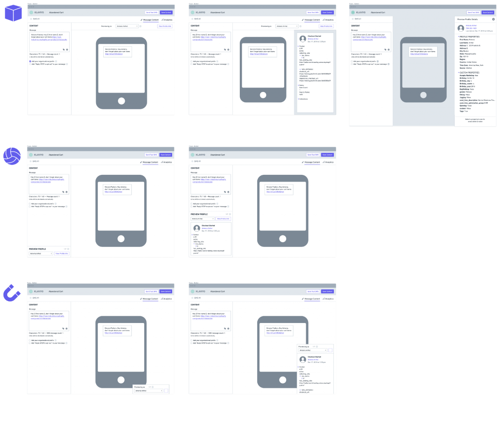
Wireframes of randomly named Cube, Volleyball and Magnet versions
A lot of iterations were made to get this just right without changing the overall data model. Do we show a pill? How much information do we disclose in the preview card? Do we let users cycle through profiles only by searching (existing behavior) or we let them shuffle quickly through a random list of profiles in their account to quickly validate that what they are choosing to customize will work for everyone?

Users can also dig deeper into any profile data stored in their Klaviyo account straight from the builder itself via a side panel. Profile data is the key to effective customization at scale, so now users can now get inspiration from what they’ve collected about their users and quickly copy the code that adds this dynamic data via a single click.
(Additional improvements to dynamic content discoverability and insertion are in the roadmap as well!)

Learning from Users
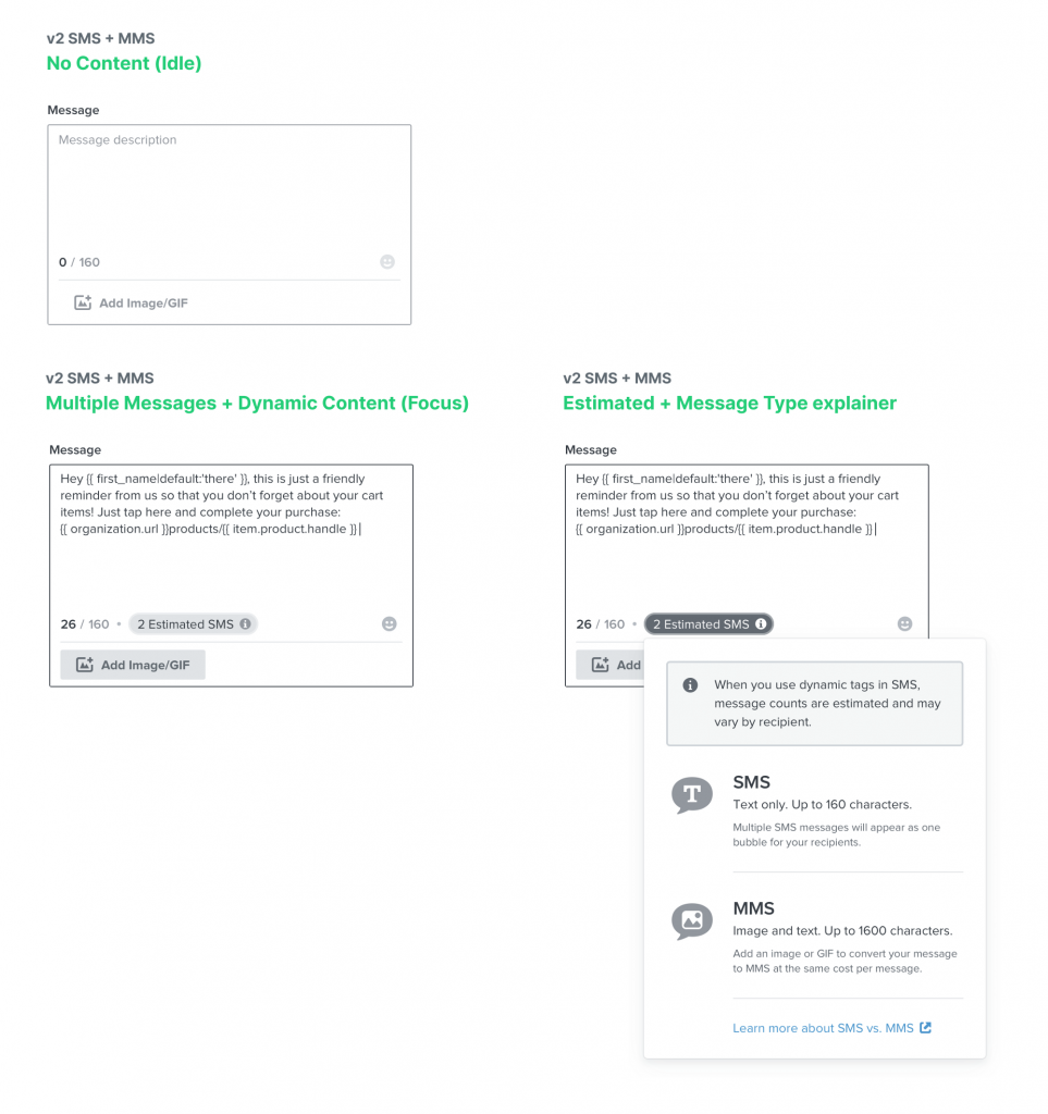
On our first iterations for the SMS builder, we provided information about how many individual SMS messages would be sent based on the number of characters at all times, thinking that bringing this data upfront would help users understand how the character count can impact the big picture of how many messages they are sending.

Over time, we learned that users were surprised when price estimations were doubled due to long messages — they were not noticing the message count changing since it was there at all times! Critical information was being missed: your message now costs double. Additionally, a lot of users were concerned that recipients would get their messages broken down into multiple pieces for multi SMS messages, something that doesn’t occur in the vast majority of mobile carriers and mobile operating systems.
The improved behavior in the product today showcases the message count only when it’s relevant to do so — for longer, multi-SMS messages or if there is a dynamic element that makes the current count an estimation. That way, more users are aware of the change in their message status and are have proper context through their content to understand how these elements play a role in their charged amount.

Delivering to a pocket near you!
Building SMS meant thinking big picture.
Introducing a new communication channel involved much more than building a new composing experience. The relationship between multiple areas of the product (Campaigns, Flows, Profiles, Lists and Segments, Signup Forms, Settings, Billing!) were all at play. Many built-in assumptions in our platform about the medium users were building for had to be revisited.
As a designer, it was an enlightening opportunity, as it meant understanding how all these distinct areas operate and what levers we could pull to make the complex simple, while still allowing for power and capability.
Even more enlightening, however, is learning how people are using SMS in Klaviyo. Every day, we hear stories on how businesses are connecting to their audiences directly to their most personal and frequently used computing devices. Early users of SMS in Klaviyo have found a return on their investment of up to 30x, showing that a new and exciting era of mobile communication is upon us.
A designer’s work is only as good as their team, so special shout-out to Mobile Team crew:
Product Managers Andrea Wan, Hansen Liang and Jake Cohen • Engineers Chris Conlon, Noah Durell, Jordan Griffin and Yann Tambouret.
We know that there’s always room for improvement, so please let us know how we can do better by giving feedback at ux-team@klaviyo.com!

No Comments.