Universal Blocks
Klaviyo's Email Builder Feature
OVERVIEW
Users of Klaviyo’s Email Builder could previously save some aspects of an email to their account, but those elements were added as copies - not syncing.
Universal blocks gave users control - content could behave consistently across different messages - saving time and a lot of unnecessary busy work.
OVERVIEW
Users of Klaviyo’s Email Builder could previously save some aspects of an email to their account, but those elements were added as copies - not syncing.
Universal content gave users control - content could behave consistently across different messages - saving time and a lot of unnecessary busy work.
ABOUT
Web email builder feature
ROLE
User Experience, User Interface
TEAM
Product • Corrine Lin, Sean Walsh
Design • Gui Schmitt, Sara Reich
Engineering • Lindsey Curran, Nikita Shenkman, Daniel Kezerashvili
THE PROBLEM
THE PROBLEM
More time invested, more time on maintenance
We encouraged users to create sophisticated automated sending strategies - specialized messages for different segments of an audience. For example, changing a message based on the cost of items left in a cart, or how frequent of a buyer someone was.
While strategizing this way provided great results, it created a lot of work in the future to maintain consistency across email messages.
Missed opportunities for dynamic communication
Not having the ability to update fixed elements with ease meant that customers couldn't take advantage of time-based events (like a Black Friday sale, or the launch of a new collection) for messages they were already sending via automations.
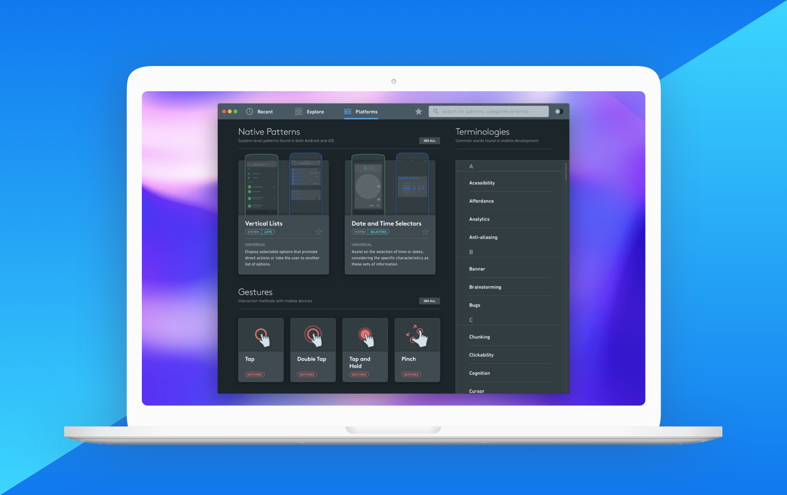
Most easily accessible resources on mobile UX patterns provide a catalog approach, showcasing examples of patterns with little to no contextual information on their strengths, best uses, and weaknesses. The tool should provide users with enough relevant context to make informed design decisions, regardless of their expertise.
How might we...
How might we...
enable users to update content that syncs across multiple places in Klaviyo in an intuitive way?
bring together the vast knowledge available on user experience patterns with the conveniences of a digital tool, serving both beginners and experienced designers?
bring together the vast knowledge available on user experience patterns with the conveniences of a digital tool, serving both beginners and experienced designers?
enable users to update content that syncs across multiple places in Klaviyo in an intuitive way?
bring together the vast knowledge available on user experience patterns with the conveniences of a digital tool, serving both beginners and experienced designers?
Process
Process
Research
Research
Our competitor research revealed that synced content was rarely found in email editors.
To gain further insight, I looked beyond email and searched for patterns used in mass market website builders (which, like email, have shared elements across pages) and other creative tools that incorporate a similar concept of visually editable elements across multiple places (e.g. Symbols in Sketch and Components on Figma).
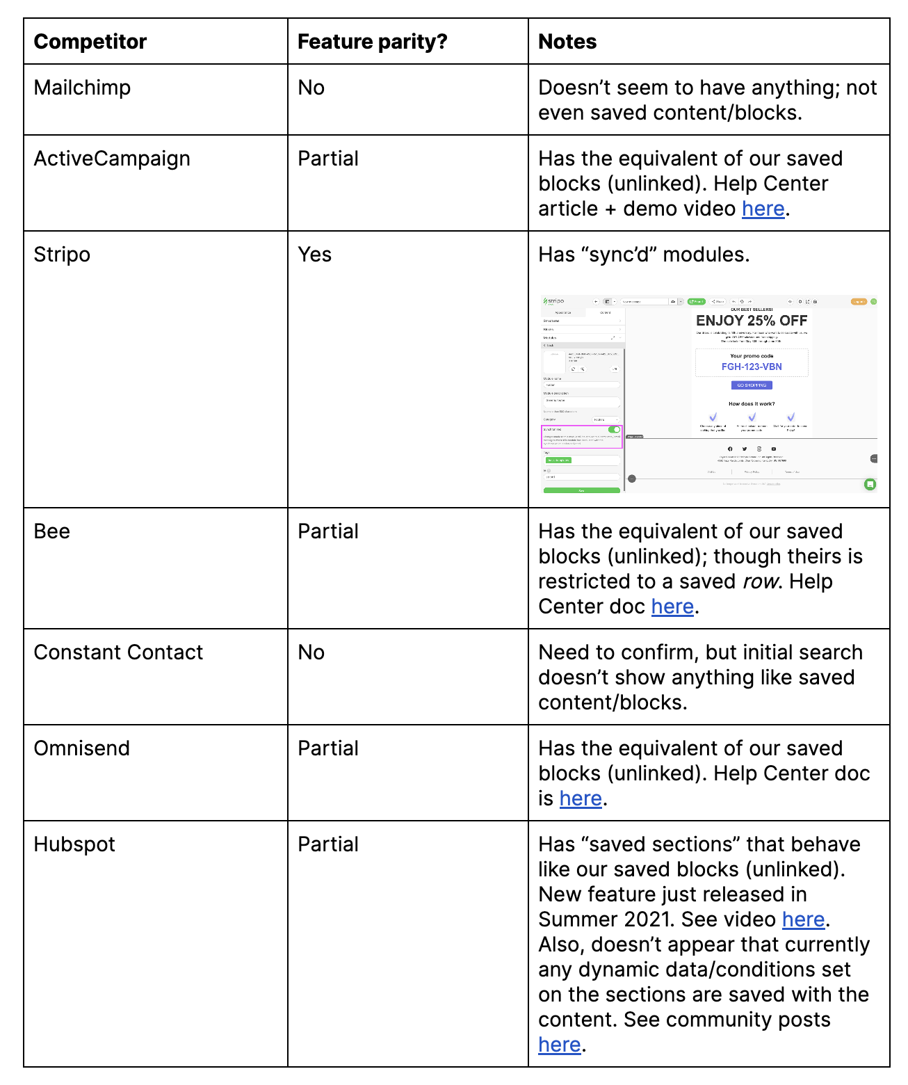
Most email builders didn't had support for similar functionality
Photos on the Mac is an application that uses dark mode to differentiate the editing mode from the viewing mode.
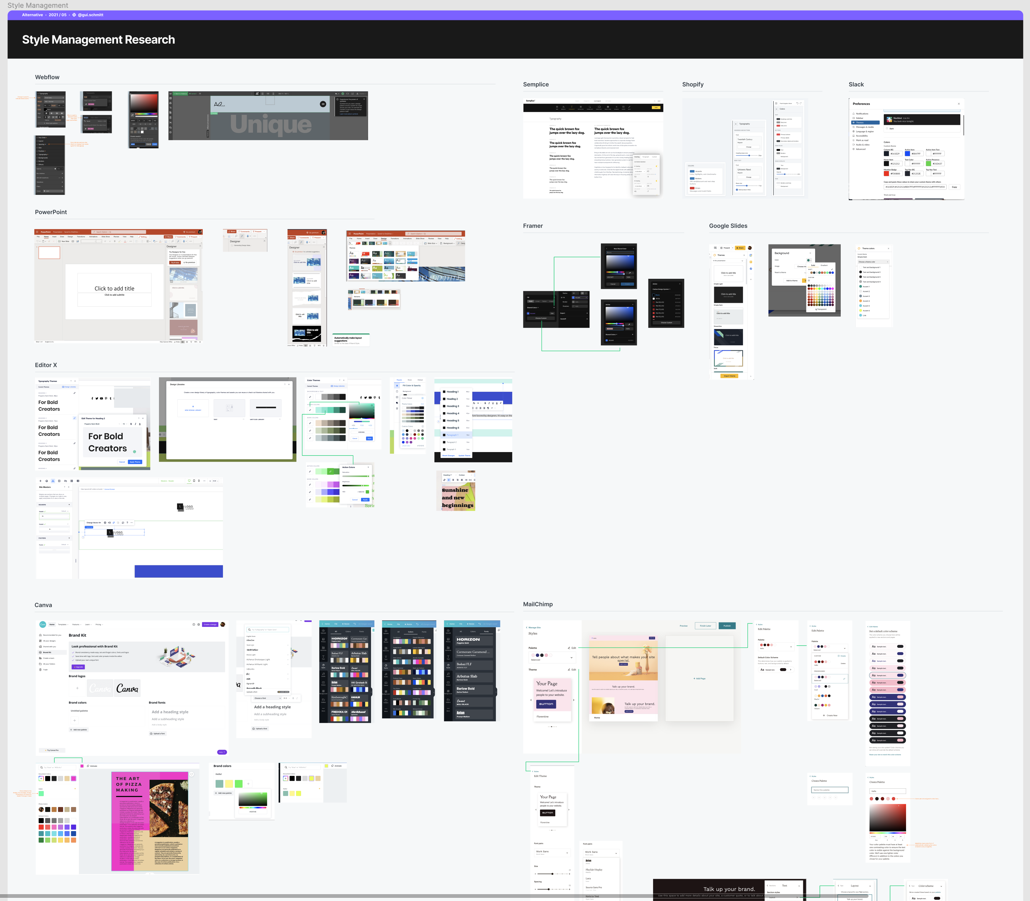
Research on patterns used across content builders on the web.
Most common occurance of linked content is found on shared styling (fonts, colors, etc.)
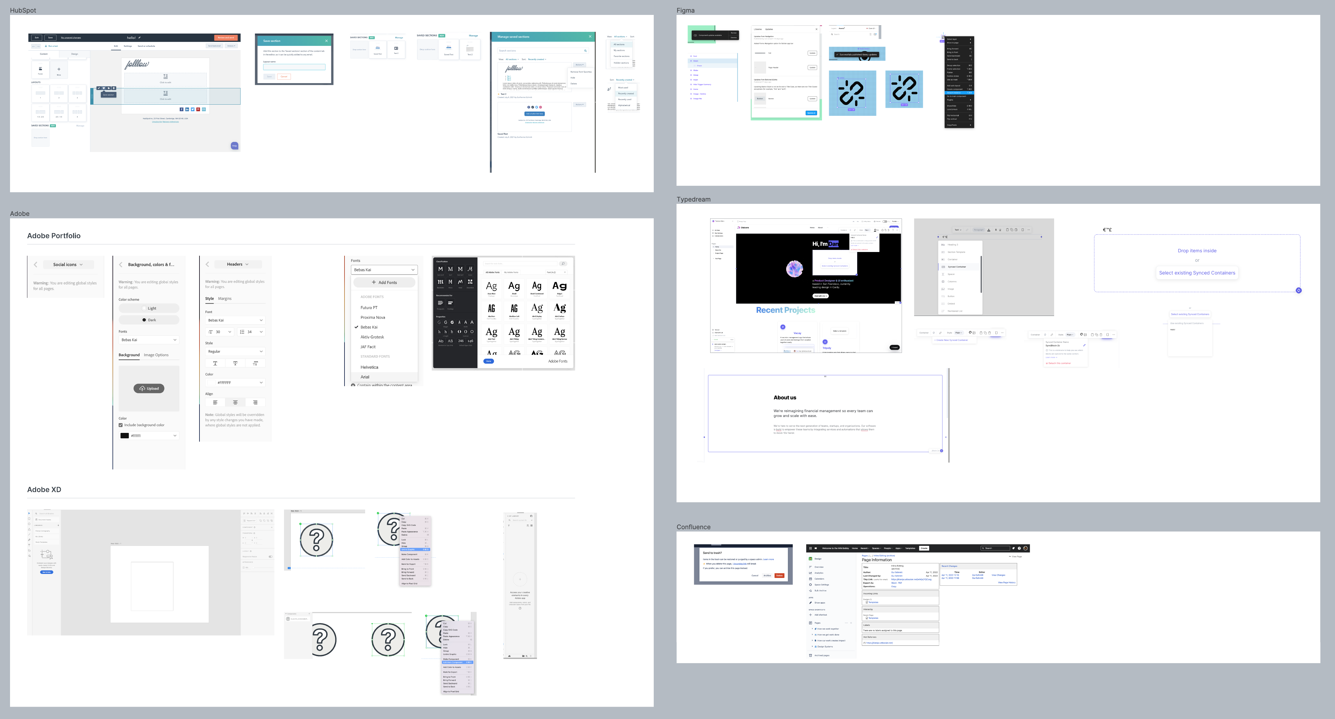
Synced content experiences found in web builders including Hubspot, Figma, Adobe XD and Confluence. Each platform implements different levels of friction to prevent errors and ensure users are aware of the consequences of their changes.
Early usability tests
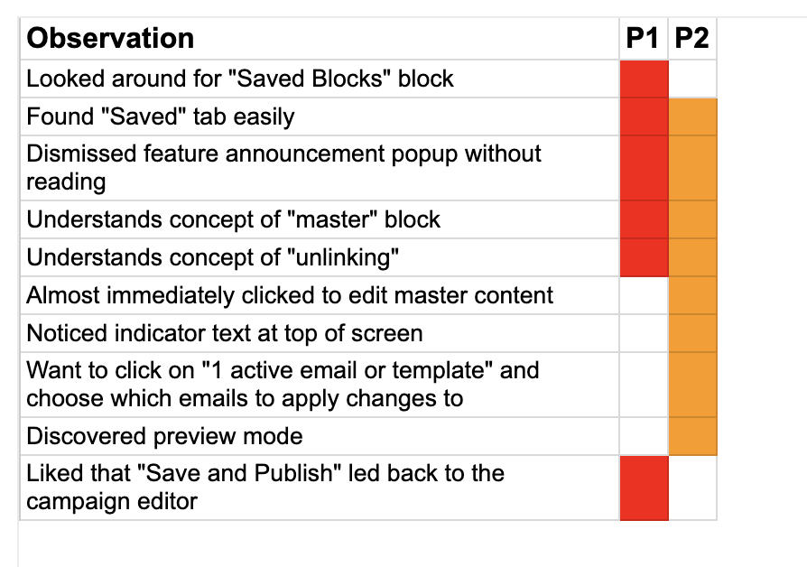
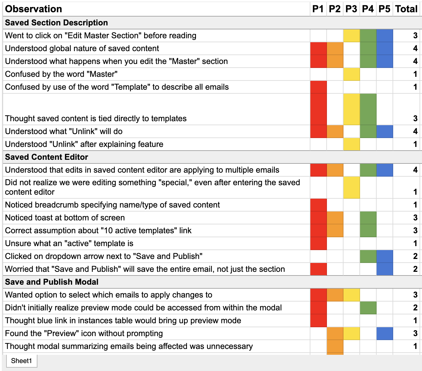
Using early concepts that borrowed from patterns in website editing tools tweaked to fit within the environment of Klaviyo’s email editor, we performed usability tests with customers that were used to saving unlinked content in Klaviyo. Our goal was to understand:
- Could users understand this new editing dynamic?
- What were there any major pain points in this proposed system?
Key findings
While some users understood the feature benefit, others didn't pause to read - stronger visual signifiers and clearer action copy was needed.
The editing mode needed further visual differentiation from the standard editor and a clearer hierarchy.
Users missed seeing some context of the original message while editing universal content.
Terms needed to be tweaked - keeping the name as “Saved” didn't communicate the new syncing capabilities (and made it hard to market), while terms like "Master” (commonplace around Engineering at the time) were culturally insensitive.
Iterations
I experimented with using distinct colors to highlight dynamic content from standard content, taking inspiration from design tools like Figma. However, other features in our platform around AI-generated content were already utilizing purple. After talking with the Design Systems team, we opted for green.
I also explored several ways to communicate entering a different editing mode.
My goal was to strike a balance between informing what just happened without disorienting users. We opted for a full replacement of the top editing bar, as we found success internally to highlight that users were using a Staff account (and therefore should be careful with data handling).
Solution
Solution
Universal blocks empower users to sync elements across multiple emails, saving time and effort.
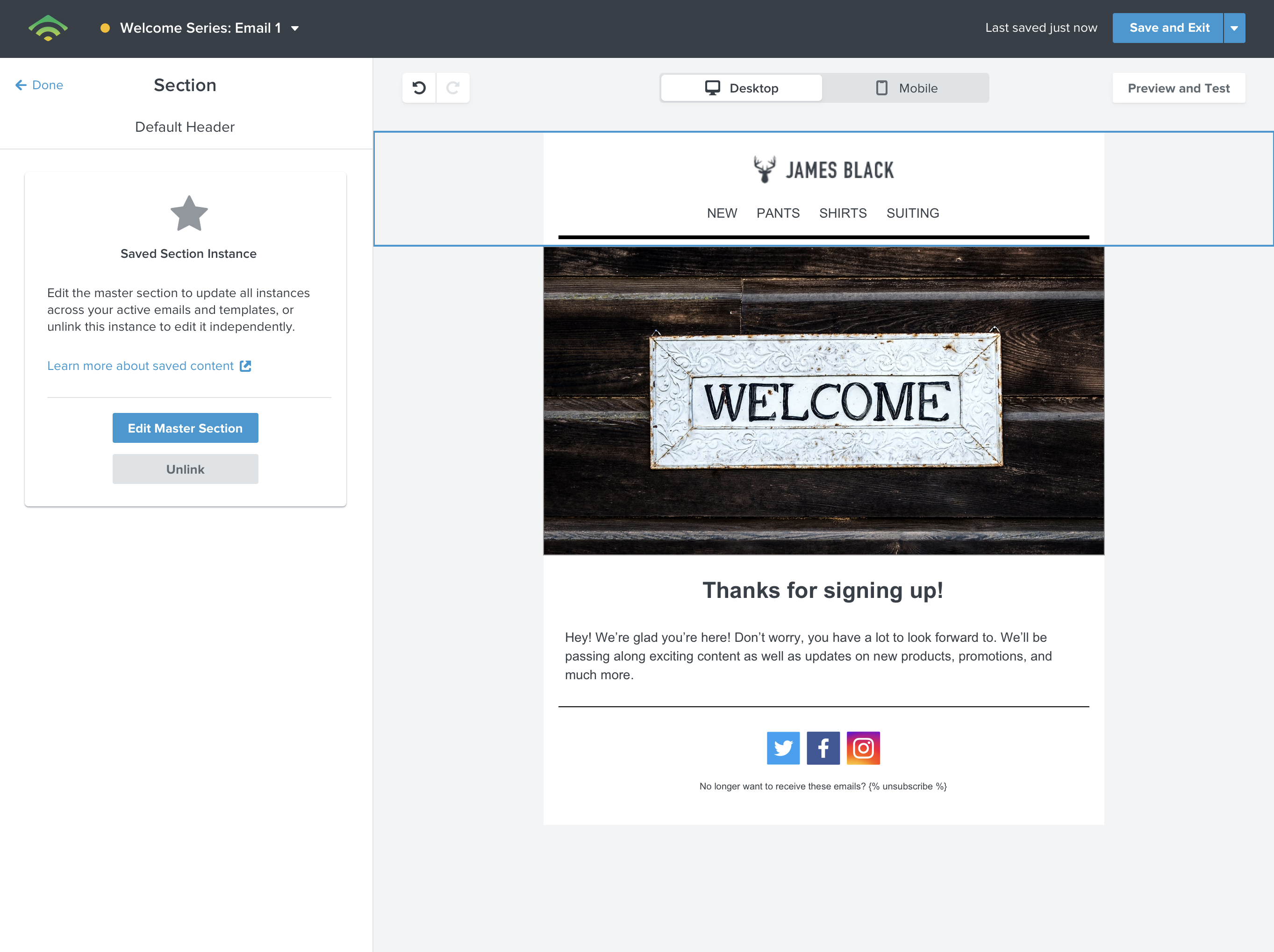
It educates new users on the capability and its advantages, while also providing helpful reminders of the consequences of editing content that affects multiple messages.
Universal content empowers users to sync elements across multiple emails, saving time and effort.
It educates new users on the capability and its advantages, while also providing helpful reminders of the consequences of editing content that affects multiple messages.
Positive friction, clear actions
Positive friction, clear actions
First-time users are greeted with a card carousel that explains core navigation and functionality.
Upon selecting, users see an animation that communicates the impact of editing universal blocks, while icons and clear copy on buttons bring important context to the options available.
First-time users are greeted with a card carousel that explains core navigation and functionality.
Upon selecting, users see an animation that communicates the impact of editing universal content, while icons and clear copy on buttons bring important context to the options available.
First-time users are greeted with a card carousel that explains core navigation and functionality.
Upon selecting, users see an animation that communicates the impact of editing universal content, while icons and clear copy on buttons bring important context to the options available.
Edit mode awareness
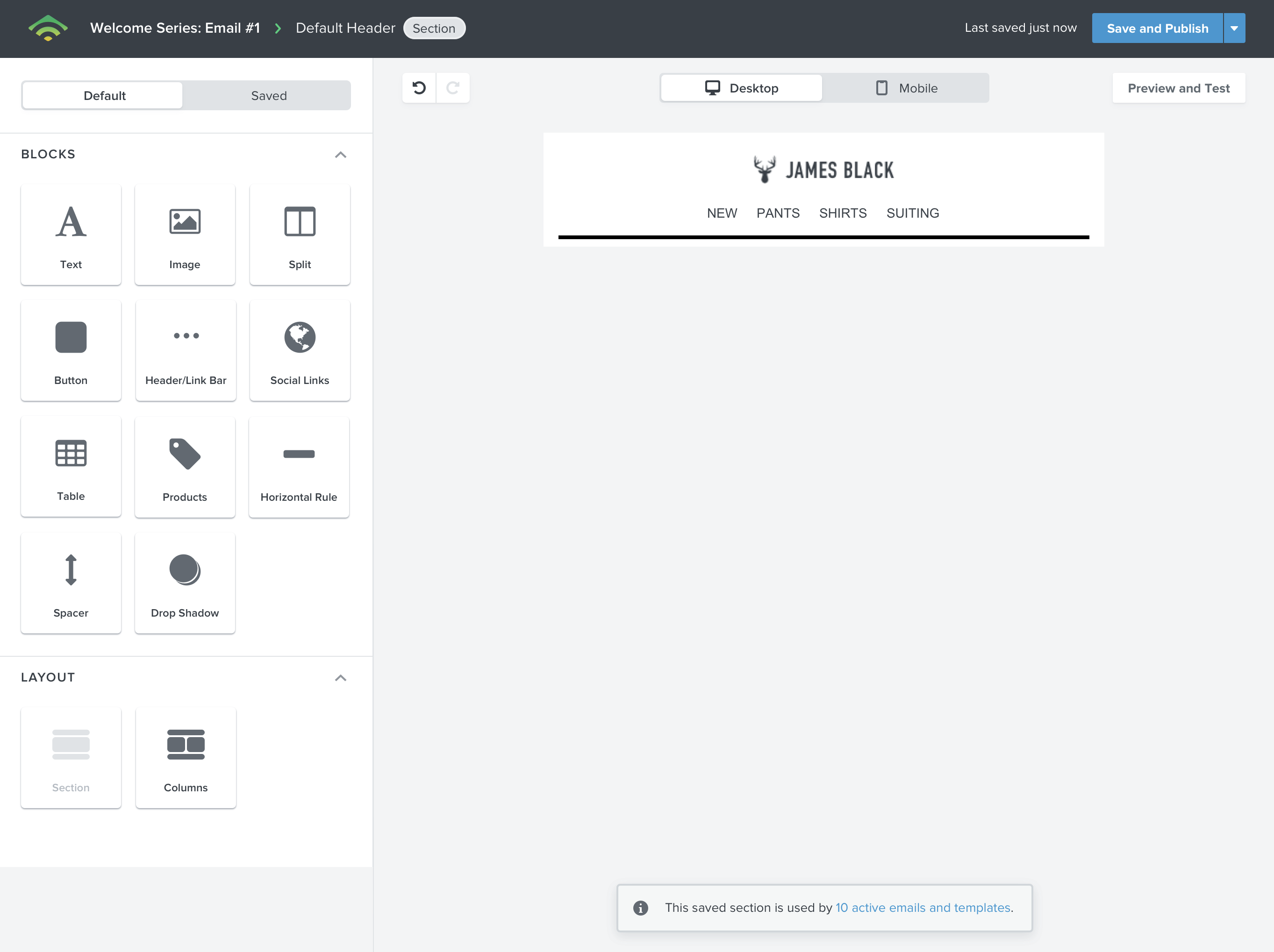
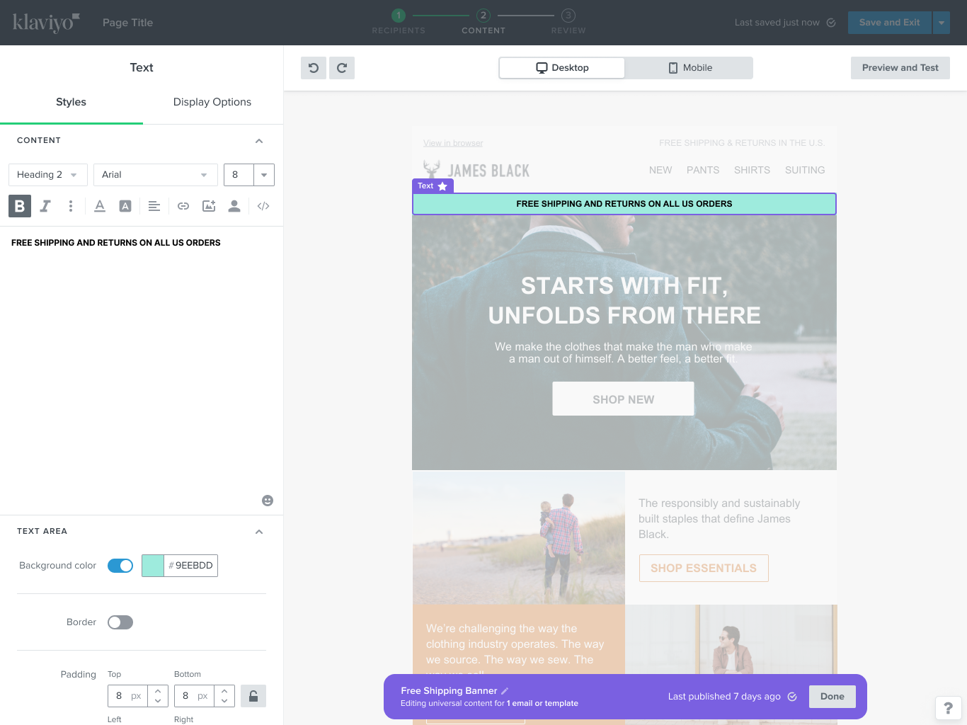
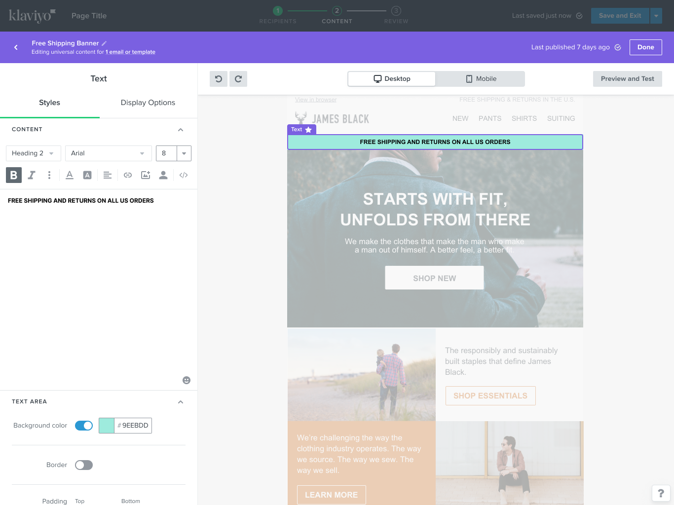
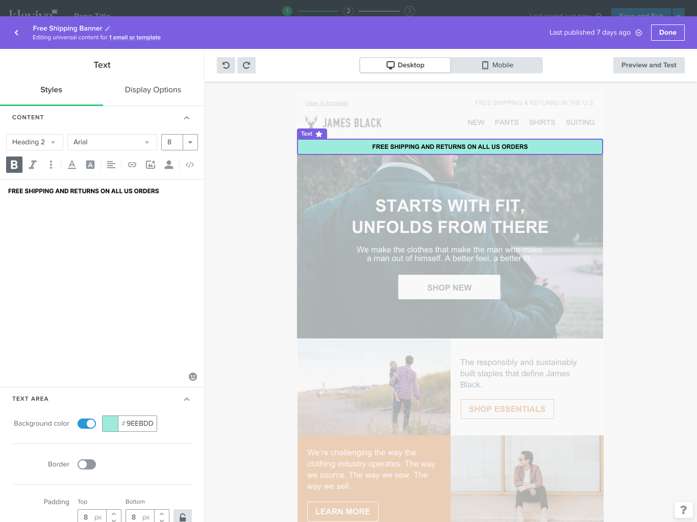
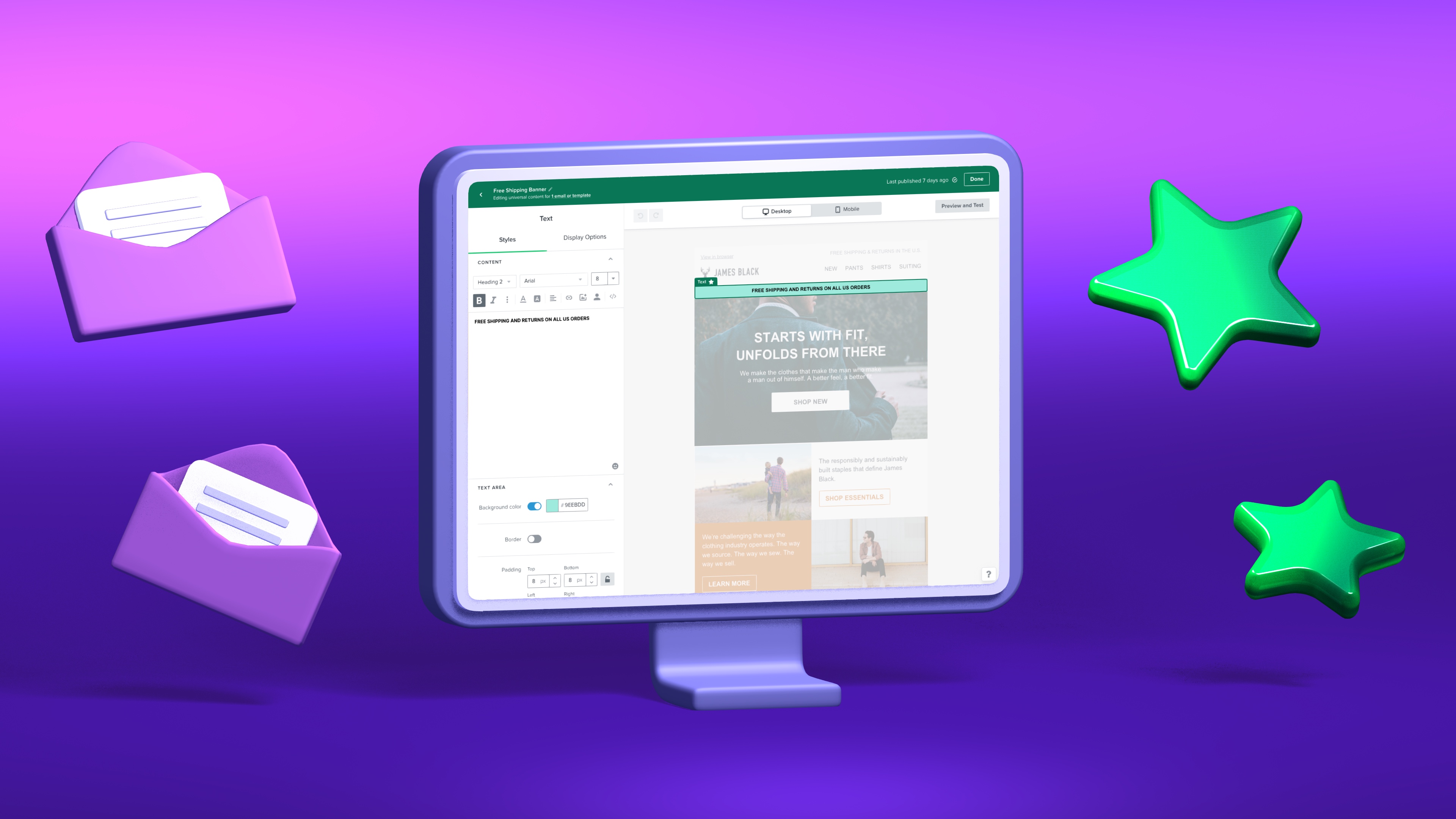
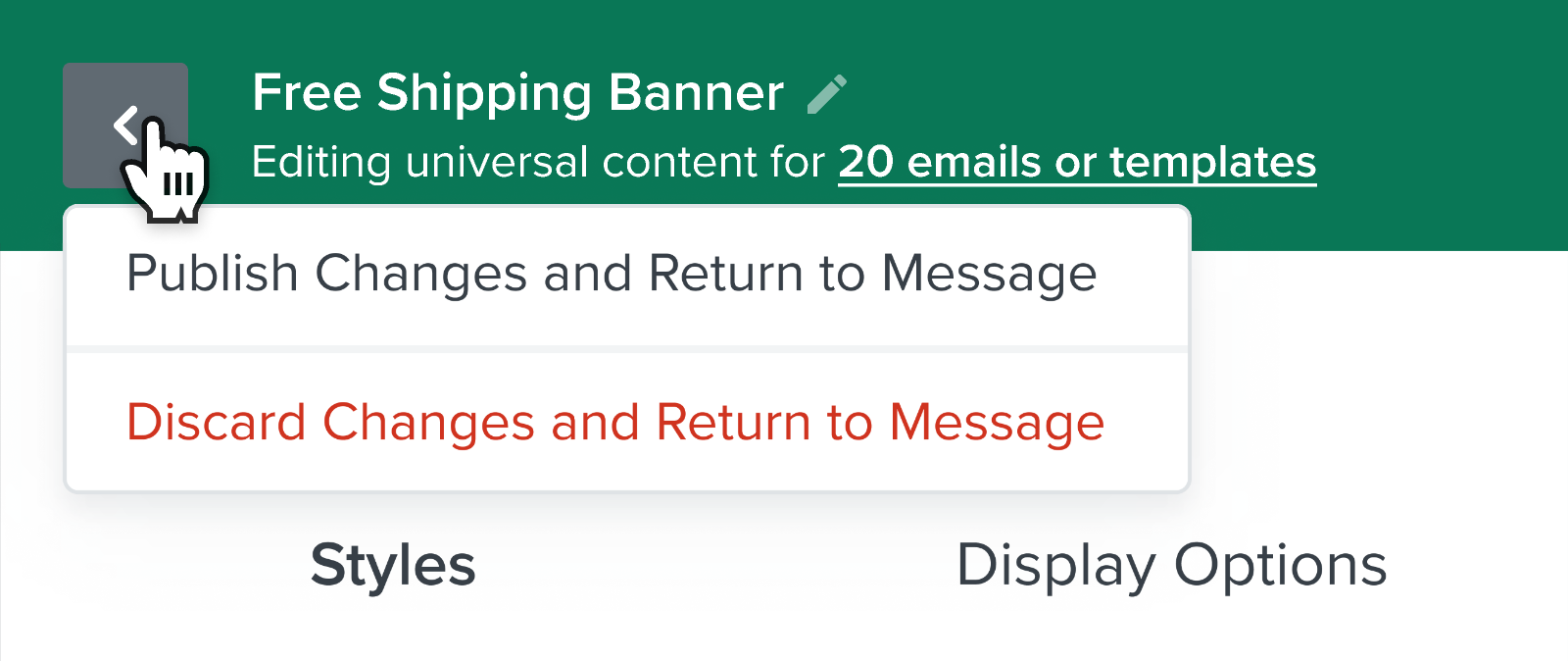
The interface for editing universal blocks has been modified with a special green header, emphasizing its new state and the effects of editing the content which will update in multiple locations.
The header highlights how many other messages also use the same universal block.
Users can still view the context of the original message, but with reduced opacity to avoid confusion.
The interface for editing universal content has been modified with a special green header, emphasizing its new state and the effects of editing the content which will update in multiple locations.
The header highlights how many other messages also use universal content. Users can still view the context of the original message, but with reduced opacity to avoid confusion.
Control and visibility
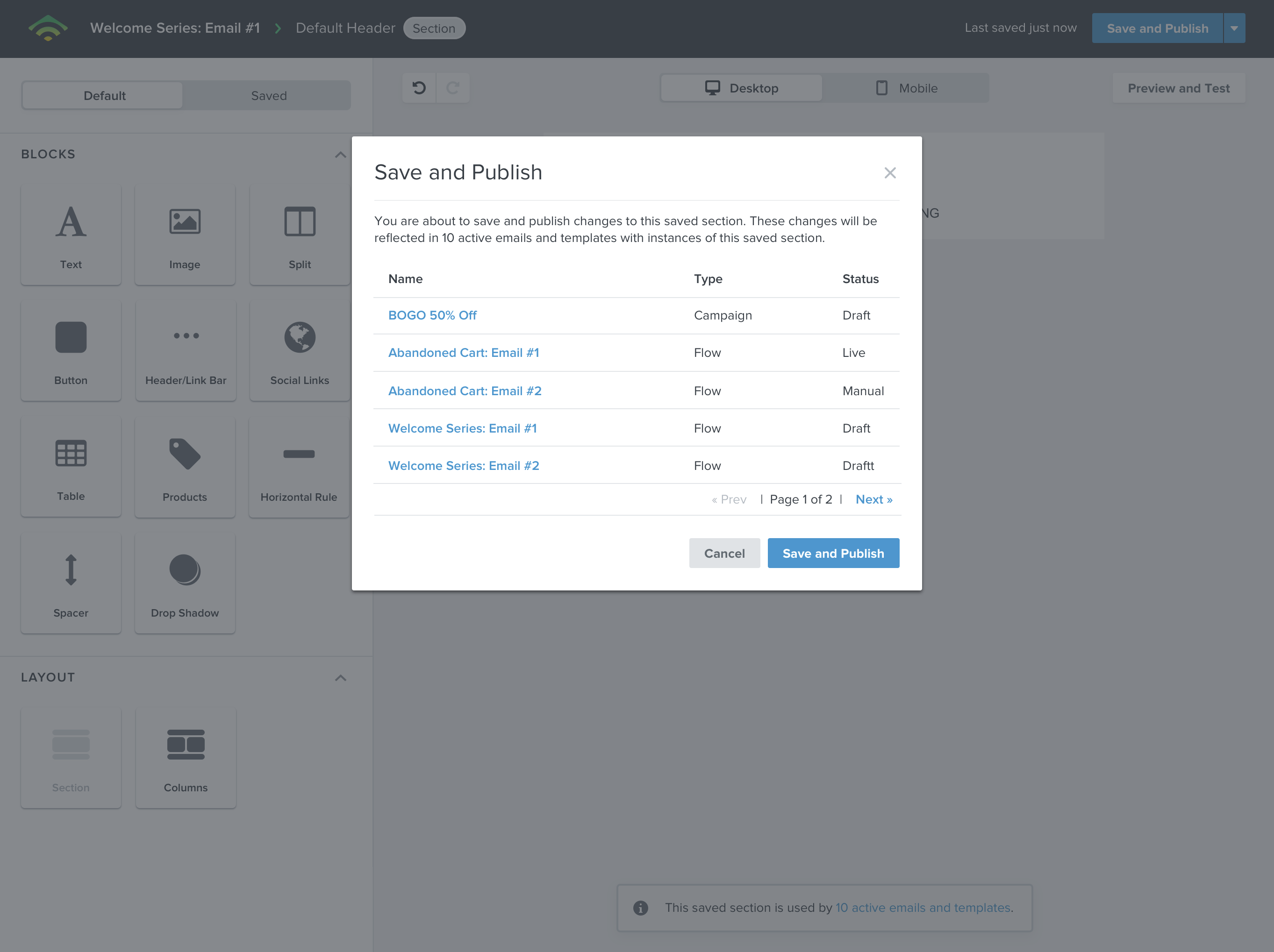
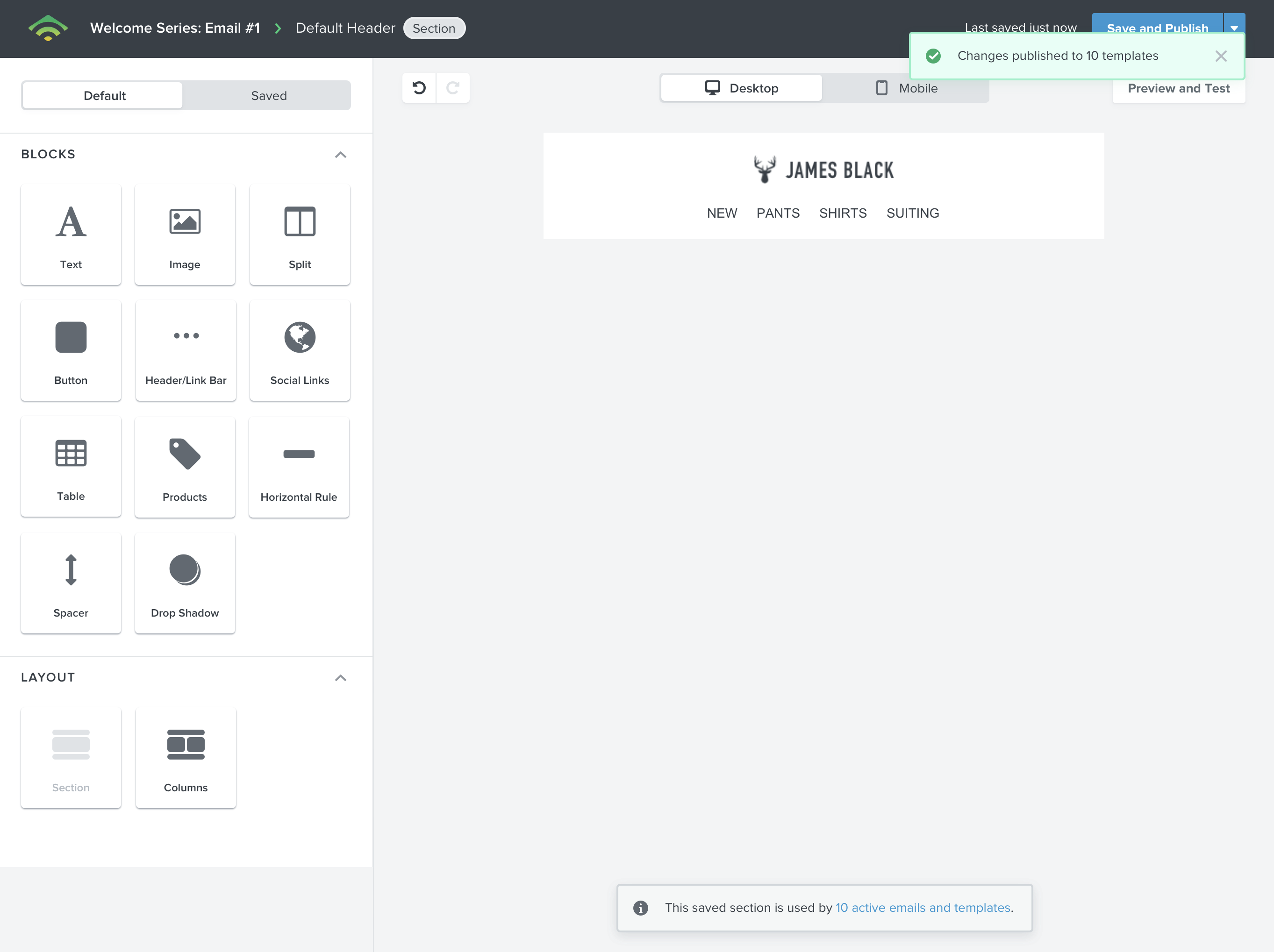
If mistakes were made, users are given clear options to discard changes and can see the impact of how many messages will get an update after confirming edits to the universal block.
If mistakes were made, users are given clear options to discard changes and can see the impact of how many messages will get an update after confirming edits to the universal content.
If mistakes were made, users are given clear options to discard changes and can see the impact of how many messages will get an update after confirming edits to the universal content.
If mistakes were made, users are given clear options to discard changes and can see the impact of how many messages will get an update after confirming edits to the universal content.
Impact
Impact
Universal blocks was released to a small segment of customers prior to being available to all users - this allowed us to collect additional feedback and fix bugs before general release in the fall of 2022.
Users were thrilled about the time-saving capabilities of universal content, specifically larger companies with a vast number of automated emails.
Universal blocks also acted as a major incentive for users to convert to the new Email Builder, as it was exclusive to it.
Universal Content was released to a small segment of customers prior to being available to all users - this allowed us to collect additional feedback and fix bugs before general release in the fall of 2022.
Users were thrilled about the time-saving capabilities of Universal Content, specifically larger companies with a vast number of automated emails.
Universal Content also acted as a major incentive for users to convert to the new Email Builder, as it was exclusive to it.
Universal editing 😍😍😍 @klaviyo you just saved me HOURS
— Lexie Flick 💌 (@lexieflick) October 27, 2021
Klaviyo's new email editor is worth the effort to learn how to use - looks much much better on mobile and the universal blocks feature is an absolute game changer.
— Conor (@conorgallagh) July 11, 2022
You can adjust a block or section of blocks in every email it's featured in - at once. Highly recommend.
Universal content in the @klaviyo editor is a game changer for creating email design systems.
— Brian Becker (@bemilbecker) October 27, 2021
Can't wait to start experimenting with it.
With universal content blocks now available, I couldn't not: I've spent my day building out some existing email templates in the NEW @klaviyo template editor & I am happy to see so many improvements have been made ⭐️
— Steph’s Email Studio | Email Design & Development (@steph_hajj) May 5, 2022
We've been in the process for the last two months of converting client emails to Klaviyo's new editor. Having clamored for Universal Content Blocks for years, seeing it all in action now is just... 🤌 pic.twitter.com/fyOtGRn7hI
— Ben Zettler (@benzettler) September 12, 2022
links & hobbies
links & hobbies
links & hobbies
links & hobbies
links & hobbies
Photography ∙ Playlists ∙ Films
hey, thanks for visiting
hey, thanks for visiting
hey, thanks for visiting
hey, thanks for visiting
hey, thanks for visiting
have a nice day
have a nice day
have a nice day
have a nice day
have a nice day
PIXELS POLISHED WITH ♥, BY GUI ∙ LAST UPDATED EARLY 2023
